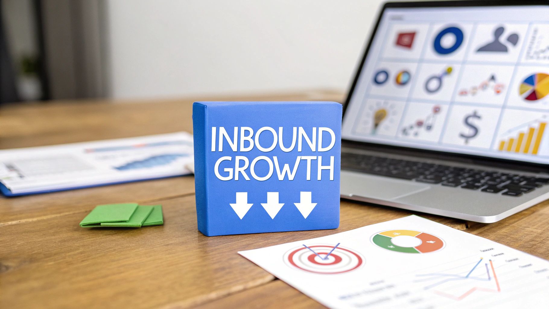
Summary
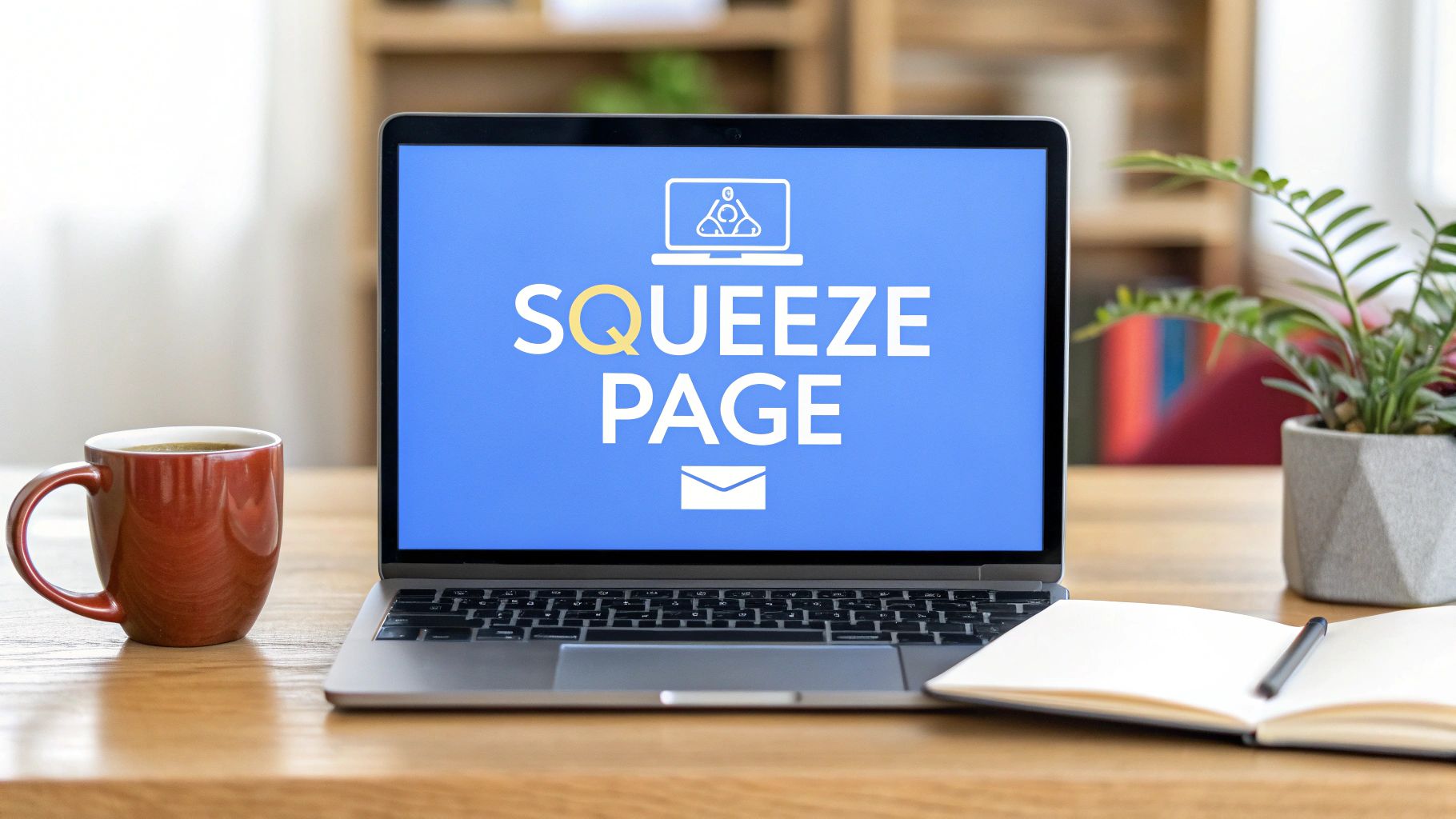
So, what is a squeeze page? Think of it as a hyper-focused webpage built with one single, solitary goal: to capture a visitor's email address. How? By offering them something valuable in return. Unlike a cluttered homepage, it cuts through all the noise. It creates a simple, frictionless path for visitors to join your marketing list.
Understanding the Squeeze Page Concept

Let's use an analogy. Imagine your website's homepage is a sprawling department store. It has multiple entrances, dozens of aisles, and countless products all screaming for attention. A visitor can easily get lost, browse for a bit, and walk right back out.
A squeeze page, on the other hand, is like a friendly concierge at an exclusive event. This person has just one job: collecting business cards (email addresses) from interested guests. In exchange, the guest gets instant access to something special—like a VIP lounge or a complimentary gift.
That's the essence of a squeeze page. It isn't built for browsing. Its entire purpose is to create a simple, direct value exchange. Are you starting to see the power in this approach?
A squeeze page is a type of landing page, but its mission is far more specific. While a general landing page might aim for a sale or a demo request, a squeeze page is ruthlessly efficient. It focuses only on capturing lead information—usually just an email address.
This intense focus is where its real power lies and is a key differentiator from other types of landing pages.
The Power of a Singular Focus
The magic of a squeeze page is its minimalism. By stripping away everything that doesn't contribute to its core mission, it eliminates decision fatigue. You won't find navigation menus, distracting sidebars, or competing calls to action.
This laser-focused approach gives visitors a clear, binary choice: "Do I want this awesome offer enough to trade my email for it?" That simplicity is what sends conversion rates through the roof.
An effective squeeze page boils down to a few key ingredients:
- A Compelling Offer: This is the heart of the operation, often called a "lead magnet." It could be a free guide, an exclusive discount, or access to a must-see webinar.
- Minimalist Design: The layout must be clean and uncluttered, guiding the visitor's eye straight to the offer and the sign-up form. No distractions allowed.
- A Simple Form: It asks for the bare minimum—typically just an email address—to make signing up completely effortless.
Essentially, a squeeze page is your specialist tool for building an email list. By streamlining the user's decision, it becomes a cornerstone of any effective lead generation campaign. To dive deeper, check out this great resource on the basics of squeeze pages from GetResponse.com.
To help you see the difference clearly, let's break down how squeeze pages stack up against traditional landing pages.
Squeeze Page vs Landing Page at a Glance
This table breaks down the core differences, helping you quickly understand their unique roles in a marketing strategy.
As you can see, while both are designed for conversion, their jobs are very different. A squeeze page is your specialist for getting that initial "yes." A traditional landing page handles the heavier lifting of closing a sale or securing a qualified lead.
Why Squeeze Pages Are a Lead Generation Powerhouse
So, why are experienced marketers so obsessed with squeeze pages? Simple. They just work.
These incredibly focused pages are designed to solve one of the biggest conversion killers out there: decision fatigue.
When a visitor lands on a typical webpage, they're bombarded with choices—navigation menus, multiple offers, and dozens of links. It’s overwhelming, and a confused mind almost always says "no." A squeeze page cuts through that noise by stripping away everything that doesn't serve its one purpose.
By presenting one killer offer and one clear action, the path forward is crystal clear. This laser focus is why squeeze pages often blow standard website pages out of the water when it comes to opt-in rates.
The Engine of Your Email List
The biggest win? Squeeze pages are absolute machines when it comes to learning how to build email lists. And let’s be clear, an email list isn't just a bunch of contacts. It's a direct, unfiltered line of communication to your most interested prospects.
Unlike social media, where mysterious algorithms decide who sees your content, your email list gives you a direct key to your audience's inbox. This makes squeeze pages the true engine of sustainable list growth, turning casual visitors into dedicated subscribers.
A squeeze page isn't just a webpage; it’s a strategic asset for turning fleeting interest into measurable, long-term business growth.
Once they're on your list, you can build a real relationship. You can nurture them with valuable content and guide them through your sales process on their own terms.
Generating High-Quality, Engaged Leads
Here's something else to consider: not all leads are created equal. A squeeze page is brilliant at attracting people who are genuinely interested. When someone willingly trades their email for your lead magnet, they're raising their hand and saying, "Yes, I want to hear more from you!"
This self-qualification process is priceless. In fact, nearly half of marketers (49.7%) say that online forms and squeeze pages generate their highest-quality leads. With over 61% of marketers admitting that lead generation is their biggest struggle, these pages are a direct solution.
That means the leads you collect are already warm. They're far more receptive to your future messages because they opted in for a reason.
The Power of Early Segmentation
Want to know the hidden superpower of a squeeze page? It lets you segment your audience right from the start.
By creating different squeeze pages with offers tailored to different needs, you can automatically sort new subscribers into organized groups.
For example, you could set up separate squeeze pages for:
- Beginners: Offering a "Getting Started Guide."
- Advanced Users: Providing an "Advanced Tactics Checklist."
- Specific Interests: Offering a case study on a particular industry.
This immediate segmentation makes your follow-up email campaigns incredibly relevant. Instead of blasting everyone with the same message, you can deliver content that speaks directly to each person's unique goals. That’s how you dramatically boost engagement and, ultimately, your bottom line.
The Anatomy of a High-Converting Squeeze Page
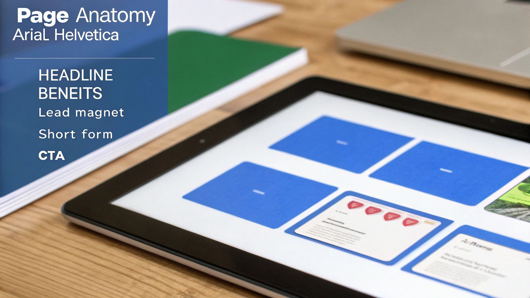
So, what’s the secret sauce that makes a squeeze page work so well? It’s not magic. It’s a simple, powerful recipe. When you get the five essential ingredients just right, you create an experience that’s nearly impossible for your ideal visitor to ignore.
Each part of the page has one specific job. When they all work together, they create a seamless path that guides your visitor toward that one critical action—giving you their email. Let's break down the core components.
The Magnetic Headline
Your headline is your first—and sometimes only—shot. You have about three seconds to grab someone's attention. Its one and only job is to communicate a powerful benefit that answers their biggest question: "What's in it for me?"
A great headline is never just clever; it's crystal clear. It promises a tangible solution to a pressing problem. Vague headlines like "Sign Up for Our Newsletter" are conversion killers. Instead, something like "Unlock the 5 Secrets to Doubling Your Website Traffic in 30 Days" immediately sparks curiosity and screams value.
Crisp and Persuasive Copy
Once the headline has them hooked, the copy's job is to reel them in. But on a squeeze page, less is always more. You don't need winding paragraphs. In fact, that kind of clutter just gets in the way.
The best squeeze page copy is often just a short sub-headline followed by a few benefit-packed bullet points.
- Focus on the outcome, not the features. Don't say "10-part video series." Say "Master a new skill in just one week."
- Keep the language punchy and direct. Use action words that create energy.
- Hit on a pain point. Show them you understand their struggle and have the exact solution.
This copy exists for one reason: to reinforce the value of your offer and make trading their email address feel like an absolute steal.
A squeeze page is an exercise in persuasive minimalism. Every word, image, and element must justify its existence by contributing directly to the goal of capturing that email address. Anything else is a distraction.
Figuring out how to balance these elements is key. The fundamentals of how to launch a successful landing page are nearly identical, and many of the core principles apply directly here.
An Irresistible Offer or Lead Magnet
This is the core of the entire exchange. Your lead magnet is the amazing "something" you're offering in return for that precious email address. For this to work, your offer can't just be good—it has to be completely irresistible to your specific audience.
The value of your lead magnet has to feel way bigger than the "cost" of handing over their contact info. Some of the most effective lead magnets offer immediate value:
- Ebooks or Guides: Deep dives that solve a very specific problem.
- Checklists or Cheatsheets: Simple, actionable tools that make a complex task feel easy.
- Webinar Access: An exclusive invitation to a live training session.
- Discount Codes or Free Trials: A direct financial or experiential perk.
What's one problem you can solve for your visitor right now? The answer is your perfect lead magnet.
The Streamlined Opt-In Form
The opt-in form is where the transaction happens, and the golden rule is to eliminate all friction. Every extra field you ask someone to fill out dramatically increases the odds they'll give up and leave.
For a true squeeze page, all you really need is one field: email address. You might be tempted to ask for a first name for personalization, but you must test whether it hurts your conversion rate. Anything more—like a phone number or company name—is asking too much, too soon. Make the process feel effortless.
A Bold and Action-Oriented CTA
Finally, the Call-to-Action (CTA) button is the final push. This is no time to be subtle. Your CTA needs to be big, bold, and use urgent, action-focused language that tells visitors exactly what to do.
Ditch boring words like "Submit" or "Subscribe." Instead, use exciting, first-person language that reinforces the benefit:
- "Get My Free Guide Now!"
- "Send Me the Checklist!"
- "Unlock My 10% Discount"
The CTA is that final nudge that gets the visitor to commit. Each of these five elements builds on the last, creating a persuasive journey. Nailing these components is the foundation, and you can explore more advanced strategies in our guide on how to create a high-converting landing page.
Squeeze Page Examples That Actually Convert

Alright, we’ve covered the "what" and "why." Now for the fun part. Seeing these principles in action is where the real lightbulb moments happen.
Let's move past the theory and dive into some real-world squeeze page examples that absolutely nail it. We’ll break down not just what they look like, but the subtle psychology that makes them so effective.
Think of this as a playbook of proven tactics you can adapt for your own campaigns. As we go, notice how each one sticks to the script: a killer headline, barely-there copy, a crystal-clear offer, and a CTA you can't miss.
The SaaS Welcome Mat Example
Imagine landing on a software company’s website. Instead of being bombarded with feature lists, you’re greeted by a clean page with a powerful headline: "See Why 50,000+ Teams Trust Us to Manage Their Projects." Boom. Instant social proof.
The copy is minimal, maybe with a sub-headline like, "Get started for free. No credit card required."
- Why It Works: That big number (50,000+ teams) does the heavy lifting, immediately building trust. Then, the magic words "No credit card required" dismantle the biggest roadblock for sign-ups, making it a risk-free decision.
- The Offer: The lead magnet here is the product itself. Giving immediate access via a free trial is a home run for SaaS companies.
- The CTA: A simple, direct button that says, "Get Started Free."
This approach is potent because it trades an email for a tangible, high-value experience.
The E-commerce Discount Pop-up
You’ve seen this a million times for one simple reason—it works. You're browsing an online shop, and a slick pop-up appears: "Get 15% Off Your First Order." It's a classic squeeze tactic, often showing up as an overlay when you're about to leave.
The design is brilliantly simple: a nice product shot, the bold discount headline, a single field for your email, and a bright button screaming "Claim My Discount."
The psychology here is brilliant. It presents a direct, immediate benefit (saving money) at the exact moment the user is showing purchase intent. It's a perfectly timed value exchange that feels like a win for the customer.
This strategy is a cornerstone for many of the best lead generation landing pages, especially in e-commerce. If you want to see more killer examples, check out our deep dive into some of the best lead generation landing pages across different sectors.
The Expert Coaching Webinar Sign-Up
For consultants and coaches, the squeeze page is the front door to a high-value webinar. The page usually features a professional headshot next to a headline that hits on a major pain point, like "Finally Learn How to Launch Your Online Course in Just 30 Days."
The copy often uses bullet points to tease the "secrets" the visitor will learn. This builds massive curiosity.
- The Element of Scarcity: These pages almost always use a countdown timer or phrases like "Limited Spots Available" to create urgency. This encourages people to act now.
- Minimalist Form: They only ask for what's necessary—usually a name and email. Keeping the form short makes signing up feel effortless.
- Benefit-Oriented CTA: The call to action is something like "Save My Spot!" or "Yes, I Want to Learn!" which is far more engaging than "Register."
By looking at these examples, you can see how the core principles of a squeeze page can be molded to fit any business. The key never changes: maintain a laser focus on one goal—capturing that email with an offer they can't refuse.
How to Optimize Your Squeeze Page for Better Results

Getting your squeeze page live is a great first step, but it’s just the starting line. The real results come from treating your page not as a static brochure but as a living asset that you constantly test and refine.
The highest-performing pages are never truly "finished." Continuous, data-driven optimization is what separates a page that merely works from a page that becomes a genuine lead-generation machine. Let's dive into the strategies that will turn a good squeeze page into a great one.
Embrace the Power of A/B Testing
A/B testing, or split testing, is your most important tool for improvement. The idea is simple: you create two versions of your page (Version A and Version B), change just one element, and see which one performs better.
Guesswork has no place here. Data should drive your decisions. By testing one thing at a time, you can scientifically figure out what clicks with your visitors.
Where should you start? Focus on the elements with the biggest potential impact first.
- Your Headline: Pit a benefit-driven headline against one that creates curiosity.
- The CTA Button: Does "Get My Free Guide" pull better than "Download Now"? What about the button's color?
- The Image: Test a product mockup against a photo of a person.
- Form Fields: Try asking for just an email versus a name and an email.
Make Mobile Responsiveness a Top Priority
This isn't just a suggestion—it’s non-negotiable. With a huge chunk of all web traffic coming from smartphones, your squeeze page must look and work perfectly on a small screen. If someone has to pinch and zoom to read your text, they're gone.
A truly mobile-optimized squeeze page will have:
- Large, easy-to-read fonts
- A clean, single-column layout
- Thumb-friendly buttons
- A form that isn't a pain to fill out
Don't just assume your page is mobile-friendly. Pull it up on your own phone. A clunky mobile experience is one of the quickest ways to torpedo your conversion rate.
Optimizing for better results is a continuous journey, not a one-time task. Small, consistent tweaks based on real user data can lead to massive improvements in lead capture over time.
Build Instant Trust with Social Proof
The moment a visitor lands on your page, they're making a judgment call: Can I trust this? You have to give them an immediate reason to say "yes." This is where trust signals and social proof come in. They are powerful psychological shortcuts that reassure visitors.
Even small trust signals can have a huge impact. For a deeper dive, our complete guide on how to optimize landing pages covers more advanced techniques.
Think about adding some of these elements:
- Client Logos: Displaying the logos of companies you've worked with.
- A Short Testimonial: A single, punchy quote from a happy customer.
- Security Badges: Icons that show their data is safe and secure.
- "As Seen On" Banners: Featuring logos of media outlets that have mentioned you.
These work because they prove that other people already trust you. That makes it much easier for new visitors to do the same. This is especially true when aiming for top-tier performance. While a typical squeeze page often outperforms an average landing page, proper optimization can take a page with a respectable 12% conversion rate and push it to 27% or even higher.
Got Questions About Squeeze Pages? We’ve Got Answers.
As you get ready to build your first squeeze page, a few questions are bound to pop up. It's a simple concept, but when you're staring at a blank screen, the details can feel fuzzy.
Don't worry, that's completely normal. To help clear things up, we've pulled together the most common questions marketers have. Think of this as your final check-in before launch.
What’s the Real Difference Between a Squeeze Page and a Landing Page?
This is easily the question we hear the most. Think of it like this: a general contractor can handle all sorts of jobs, but an electrician is a specialist with one specific job.
A landing page is the general contractor. It’s a broad term for any page a visitor "lands on." Its goal could be anything—selling a product, scheduling a demo, or getting event sign-ups.
A squeeze page is the specialist electrician. It has one job: to capture an email address. It’s laser-focused on that single goal, stripping away everything else to "squeeze" that contact info from the visitor.
So, while all squeeze pages are a type of landing page, not all landing pages are squeeze pages.
What Are the Best Tools for Creating a Squeeze Page?
Good news: you don't need to be a developer to build a high-converting squeeze page. There are fantastic tools out there for every budget and skill level.
Here’s a quick breakdown:
- For Beginners & Speed: Tools like Leadpages, Instapage, and Unbounce are your best friends. They have drag-and-drop editors and proven templates. You can have a professional page running in less than an hour.
- For WordPress Fans: If your site is on WordPress, plugins like Elementor or Thrive Architect give you incredible design power from your dashboard.
- For the All-in-One Marketer: Platforms like HubSpot or GetResponse are great. They bundle your page builder with your email marketing, CRM, and other automation tools.
The "best" tool comes down to what you're already using and your budget. Which one sounds right for you?
The most important thing to remember is that technology isn't a roadblock anymore. Modern tools make it easy to build and launch squeeze pages, so you can focus on what matters: your offer and your message.
How Much Text Should I Actually Write on a Squeeze Page?
Here’s the golden rule: as short as possible, but as long as necessary. Your only job is to communicate your offer with crystal clarity. A visitor should get it in seconds.
Long blocks of text are the enemy of a squeeze page. They create friction and kill conversions. The most effective pages usually just have:
- A punchy, benefit-focused headline.
- A short sub-headline to add context.
- A few quick bullet points highlighting the best parts of your offer.
That's it. Every single word has to fight for its spot. If it doesn't help convince someone to type in their email, get rid of it.
Do I Really Need a Thank You Page?
Yes. 100% yes. A thank you page isn't just a nice touch; it's a non-negotiable part of the process. Skipping it is like hanging up the phone after someone gives you their number.
First, it confirms their submission went through. It tells them, "Success! Now, go check your inbox." This reassurance prevents confusion and makes for a better user experience.
But more importantly, the thank you page is prime marketing real estate. You have the full attention of a brand new, highly engaged lead. This is your first chance to guide them deeper. You can use it to:
- Make a special one-time offer.
- Ask them to follow you on social media.
- Point them to your most popular blog post.
Don't just say "thanks." Start the next conversation.
Ready to stop wasting ad spend on pages that don't convert? At LanderMagic, we build dynamic, AI-powered landing pages that are perfectly optimized for your Google Ads campaigns. Start creating high-converting experiences today with LanderMagic.