Summary
Meta description: Ready to improve your landing page conversion rate? This guide reveals 11 actionable strategies, from compelling copy to A/B testing, to turn more visitors into customers.
Before you start tweaking button colors or split-testing headlines, let's get the fundamentals right. Are you building on a solid foundation? The most successful landing pages aren't just a collection of flashy tricks.
It all starts with a simple promise: what your ad says is exactly what your landing page delivers. This is called message match, and it's the fastest way to build trust with a visitor the second they arrive. When your message aligns with a single, crystal-clear goal, you create a focused path that guides people straight to the action you want them to take.
Laying the Groundwork for High Conversions

A high-converting landing page is a masterclass in strategic design. It's an experience built to steer a visitor toward one specific action. What's the most common mistake? Trying to make a single page do way too much.
Take a hard look at your page. Does it have one clear goal? If you're asking visitors to "Buy Now," and "Download the eBook," and "Follow Us," you’re just creating decision fatigue. Every single element—from the headline to the images to the final CTA—must support a single, unified objective. This singular focus is the bedrock of a killer landing page.
Before we dive into the nitty-gritty, let's nail down the essentials. What non-negotiable components does every great landing page need?
Core Elements of a High-Conversion Landing Page
Getting these core pieces right gives you a powerful framework. From here, every optimization you make will have a much bigger impact.
Defining Your Core Value Proposition
Your value proposition is the heart of your landing page. It has one job: to instantly answer the visitor’s most important question, "What's in it for me?" A weak value prop is a guaranteed conversion killer. If people don't get it in seconds, they're gone.
Ready to sharpen your value proposition? Ask yourself these questions:
- Is it clear? Can someone understand your offer in five seconds or less?
- Is it relevant? Does it solve a real, specific problem for your target audience?
- Is it unique? What makes your offer different or better than the competition?
The most effective landing pages communicate their core value proposition above the fold. A visitor should grasp the main benefit without having to scroll, instantly validating their decision to click your ad.
The Psychology of User Action
Understanding why people click is the secret to getting more of them to do it. At their core, people are motivated by two things: solving a painful problem or achieving a desired outcome. Your copy and design need to tap directly into these psychological triggers.
This means shifting your focus from features to benefits. Don't just list what your product does; explain how it makes your customer's life better. It’s a subtle but powerful change.
For instance, a shorter page with a super-focused message often wins because it reduces cognitive load. It’s easier for the brain to process. In fact, research has shown that shorter landing pages can outperform longer, more complex ones by as much as 13.5%. This highlights the power of keeping your message concise and benefit-driven.
You can also engage visitors with tools like chatbots for lead generation, which guide them toward your conversion goal. By getting these foundational principles right, you're building a conversion machine on solid ground.
Crafting Compelling Copy That Drives Action
A killer design might get people to look, but it’s your words that get them to act. Great copy is what separates a pretty page from a conversion machine. It's about connecting with your visitor’s biggest headaches, earning their trust, and making them feel like clicking your CTA is the most logical next step.
If your copy is bland or generic, even the slickest design won't be enough to improve your landing page conversion rate.
It all starts with a headline that does the heavy lifting. Your headline needs to instantly tell visitors, "You're in the right place." It should be punchy, benefit-driven, and crystal clear. For example, "Easy Project Management" is okay, but "Finish Projects 30% Faster With Our Simple Tool" is a whole lot better.
From Features to Benefits
Here’s a common trap: talking about features instead of benefits. Let's be honest, nobody really cares about the specs. People don't buy a drill; they buy the hole in the wall that lets them hang a family portrait.
Your visitors are searching for a solution. Your copy needs to show them exactly how you'll solve their problem.
To make this shift, take every feature and ask, "So what?" How does this actually make my customer's life better?
- Feature: Our software has 256-bit AES encryption.
- Benefit: Your sensitive data is locked down tight, giving you total peace of mind.
- Feature: This backpack is made with water-resistant nylon.
- Benefit: Keep your laptop and valuables safe and dry, even if you get caught in a downpour.
This simple change puts the customer at the center of the story.
Don’t just sell what your product is; sell what your product does for the customer. The best copy makes the reader the hero of the story.
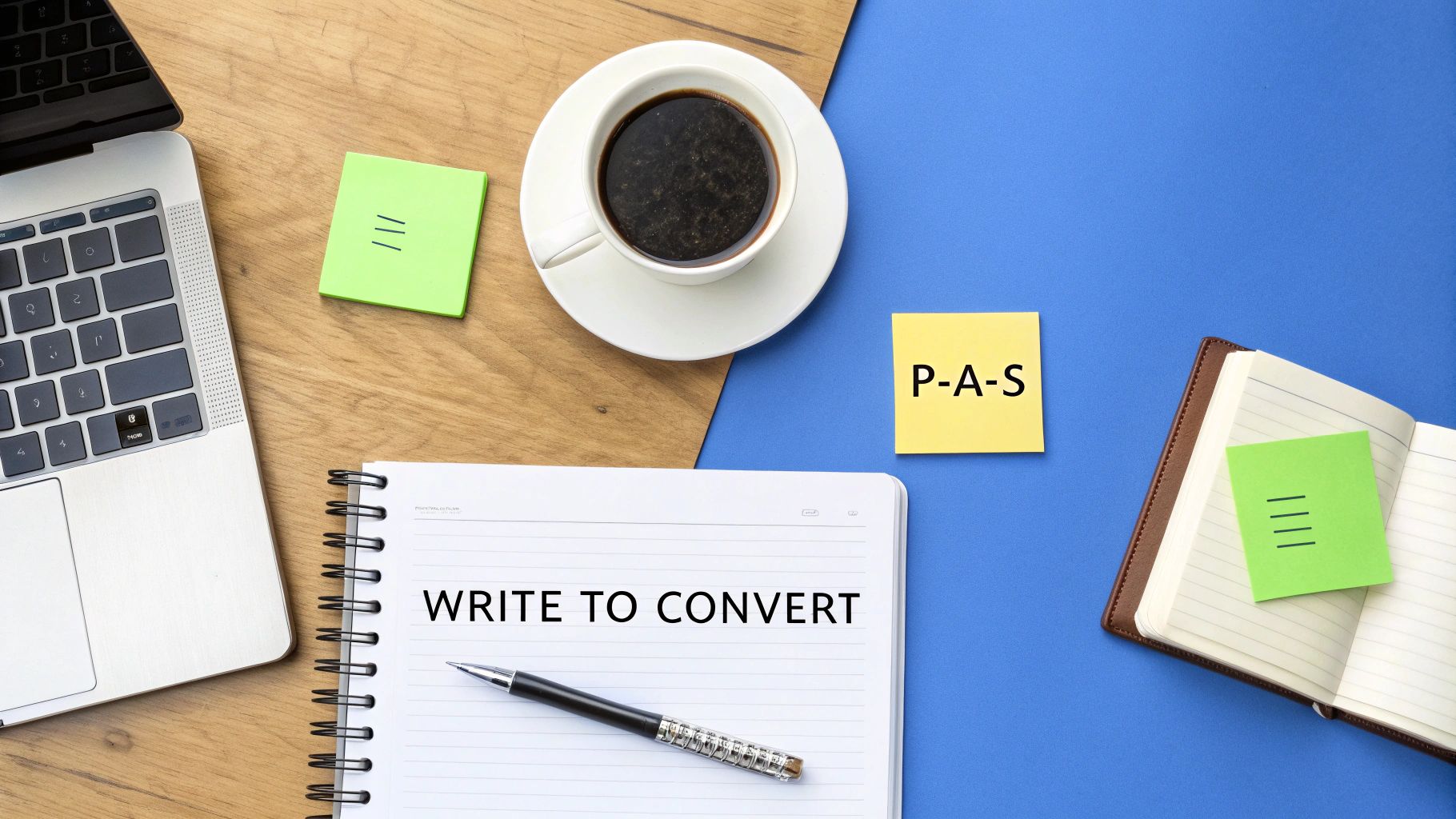
Structuring Copy for Maximum Impact
How you organize your words is just as critical as the words themselves. A framework that never fails is the Problem-Agitate-Solve (PAS) formula. It’s powerful because it taps into emotion.
First, you call out a pain point your visitor is wrestling with (Problem). Then, you twist the knife a little by describing the frustrations that come with it (Agitate). Finally, you swoop in and present your offer as the ultimate Solution. This shows empathy, not just a product.
As you write, be sure to sprinkle in social proof to build credibility. This can look like:
- Customer Testimonials: Real quotes from happy customers talking about specific wins.
- Case Studies: A deeper dive into how you helped someone achieve success.
- Trust Logos: Logos from well-known clients or publications that have featured you.
- Data Points: Use concrete numbers like "Trusted by 10,000+ businesses" to show momentum.
Finally, every word should guide the visitor toward your call-to-action (CTA). Your CTA needs to be clear and create a little urgency. Use strong verbs like "Get," "Start," or "Join," and make the value obvious. "Start My Free Trial" is miles ahead of a lazy "Submit."
Designing for a Seamless User Experience

A killer design does more than just look good—it makes converting feel obvious. The moment someone hits your page, their eyes should flow naturally from your headline to your call-to-action. That’s the magic of a strong visual hierarchy, a non-negotiable part of any strategy to improve landing page conversion rate.
Think of it as telling a story with your layout. Your most critical elements, like the headline and CTA button, have to be the stars of the show. How do you do that?
- Size: Make your headline noticeably bigger than any subheadings or body copy.
- Color: Your CTA button needs to pop. Use a bold, contrasting color that dares someone not to click it.
- Space: Give your most important elements room to breathe. White space draws the eye and kills clutter.
Building Instant Trust with Visuals
Every image, video, and icon on your landing page is either building trust or putting up a roadblock. Generic stock photos scream "we didn't try," and they're a total trust-killer. Ditch them. Instead, use high-quality, authentic visuals that show off your product or the amazing results your customers get.
This also extends to how you present your product. For example, knowing how to create high-converting visual assets can make a huge difference. Another quick win is to sprinkle in visual trust signals.
Place security badges, partner logos, or "money-back guarantee" seals right next to your CTA. Putting them there reassures hesitant visitors at the exact moment of decision, giving them that final nudge they need.
Mastering the Mobile Experience
These days, most of your traffic probably comes from a smartphone. That means a slick mobile experience isn't a "nice-to-have"—it's everything. Your page can't just "work" on a phone; it needs to be designed for a smaller screen and thumb-friendly scrolling. We're talking big, tappable buttons, readable fonts, and content that stacks vertically.
Seriously, if your visitors have to pinch, zoom, or squint, you've already lost. For a deeper look, check out our guide on landing page design best practices. When you prioritize a clean, intuitive design, you're clearing the path to conversion for every visitor, no matter their device.
Squeeze More Conversions Out of Your Page with Speed Optimization
In the battle for conversions, every fraction of a second matters. Seriously. Page speed isn't a minor technical task to hand off and forget about; it's a massive conversion lever.
Think about it. A slow-loading page is the digital equivalent of a shop with a stuck door. It creates a terrible first impression, and most visitors will just give up. That initial spark of interest from your ad? Gone.
This delay is a direct killer of your ROI. When someone clicks your ad, their excitement is at its peak. Making them wait is the fastest way to kill that momentum. If you do one thing to improve your landing page conversion rate, make it this.
Why Every Millisecond Is Money
The link between load time and conversions is brutally direct. Data shows that if a landing page loads in just one second, conversion rates can be up to 2.5 times higher than pages that take five seconds.
It gets worse. Conversion rates drop by an average of 4.42% for every additional second of load time. You can dig into more of this data by checking out the full conversion rate optimization statistics.
Let that sink in. A two-second delay isn't a small hiccup—it’s actively costing you nearly 9% of your potential conversions. The longer you make people wait, the more money you're leaving on the table.
Think of your page speed as the digital front door to your business. If a customer has to struggle with a heavy, slow-moving door just to get inside, most will just turn around and leave. Don't have a sticky front door.
Actionable Steps for a Lightning-Fast Landing Page
So, how do you actually make your page faster? It starts with figuring out what’s weighing it down. The good news is, you don’t need to be a developer to make a real difference.
First, run your landing page URL through a free tool like Google's PageSpeed Insights. It will give you a performance score and a checklist of things to fix. Zero in on these high-impact areas first:
- Crush Your Images: This is the biggest offender. Large image files are incredibly heavy. Use a tool like TinyPNG or Squoosh to shrink your images before you upload them. You can often cut the file size by over 70% without a noticeable drop in quality.
- Use Browser Caching: This tells a visitor's browser to save static parts of your page—like your logo and CSS files—on their computer. The next time they visit, the page loads almost instantly.
- Trim Your Code and Scripts: Every extra plugin and tracking script adds more weight. Go through and ruthlessly remove any scripts that aren't absolutely essential for getting that conversion.
By systematically tackling these technical pieces, you create a smoother experience that moves visitors right along to your call-to-action.
Use Personalization to Get a Serious Edge
Let's be honest, the days of one-size-fits-all landing pages are gone. If you want to outpace the competition, you have to create experiences that feel personal and hyper-relevant. Personalization isn't just a fancy buzzword; it's a core strategy for improving your landing page conversion rate by proving you understand your visitors.
It often starts with a powerful technique called dynamic text replacement.
Imagine a user searches Google for "eco-friendly running shoes" and clicks your ad. Instead of a generic shoe page, they see a headline that says, "Find the Perfect Eco-Friendly Running Shoes Here." This instant message match is huge. It immediately confirms they're in the right place, building trust from the first second.
This small tweak creates a seamless, reassuring journey from ad to page, making the visitor feel like you're reading their mind.
Tailor Your CTAs for Different Visitors
Why would you show everyone the exact same call-to-action? Personalized CTAs are a total game-changer. You can adjust the button text based on a visitor's location, past behavior, or the marketing campaign that brought them there.
For instance, a visitor from Canada could see a CTA that says, "Get Free Shipping to Canada," while someone who previously eyed your premium plan gets, "Upgrade to Pro and Save 25%." This specificity makes your offer incredibly compelling.
The data backs this up. Personalized CTAs can convert 42% more visitors than generic ones. Seriously. If your page is currently converting at 6.6%, a well-crafted personalized CTA could push that number past 9%. To grasp the numbers, check out the impact of these landing page statistics and see how much personalization truly matters.
Let’s look at a few examples.
Generic vs. Personalized CTAs
As you can see, the personalized versions are far more direct and enticing. They acknowledge the visitor's context, making the next step feel natural.
The goal of personalization is simple: make every visitor feel like the landing page was built just for them. When someone feels seen and understood, the friction in the conversion process just melts away.
Roll Out More Advanced Personalization Tactics
Beyond dynamic text and smart CTAs, there are other powerful strategies you can use to capture more conversions.
- Exit-Intent Popups: Just as a user’s cursor drifts toward the back button, you get one last shot. This is the perfect moment to trigger a popup with a special discount or a free guide. It’s a surprisingly effective way to recover leads you would have lost.
- Multi-Step Forms: Nobody likes staring at a long, intimidating form. The solution? Break it into smaller, bite-sized pieces. Asking for just a name and email first feels easy. Once they've started, users are psychologically invested and more likely to complete the rest.
These tactics create an experience that feels more like a conversation. For more inspiration, check out these excellent personalized landing page examples.
By tailoring the experience, you transform your landing page from a static brochure into a dynamic conversion machine.
Adopting a Mindset of Continuous Optimization
Launching your landing page isn't the finish line; it’s the starting gun. What's the biggest mistake you can make? Treating your new page as a "set it and forget it" project.
The truth is, the highest-converting pages aren't born that way. They're built through a relentless cycle of testing, learning, and refining. Adopting this mindset of continuous optimization is what separates the marketers who get by from those who truly dominate.
It’s time to stop guessing and start making decisions based on what your users are actually doing. This is where A/B testing, also known as split testing, becomes your best friend. The idea is simple: you create two versions of your page (an "A" version and a "B" version), show each to a different segment of your audience, and see which one gets more conversions.
Every great test starts with a solid hypothesis. Don't just throw random ideas at the wall. Formulate an educated guess, something like: "Changing our CTA from 'Submit' to 'Get My Free Guide' will boost form fills because it highlights the immediate value." This focused approach ensures every test teaches you something valuable.
Running Clean and Effective Tests
If you really want to improve your landing page conversion rate, your tests have to be clean. What does that mean? It means changing only one significant element at a time. If you change the headline, button color, and main image all at once, you’ll have no clue which change actually moved the needle.
So, what should you test? The list is practically endless, but always start with the elements that have the biggest potential impact:
- Headlines: Pit a benefit-driven headline against one that focuses on solving a specific problem.
- Calls-to-Action (CTAs): Play with different text, colors, sizes, and even placement on the page.
- Hero Images/Videos: Does a clean product shot work better than a video testimonial? Test it.
- Form Length: This is a classic. Try cutting the number of fields and see what happens.
For a much deeper dive, our complete guide on A/B testing for landing pages lays out the entire framework. And remember, let your test run long enough to get a statistically significant result.
Moving Beyond Simple A/B Tests
Once you've got the hang of A/B testing, you can explore more advanced techniques. Multivariate testing is a great next step, letting you test multiple changes at once to figure out which combination of elements works best.
You should also bring in data from user feedback tools to get the "why" behind your numbers. Heatmaps are fantastic for showing you where people are clicking and how far they scroll. Session recordings let you watch anonymized user journeys, uncovering friction points you never would have guessed were there.
This infographic breaks down a simple flow for creating a more relevant user journey, right from the initial search.
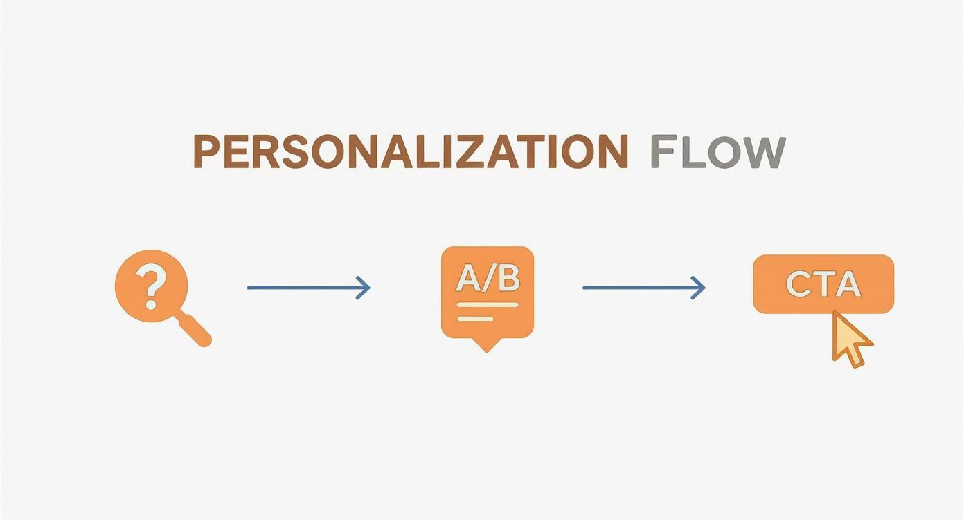
This process shows how aligning a user's search query with dynamic page text and a personalized CTA can create a seamless path to conversion. By constantly testing and analyzing, you create a powerful feedback loop that fuels real, sustainable growth.