Summary
An event landing page is your digital front door, crafted for one specific purpose: to turn curious visitors into confirmed attendees. It’s a standalone web page, intentionally stripped of the usual website distractions. Its entire job is to focus a visitor's attention on a single call to action: signing up for your event.
But how do you create one that actually works? Let's dive in.
Why Your Event Needs a Dedicated Landing Page
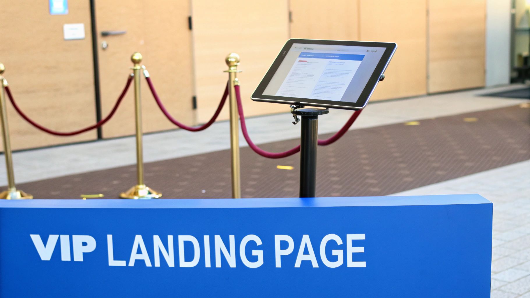
Imagine trying to sell VIP concert tickets in a noisy, crowded mall. That's what happens when you send potential attendees to your website's homepage. They get sidetracked by your blog, your services page, and a dozen other shiny objects. An event landing page is the opposite—it's an exclusive VIP lounge where the only thing to do is sign up.
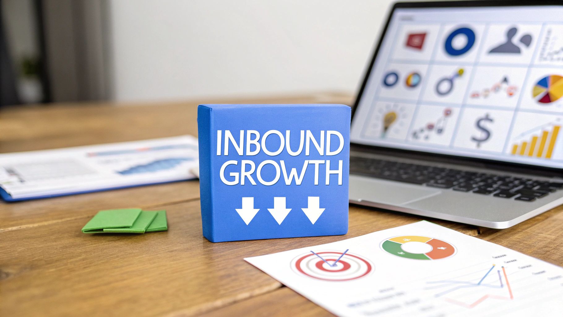
This focused approach is the backbone of a modern event marketing strategy. Instead of scattering your message, you create a central hub for your webinar, conference, or workshop. This streamlines promotional efforts and gives everyone a consistent, professional experience.
How a Landing Page Boosts Your Conversion Rates
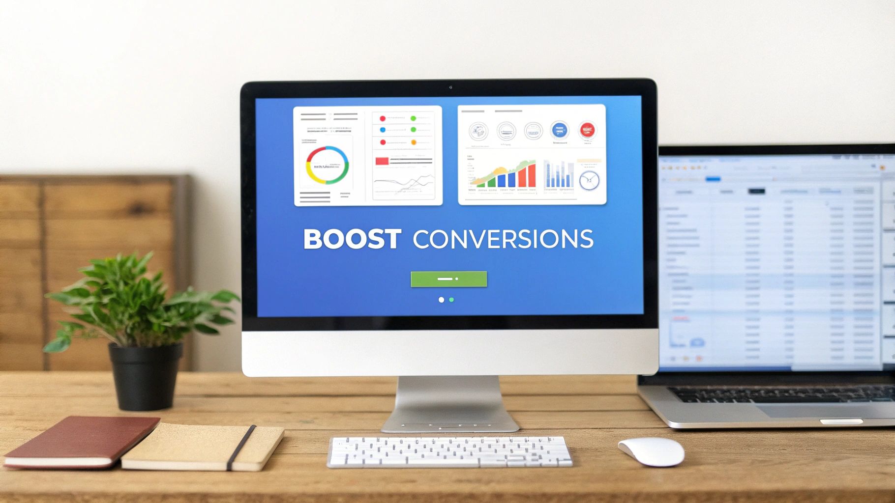
The number one reason to use an event landing page is simple: it dramatically increases conversions. By removing competing links and distractions, you create a clear path to the registration form. It's a surprisingly effective trick. In fact, research shows that removing the main navigation menu from a landing page can sometimes double conversion rates.
Why does this work so well? It eliminates decision fatigue. When someone lands on your page, there's no guesswork. The path is obvious: learn about this amazing event and sign up.
Create a Powerful First Impression Your Event Deserves
A well-designed landing page does more than convert; it builds instant trust. It signals that your event is professional, organized, and worth someone's time and money. This is your chance to make a polished first impression that a generic Facebook event page just can't match. You control the entire narrative.
Let's break down the core benefits:
- Focused Messaging: Every element—from headline to images—reinforces the value of attending. You're speaking directly to your audience's needs.
- Lead Capture: A "coming soon" landing page is a perfect way to collect email addresses and build a highly engaged list of interested people before tickets even go on sale.
- Enhanced Analytics: With all traffic going to one page, you get clear insights into your marketing campaigns. You can easily see which channels drive registrations.
Ultimately, this single page is the most critical asset in your promotional toolkit. It’s not just a registration form; it’s a persuasion machine working for you 24/7.
The Anatomy of a High-Converting Page

Think of a killer event landing page like a finely tuned engine. Every part has a specific job, and they must all work in harmony to get you to your destination: a successful registration. If one piece is out of place, the whole machine can stall.
So, how do you build this engine from the ground up?
It all starts the moment a visitor arrives. You have about three seconds to convince them they’re in the right place. This makes the top section of your page, the "hero" section, your most valuable real estate. This is where you make your big promise.
Crafting a Magnetic First Impression
Your headline is the first thing people read, so it has to hit hard. It needs to scream the event's biggest benefit, not just state its name. Ditch "Marketing Summit 2025" and try something like, "Triple Your Leads in 2025: The Ultimate Marketing Summit." See the difference? One is a label; the other is a result.
Next to that headline, you need a powerful hero image or a quick video. This isn't just decoration; it’s your chance to bottle the energy of your event. Use photos of engaged attendees or a dynamic speaker on stage. You want to create instant FOMO (fear of missing out).
A great event landing page answers the visitor's most important question—"What's in it for me?"—within seconds. Every element should reinforce the value and create an undeniable urge to register.
Just below, spell out your event’s unique value proposition (UVP). This is your elevator pitch—a short, punchy statement explaining why this event is the can't-miss opportunity of the year.
- Be Specific: Don't just promise "networking opportunities." Say, "Connect with 150+ industry leaders and VPs from top tech companies."
- Focus on Outcomes: Instead of listing "8 speaker sessions," frame it as a benefit: "Gain actionable strategies from 8 expert-led sessions to solve your biggest challenges."
Building Momentum with Your Page Layout
Once you've hooked them, the rest of the page must keep that momentum going. This is where you lay out the details that build trust and crank up the excitement, guiding them smoothly toward the registration button. Think of each section as answering a question or knocking down a potential objection.
Before we dive deeper, here are the absolute must-have components.
Core Components of a High-Converting Event Landing Page
By laying out these elements strategically, you’re telling a persuasive story that turns a curious visitor into a committed attendee.
An effective page structure often weaves these elements together seamlessly:
- Speaker Highlights: Introduce your heavy hitters. Professional headshots paired with short, impressive bios lend instant credibility.
- Clear Event Agenda: Show them the plan. A simple breakdown of the schedule removes uncertainty and helps people see exactly how they’ll spend their time.
- Social Proof: Let others do the selling for you. Nothing is more convincing than seeing that their peers have already benefited.
- A Powerful Call-to-Action (CTA): This is the finish line. Your CTA button should be impossible to miss. Use a color that pops and compelling, action-oriented text like "Reserve My Spot" or "Register for Free."
By the time a visitor reaches the bottom, they should feel confident and ready to click that button. Ready for more inspiration? Check out these guides on landing page design best practices.
Driving Registrations with Persuasive Design and Copy

You have all the essential pieces on your page. Now what? It's time to breathe life into them with design and copy that actively persuades visitors to register. This is less about listing information and more about tapping into human psychology.
Your goal is to gently steer potential attendees from "maybe" to "yes" by building excitement and eliminating hesitation. Two of the most effective psychological triggers you can use are urgency and scarcity.
How to Create Urgency and Scarcity on Your Page
Let’s be honest, we’re all expert procrastinators. When people feel like time is running out or an opportunity is limited, they are far more likely to act now. You can create this feeling without being spammy.
Here’s how:
- Countdown Timers: A ticking clock is a powerful visual nudge. A live countdown timer showing the end of an early-bird discount makes the deadline feel real and tangible. It's a simple trick with a big impact, and you can learn how to add a countdown timer to your website.
- Limited-Slot Notifications: Is your workshop capped at a certain number of people? Say so! A simple line like, “Only 17 spots left!” creates authentic scarcity and speeds up the decision to commit.
This simple shift changes the internal monologue from "I'll think about it later" to "I need to decide now before it's too late."
The best event landing pages don't just present information; they create an emotional connection. They address the attendee's problems and aspirations, making registration feel like the clear solution.
Transforming Features into Attendee Benefits
Your copy is your 24/7 salesperson. It needs to do more than list what your event includes (features); it needs to sell what attendees will get out of it (benefits). This is the most critical shift you can make in your writing.
Think about it. Don't just say, "Featuring eight expert speakers." That’s a feature.
Instead, reframe it as a benefit: "Learn proven growth strategies from eight industry leaders who have built million-dollar businesses." The second version speaks directly to an attendee's goals.
Designing Your Page for a Single Goal
Finally, let's talk design. Every element on your page should serve one purpose: getting that registration. This means you must be ruthless about eliminating distractions.
What's the single biggest move you can make? Remove all main site navigation links. You are creating a closed loop. The only path forward should be to register or close the tab—nothing else.
This isn’t just a hunch; it's backed by data. Pages with a single, clear call-to-action consistently see higher conversions. Some studies show removing the navigation menu can double conversion rates, bumping them from 3% to 6%. It’s a simple change that keeps your visitor focused on the immense value you're offering.
Building Unshakeable Trust with Social Proof
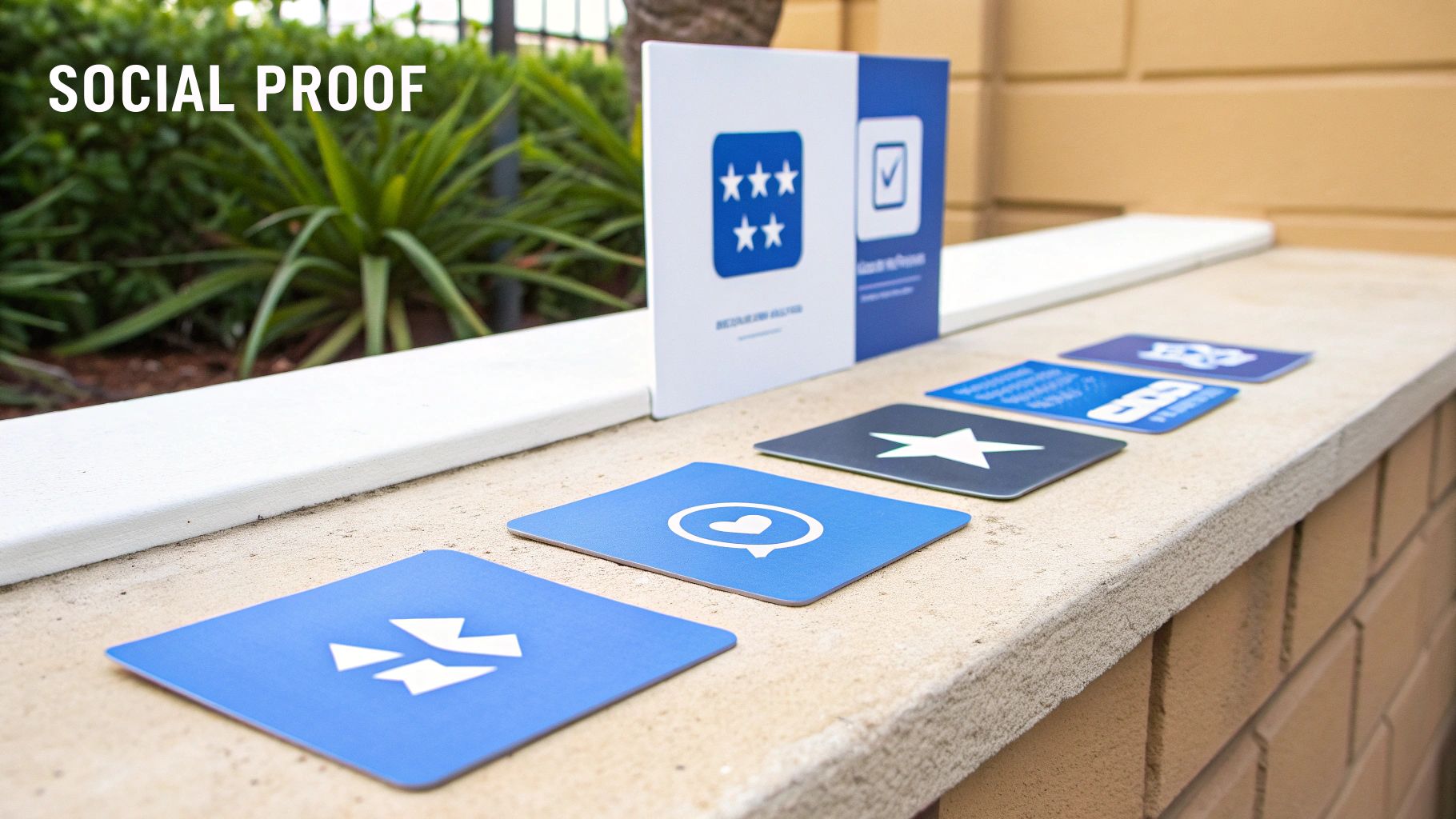
You can say your event is fantastic all day, but letting past attendees do the talking is infinitely more powerful. This is the magic of social proof—the idea that people trust the actions and opinions of others when making decisions. On your event landing page, it's the ultimate trust-builder.
Think about the last time you bought something online. Did you scroll right past the product description to read the reviews? Your potential attendees do the same thing. They are looking for real signals that your event is worth their time and money.
Your most effective marketing tool isn't your own copy—it's the authentic voice of a happy past participant. Genuine feedback dismantles skepticism and proves your event's value in a way no marketing slogan ever could.
This is why featuring user-generated content (UGC) is a game-changer. A recent analysis revealed that event landing pages with UGC hit a 3.2% conversion rate. Even better, when visitors actually engaged with that content, the rate shot up to 7%. For more on this, you can explore the full conversion rate analysis on WordStream.com.
How to Strategically Display Social Proof
Having social proof isn’t enough; you need to show it off strategically. The goal is to sprinkle these trust signals throughout your page, reinforcing key messages right when a visitor might have doubts.
Here’s how to gather and showcase social proof that works:
- Compelling Testimonials: Ditch generic quotes. Ask past attendees for specific feedback. A great testimonial highlights a tangible result, like "I closed two new clients after the networking session," which is far more convincing than "It was a great event."
- Video Snippets: A short, 30-second video of an attendee sharing their experience is incredibly persuasive. It adds a human touch that text can't replicate.
- Sponsor and Attendee Logos: Do you have well-known companies that have attended or sponsored your event? Flaunt those logos. It acts as a powerful, instant endorsement.
Integrating Proof for Maximum Impact
Where you place your social proof matters. Don’t just tack all your testimonials at the bottom of the page. Instead, weave them in where they can directly address potential objections.
For example, try placing a powerful testimonial right next to your call-to-action button. Just when a visitor is hesitating, a glowing review can be the final nudge they need. This thoughtful placement turns curious visitors into confident registrants. For a closer look, check out these powerful social proofing examples on our blog.
Getting Your Landing Page Seen by the Right People
So you've built a brilliant event landing page. That’s a huge step, but it’s only half the battle. What good is a masterpiece if no one sees it? Now it's time to shift your focus from building the page to actively driving the right people to it.
A two-pronged approach works best: combine long-term visibility with immediate traffic boosts. Think of it as setting up a permanent sign for your event (SEO) while also sending out personal invitations (promotion). Both are essential for filling your seats.
Optimizing Your Event Landing Page for Search Engines
Search Engine Optimization (SEO) is your long game. It's the strategy for attracting organic traffic from people actively searching on Google for an event just like yours. This isn't about quick wins; it's about building a foundation so your page consistently shows up.
It all starts with keyword research. What terms would your ideal attendee type into a search bar? Brainstorm phrases like "digital marketing conference NYC" or "free webinar on social media trends."
Once you have your target keywords, weave them naturally into your page:
- Meta Title and Description: These are the first things people see in search results. Your title needs to be compelling and include your main keyword, while the description acts as a mini-ad for why they should click.
- Headings and Subheadings: Place your primary and secondary keywords in your H1, H2, and H3 tags. This signals to search engines what your page is all about.
- Body Copy: Mention your keywords where it feels natural. The golden rule is to write for humans first, search engines second.
Promoting Your Page Across Multiple Marketing Channels
While your SEO works in the background, you need to make some noise. A multi-channel promotional plan ensures you reach your audience wherever they hang out online. Your goal is to create a buzz that's impossible to ignore.
A great promotional strategy doesn't just broadcast a message; it starts a conversation. Each channel should guide potential attendees back to your landing page, the central hub of your event.
Here’s an effective promotional checklist to get you started:
- Email Marketing Campaigns: Your email list is gold. Send targeted emails announcing the event, highlighting speakers, and offering early-bird discounts—always linking back to your landing page.
- Paid Social Media Ads: Use platforms like LinkedIn or Facebook to run highly targeted ad campaigns. You can zero in on specific job titles, interests, or demographics to ensure your ads are seen by the most relevant people.
- Collaborate with Partners and Speakers: This is a powerful tactic. Ask your speakers, sponsors, and partners to share the event landing page with their own networks. This act of cross-promotion can expose your event to a brand-new, qualified audience.
Measuring Success and Optimizing for Better Results
Getting your event landing page live is the start of the race, not the finish line. The smartest marketers know that their pages are dynamic tools that need constant attention. The secret? Measure performance and make data-driven tweaks to get better results.
So, how do you know what’s actually working?
Track the right metrics. Don't get lost in a sea of data. Instead, zero in on a few core numbers that tell the real story of your page's performance. These metrics will be your compass, guiding your optimization efforts.
What Key Performance Indicators (KPIs) Should You Track?
Start by keeping a close eye on these essential data points. They give you a clear snapshot of how visitors are interacting with your page and where you might have opportunities to improve.
- Conversion Rate: This is your North Star. It’s the percentage of visitors who complete the registration form. A higher conversion rate means your page is successfully persuading people to sign up.
- Bounce Rate: This shows the percentage of visitors who land on your page and leave without doing anything. A high bounce rate can be a red flag that your message isn't landing.
- Cost Per Registration: If you're running paid ads, this number is everything. It tells you exactly how much you're spending to get each new attendee.
For context, recent data showed the median conversion rate for event landing pages was around 4.3%. That means for every 1,000 visitors, an average of 43 people registered. You can read the full conversion benchmark report on Unbounce.com to see how you stack up.
Fine-Tuning Your Page with A/B Testing
Once you have your baseline metrics, it's time to experiment. This is where A/B testing comes in. It's a simple process: you create two versions of your page (A and B) with one small difference between them and see which one performs better.
Could a different headline or button color make a difference? Test it! This ongoing cycle of testing, measuring, and refining is what separates good event landing pages from great ones. For a deeper dive, check out these essential conversion rate optimization best practices.
If you want to learn more, our guide to A/B testing for landing pages provides a step-by-step framework.
Still Have Questions? Your Event Landing Page FAQ
Even with a solid plan, a few practical questions always pop up. Don’t worry, that's normal. This quick FAQ section tackles some of the most common hurdles you might face.
So, How Long Should My Landing Page Be?
There’s no magic number. The best rule of thumb is this: your page needs to be long enough to answer every question a potential attendee has, but not a word longer.
For a free webinar, a short and punchy page usually works. But if you're selling tickets to a high-end, multi-day conference? You'll need a much longer page to unpack the value, showcase speakers, detail the agenda, and justify the price tag.
Can I Handle Different Ticket Types on One Page?
Absolutely, and you should. Most modern landing page builders and event platforms are built for this. You can easily lay out different options—like Early Bird, VIP, and General Admission—in a clean, easy-to-read pricing table.
This approach creates a better user experience. It lets people see all their choices side-by-side so they can compare and decide without having to click away.
When Is the Right Time to Publish My Page?
The answer is simple: as early as possible. Seriously. Even if you haven't nailed down every detail, get a "coming soon" page up with a simple email signup form. It's a fantastic way to gauge interest and start building a list of people who are eager to hear from you.
When it's time for the full launch with registration, aim to go live at least 8-12 weeks before a major event. This gives your marketing efforts enough runway to build momentum and lean into that early-bird excitement.
Ready to create stunning, high-converting event landing pages that practically sell tickets for you? LanderMagic uses AI to build dynamic pages that adapt to your audience, making sure every click has the best chance to convert. Start for free and see the magic for yourself.