Summary
Landing pages for webinars have one critical mission: to convert curious visitors into registered attendees. How do they succeed? By pairing a powerful value promise with a registration process so smooth it feels effortless. A standout webinar page grabs attention with a compelling headline, follows up with concise, benefit-driven copy, and seals the deal with undeniable social proof.
Are you ready to build a landing page that not only looks great but also fills your webinar seats? Let's dive in.
The Blueprint For Webinar Landing Pages That Convert
Every single element on your webinar landing page should guide visitors toward one action: registration. To do this, you must nail your core promise, speak directly to your audience's biggest pain points, and eliminate any friction from the signup process.
Here’s what you need to showcase immediately:
- A magnetic headline that clearly spells out the primary benefit.
- Crisp, scannable bullet points detailing what attendees will learn.
- A prominent registration form, placed above the fold, that asks only for essential information.
Key Benefits of a Dedicated Webinar Landing Page
- Higher Registrations: A focused page with zero distractions keeps users on task.
- Sharper Audience Targeting: You can tailor your message to speak directly to the needs of a specific audience segment.
- Clearer Performance Insights: A single-purpose page makes it easier to track conversions and understand user behavior.
Core Components of a High-Converting Webinar Landing Page
Here is a quick-reference summary of the essential elements every webinar landing page must include to maximize registrations.
Keep this checklist handy as you design and write. Each component plays a vital role in guiding visitors straight to that all-important “Register” button.
While average conversion rates on Unbounce hover around 6.6%, focused webinar pages often achieve an impressive 20% to 40%. Why? This success is driven by built-in urgency and powerful expert testimonials.
Hungry for more in-depth strategies? Check out our complete High-Converting Landing Page Guide.
Industry experts suggest that a clear headline paired with prominent social proof can boost webinar registrations by up to 30%.
For a deeper dive into optimization, explore these conversion rate optimization best practices.
Psychological Triggers That Drive Webinar Sign-Ups
- Urgency: Use a countdown timer or a "Seats Are Filling Fast!" notification to encourage immediate action.
- Social Proof: Showcase attendee numbers, well-known company logos, and glowing quotes from past participants.
- Authority: Feature professional speaker bios, headshots, and relevant credentials to build confidence and credibility.
Your Next Steps for a Winning Webinar Landing Page
- Place your headline, value statement, and call to action clearly above the fold.
- Embed a simple form with no more than three required fields.
- Add testimonials, badges, or attendee counts to solidify trust.
- Run A/B tests on different headlines, images, and copy to continuously refine your results.
Writing Compelling Landing Page Copy That Inspires Action
Let's be honest: your landing page design could be a masterpiece, but if the words don't connect, you won't get sign-ups. Your copy does the heavy lifting. It's the engine that transforms a casual visitor into a registered attendee. It must speak directly to your audience's problems and frame your webinar as the one solution they can't afford to miss.
Great copy doesn't just list what you'll discuss; it sells the transformation attendees will experience. This crucial shift from features to benefits is the cornerstone of writing for high-converting landing pages for webinars.
How to Craft a Headline That Stops the Scroll
You have about three seconds. That's it. Your headline is the single most important piece of text on the page. Its job? To grab attention and promise something incredibly valuable. If the headline fails, nothing else matters. The visitor is gone.
A winning headline isn't clever or vague; it's specific, benefit-driven, and crystal clear. It must instantly answer the visitor's one burning question: "What's in this for me?"
Let’s compare:
- Weak Headline: "Webinar on Social Media Marketing"
- Strong Headline: "Triple Your Instagram Engagement in 30 Days—Without Spending a Dime on Ads"
The first one is forgettable. The second promises a specific, highly desirable outcome (triple engagement) while tackling a common pain point (no ad budget). That's what makes someone stop scrolling. Your headline sets the tone and assures visitors they're in the right place.
Write a Description That Resonates with Your Audience
The headline did its job. Now, the description needs to reel them in. This is your chance to connect with your audience’s struggles and build on the promise you just made. Keep your paragraphs short, punchy, and easy to scan.
Start by addressing their primary pain point. Are they drowning in manual tasks? Are their leads drying up? Hit that nerve right away to show you understand their world.
"Your landing page copy is a direct conversation with your potential attendee. If you can describe their problem better than they can, they will automatically assume you have the solution."
Once you've acknowledged their challenge, pivot to the solution: your webinar. Frame your content as the key to their success. Use active, confident language that gets them excited. Ditch passive phrases like, "This webinar will cover..." and opt for something that packs a punch, like, "In this session, you'll discover exactly how to..."
Use Bullet Points to Showcase Tangible Value
Nobody reads landing pages word-for-word. They scan. That’s why bullet points are your best friend. They break down the core takeaways into bite-sized, high-impact promises. This is where you get specific about the skills, strategies, and secrets they'll walk away with. Make every bullet point an actionable promise.
- Instead of: "We will discuss content creation."
- Try this: "Master a proven framework for creating a month's worth of high-quality content in a single afternoon."
See the difference? One is a vague topic; the other is a tangible, valuable outcome. Aim for 3 to 5 of these power-packed bullet points. Make the value so obvious that registering feels like a no-brainer.
Real-World Landing Page Examples: What Works and What Fails
Let’s look at how these principles play out.
Winning Example (Dock): The B2B sales platform Dock ran a webinar with the headline, "How We Built a Predictable Pipeline to $1M ARR." This is brilliant. It targets a specific audience (B2B founders) and dangles a massive, quantifiable goal ($1M ARR). The copy laid out the exact strategies they used, instantly building credibility and making the offer irresistible.
Failing Example (Generic Tech Webinar): Contrast that with a page titled, "Exploring the Future of AI." It was completely vague and offered no benefit to the reader. The description was a wall of jargon-filled text, and the bullets listed topics like "Machine Learning Models" without explaining why anyone should care. It failed because it focused on features, not the transformation it could provide.
By focusing relentlessly on clear benefits and making your copy dead simple to scan, you build a powerful argument that guides visitors straight to that "Register Now" button.
Designing a Layout That Guides Users to Register
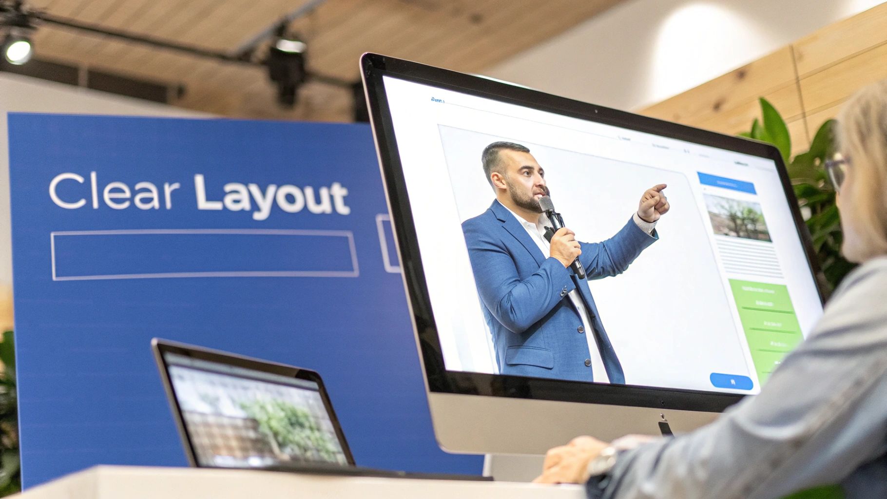
A slick design is nice, but a smart design is what drives registrations. The goal isn't just to look professional; it's to create a clear, intentional path that leads every visitor straight to the sign-up form. Think of your page as a funnel where clean layouts eliminate distractions and guide the user's eyes exactly where you want them to go.
- Keep the focus locked on the primary call-to-action.
- Use high-quality photos of your speakers to build instant trust.
- Stick to a consistent color palette to reinforce your brand identity.
Why Effective Typography and Spacing Matter
Good typography does more than make your page readable—it sets the entire tone. A well-planned font hierarchy makes headlines and key takeaways pop, grabbing attention instantly. For example, pairing a bold, modern sans-serif for headings with a clean serif for body copy creates a natural visual flow. And don't forget spacing! Ample white space prevents overwhelm and ensures visitors can scroll smoothly.
User experience studies show that simple clarity in design can boost conversion rates by as much as 20%.
A few quick tips to get this right:
- Use at least 1.5 lines of spacing for body text to improve readability.
- Limit yourself to two font families to keep things simple and professional.
- Leverage white space to create distinct sections, separating webinar details from the sign-up form.
Using Color to Guide User Action
Color isn't just for branding; it's a powerful psychological tool. On a webinar landing page, smart color choices can draw the eye and practically scream, "Click here!" A bright, warm-colored button on a cool-toned background is a classic trick for making your CTA impossible to miss. Just be careful not to go overboard—too many competing colors will only create confusion.
Notice how each color choice serves a specific purpose, working together to guide the user toward a clear action. Ready to see these principles in action? Check out our guide on dynamic landing page examples for real-world inspiration.
How to Showcase Social Proof Prominently
Hesitation is the enemy of conversion. The best way to overcome it is with undeniable social proof. Testimonials, reviews, and client logos act as powerful trust signals that can tip a skeptical visitor over the edge. Don't bury this valuable content at the bottom of the page. Place it near the registration form or right below your main headline where it can't be missed.
- Feature a rotating carousel of 5-7 powerful attendee testimonials.
- Display logos of well-known clients in a clean grid below the fold.
- Use short, punchy quotes that highlight tangible results, like, "This webinar helped us increase sign-ups by 30%!"
“Social proof is the cornerstone of credibility on webinar registration pages.”
These proof points are your secret weapon for convincing anyone on the fence to hit that "Register" button.
Integrating Visuals for Better Storytelling
Words are great, but visuals stick. To make your page truly compelling, you need to master some basic visual storytelling techniques. It adds a layer of depth and engagement that copy alone can't achieve. Think of your page as a mini-story with a beginning, middle, and end.
- Introduce the Hero: Start with a professional headshot and a short, impactful bio of your speaker.
- Show the Solution: Share a key slide, a surprising statistic, or an infographic from a past webinar.
- Reveal the Happy Ending: Present a simple before-and-after chart showcasing attendee results.
This narrative flow keeps people scrolling and constantly reinforces the value you're offering.
Why You Must A/B Test Your Landing Page Layout
No one gets it perfect on the first try. The only way to know what truly works for your audience is to test, test, and test again. A/B testing different layout variations is non-negotiable if you're serious about optimization.
- Swap out speaker images. Does a casual shot outperform a professional one?
- Test different button colors and text. Does "Reserve My Spot" convert better than "Register Now"?
- Use scroll heatmaps to see where people are getting stuck or dropping off.
You can also use subtle directional cues, like arrows or contrasting borders, to subconsciously guide visitors' eyes right to your form. It feels like magic, but it's just smart design.
Ensuring a Flawless Mobile Experience
This is a big one. Over 60% of webinar signups now happen on mobile devices. If your landing page is broken or difficult to use on a phone, you're flushing a huge chunk of your potential audience down the drain. Your design must adapt seamlessly to any screen size.
- Make sure your CTA buttons are at least 44px tall for easy tapping.
- Collapse non-essential images into sliders to save precious screen real estate.
- Test your form fields with a mobile keyboard. Is it easy to type?
A sticky header that keeps the sign-up button visible as users scroll is a pro-level tweak. This simple change ensures the registration option is always within reach, dramatically reducing friction and increasing conversions.
Optimizing Your Registration Form for More Sign-Ups
The registration form is the final barrier between a curious visitor and a confirmed attendee. It’s also where most potential sign-ups slip away. Every additional field adds friction, so you need to be ruthless about which data points truly matter.
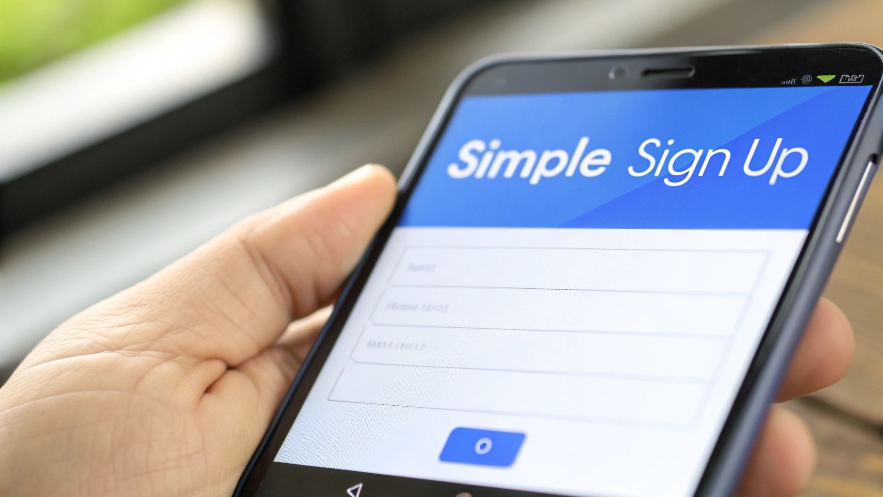
This is crunch time. If your form feels like an interrogation, visitors will hit the back button, undoing all the compelling copy and clean design you worked so hard on. What's the solution? A stripped-down approach.
How Many Form Fields Should You Use?
It’s tempting to pile on questions, but each new field chips away at your conversion rate. Think of your registration form as a friendly handshake, not a job interview. For landing pages for webinars, the priority is a quick "yes," not an exhaustive profile. You can always gather more information later.
The core principle for a high-converting form is to make registration feel effortless. If a user has to stop and think, you’ve created too much friction.
Consider these practical tips:
- Limit Fields to Three or Fewer: Name, work email, and maybe one optional field is all you need.
- Use Clear Labels: “First Name” and “Work Email” leave no room for confusion.
- Enable Autofill: Proper markup lets browsers populate details automatically, reducing typing.
Designing a Mobile-Friendly Registration Experience
With over 60% of webinar registrations happening on mobile, a form that’s cramped on a smartphone will lose you attendees in seconds. Ensure input areas are large enough to tap and that the correct keyboard appears—email fields should trigger the “@” key by default. Does it feel smooth, or do you find yourself pinching and zooming?
Crafting a Call-to-Action Button That Converts
Your call-to-action is the final "ask," so give it the spotlight. A high-contrast button draws the eye and makes the next step obvious. Swap out generic labels for something more benefit-driven. This simple shift in wording can make a significant difference.
CTA Button Text Comparison:
Color choice matters here, too. A bold orange or green button that leaps off the page can boost click-through rates significantly.
According to this detailed landing page analysis from vwo.com, the most focused landing pages—those hitting 10% or more conversion—usually have just one primary link: the CTA. Introducing extra offers can cut conversions by as much as 266%.
Ultimately, optimizing your form is about respecting your visitors’ time. Cut the fluff, clarify every step, and craft a compelling final click.
How to Drive Targeted Traffic to Your Landing Page
You can build the most persuasive landing page on the planet, but it's only half the battle. Without a steady stream of the right kind of visitors, your brilliant copy and seamless signup form will fall flat. So, how do you actively promote your webinar to an audience that's genuinely hungry for your content?
It's time to ditch the "build it and they will come" mindset. Let's walk through the proven strategies for getting your webinar landing pages in front of people who are likely to register and become fantastic, long-term customers.
Tap Into Your Warmest Audience with Email Marketing
Your email list is your single most valuable promotional tool. These are people who have already raised their hands to hear from you, making them a perfectly receptive audience. A thoughtful email campaign can easily drive the majority of your total sign-ups. But don't just blast your entire list. Segment it. Target subscribers based on their past behavior or stated interests to ensure your message hits home.
- The Initial Announcement: Send your first email about 1-2 weeks out, focusing on the core problem your webinar solves.
- The Friendly Reminder: A few days before the event, send a follow-up to catch anyone who missed the first one.
- The Final Push: A "last chance to register" email sent on the day of the webinar almost always creates a surge in sign-ups.
Your email list isn’t just a broadcast channel; it’s a community. Frame your webinar promotion as an exclusive invitation for your most engaged followers.
Find New Leads with Smart Social Media Campaigns
Social media is the perfect place to reach a broader audience. The trick is to be strategic. Focus your efforts on the platforms where your ideal attendees actually spend their time. Instead of just dropping a link, create content that feels native to the platform and teases the value of the webinar. For example, post a short video clip of your speaker sharing one powerful tip, followed by a clear call to action to register for the full story.
Scale Your Reach with Targeted Paid Ads
When you need to guarantee traffic and reach hyper-specific demographics, paid advertising is an incredibly powerful lever. Platforms like Google Ads, LinkedIn Ads, and Facebook Ads let you zero in on users based on their job titles, interests, and online behavior. On LinkedIn, for example, you can target professionals in a specific industry with a certain level of seniority. This precision ensures your ad budget is spent only on the most relevant potential attendees.
For a deeper dive, check out our guide on what paid search is and how it can fill your webinar funnel.
It also helps to know industry benchmarks. According to these 2024 webinar benchmarks and findings, adding interactive elements like polls and live Q&A sessions can boost conversion rates by about 30%.
Measure What Matters and A/B Test Your Way to Success
How do you know if your efforts are working? You have to track your results. Setting up conversion tracking is non-negotiable—it's the only way to see which channels are driving the most registrations. Once you have traffic flowing, the real fun begins: optimizing the page itself through A/B testing. This data-driven approach removes the guesswork.
Key Elements to A/B Test on Your Webinar Landing Page:
By systematically testing one element at a time, you can figure out precisely what resonates with your audience and continuously refine your landing pages for webinars until they're performing at their absolute peak.
Still Have Questions? Your Webinar Landing Page FAQ
When you're building out a webinar page, a few common questions always seem to pop up. Let's tackle them head-on so you can move forward with total confidence.
What is a good conversion rate for a webinar landing page?
While an average landing page might see a 6-7% conversion rate, webinar pages are in a different league. It’s not uncommon for them to convert anywhere from 20% to 40%. Why the huge difference? It's a perfect storm of urgency (a live event date), a clear value proposition, and the implied authority of an expert host.
Of course, "good" is relative. Your industry, audience, and topic all play a role. However, you should aim for 20% or higher as a solid benchmark. If you’re dipping below 15%, it's a sign to start testing and tweaking.
How long should my webinar landing page be?
The simple answer is: as long as it needs to be to secure the sign-up, and not a single word more. For most webinars, short and sweet wins the race. Your only mission is to get that registration, so every element must serve that one goal. Anything else is just a distraction.
Ensure all critical information is visible "above the fold" without any scrolling. This includes:
- Your killer, benefit-driven headline
- A quick summary of what attendees will learn
- The webinar date and time
- The sign-up form
Your landing page has one job: get registrations. If an element doesn't directly support that mission, it's just noise. Keep it lean and focused on the value you're promising.
The exception? If you’re tackling a complex topic or charging for the webinar, a longer page gives you the space to handle objections, dive into details, and pile on social proof with testimonials and case studies.
What are the biggest mistakes to avoid on a webinar landing page?
Even seasoned pros stumble here. Avoiding a few classic blunders will put you miles ahead of the competition. The three most common mistakes I see are:
- A Weak, Boring Headline: A title like "Webinar on Digital Marketing" is a guaranteed conversion killer. It promises nothing. Your headline needs to be a powerful hook that clearly states the benefit.
- A Cluttered, Distracting Design: Too many colors, conflicting calls-to-action, or a full website navigation menu are the enemy. You're giving visitors an escape hatch when you want them locked in on a single action.
- A Long, Intrusive Registration Form: Nothing creates friction like asking for too much information. Each extra field is another reason for someone to bounce. Name and email are usually all you need.
Should I put a video on my webinar landing page?
Absolutely—but only if you do it right. A well-made video can give your conversions a serious boost. It’s a shortcut to building a human connection and establishing trust in a way that text simply can't match. However, a low-quality or unprofessional video will do more harm than good.
Here are a few ground rules for a video that converts:
- Keep it short. Under 90 seconds is the sweet spot. Think of it as a movie trailer for your webinar.
- Introduce the speaker. Put a face to the name to humanize the event.
- Tease the best parts. Hint at the most valuable takeaways attendees will get.
- End with a clear CTA. Tell them exactly what to do next: "Fill out the form on this page to save your spot."
Ready to build dynamic, high-converting landing pages that turn clicks into customers? LanderMagic uses AI to create personalized post-click experiences that maximize your Google Ads ROI. Start optimizing your campaigns today with LanderMagic.