Summary
Meta Description: Skyrocket your conversions with these 10 landing page design best practices. Learn to optimize your headline, CTA, speed, and mobile design for 2025.
Are your landing pages working as hard as you do? In a competitive digital space, a generic page simply won’t cut it. The difference between a lead and a lost opportunity often comes down to a finely tuned combination of design, psychology, and a clear, focused strategy. This guide dives deep into the essential landing page design best practices that separate the top performers from the rest.
We're moving beyond the basics to give you a comprehensive blueprint of actionable, data-backed strategies you can implement today. By focusing on these core principles, you can transform your post-click experience, reduce wasted ad spend, and significantly boost your conversion rates. Each tip is a practical building block for creating pages that consistently turn visitors into customers.
This listicle covers everything from crafting a compelling value proposition that grabs attention immediately to optimizing for mobile-first experiences and leveraging social proof to build instant trust. You will learn how to streamline your forms, improve page speed, and use a consistent visual hierarchy to guide users effortlessly toward a single, specific action. For a broader perspective and more detailed insights, you can explore other additional landing page design best practices which complement the strategies we cover here.
The goal is simple: to equip you with a detailed, step-by-step framework for creating landing pages that not only look great but also deliver measurable, predictable results. Ready to build pages that convert? Let’s begin.
1. Craft a Clear Value Proposition Above the Fold
The most critical element of any high-converting landing page is a clear, concise, and compelling value proposition placed "above the fold." This is the first section a visitor sees without scrolling, and you have mere seconds to capture their attention. What is your offer, and why should they care? A strong value proposition instantly answers these pressing questions.
Failing to communicate this value immediately is a primary reason for high bounce rates. Visitors arriving from an ad or a search query need instant confirmation they are in the right place. This is a foundational aspect of effective landing page design best practices; it sets the stage for the entire user journey. If the initial message is confusing or weak, the rest of your page's brilliant copy and design will go unseen.

How to Craft a Powerful Value Proposition
To implement this, focus on clarity and impact. Your headline should grab attention, and the supporting sub-headline should elaborate on the benefit. For instance, Slack’s famous "Be more productive at work with less effort" is a masterclass in benefit-driven copy. It doesn’t just say what it is; it says what it does for the user. Similarly, Notion's "The all-in-one workspace" clearly defines its function and scope.
Actionable Tips for Implementation
- Benefit-Driven Headline: Focus on the outcome, not the features. Instead of "Our software has X features," try "Achieve Y outcome with our software."
- Concise Sub-headline: Use a short sentence or two to expand on the headline, explaining how you deliver the promised value.
- Supporting Visuals: Complement your copy with a high-quality hero image or a short video that reinforces your message.
- A/B Test Everything: Continuously test different headlines and sub-headlines to see what resonates most with your audience. Is your current headline performing as well as it could?
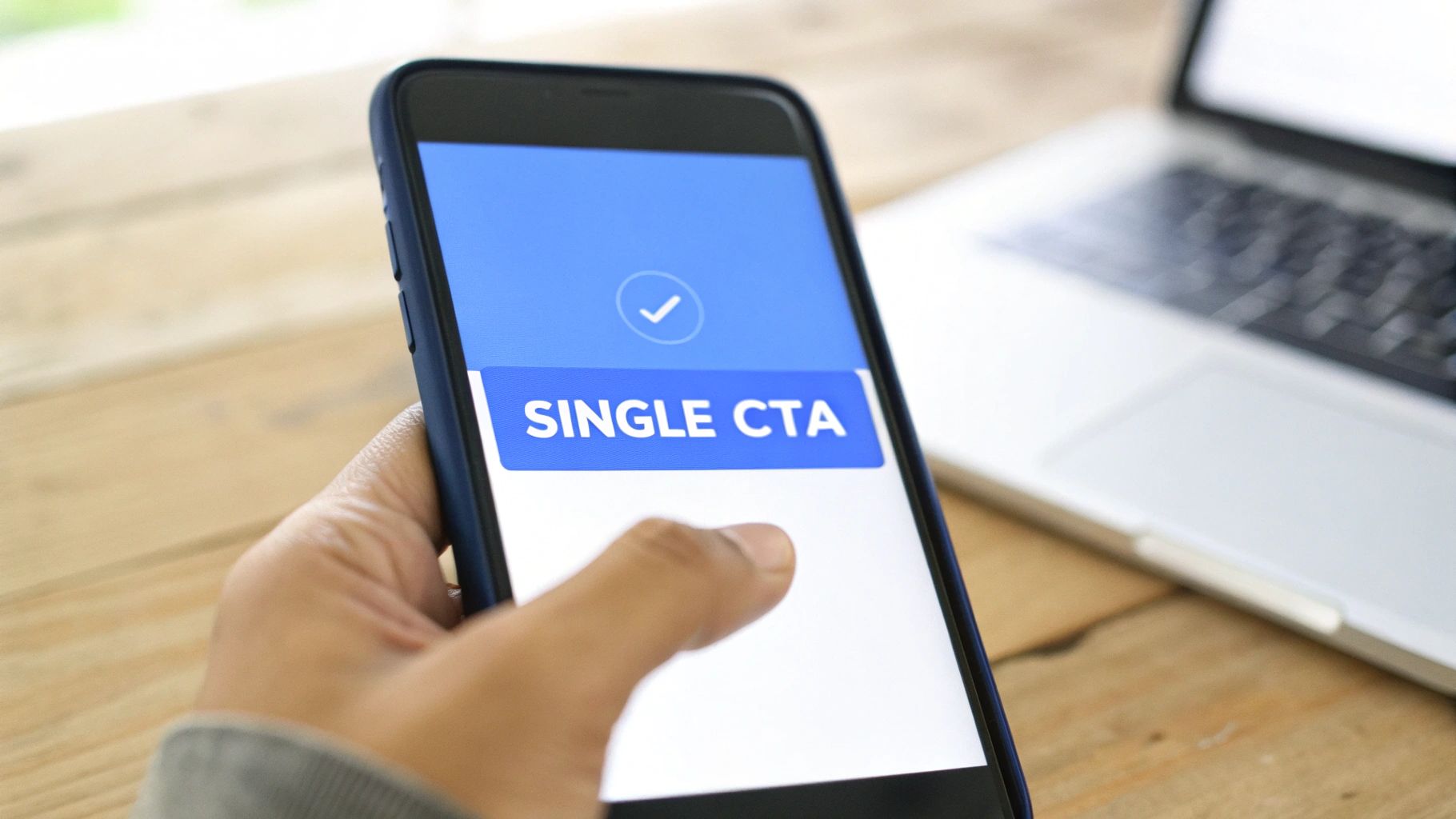
2. Implement a Single, Focused Call-to-Action (CTA)
A high-converting landing page is a focused one. Its entire purpose is to guide a visitor toward one specific goal. The most effective way to achieve this is by designing the page around a single, primary call-to-action (CTA). When you present too many options, you create decision paralysis, which leads visitors to choose nothing at all. A singular CTA eliminates this friction and clarifies the next step for the user, dramatically increasing the likelihood of conversion.
This principle is fundamental to successful landing page design best practices because it respects the visitor's attention span and directs their intent. By removing distracting links, secondary CTAs, or a complex navigation bar, you create a clear, unobstructed path to your conversion goal. This singular focus ensures every element on the page supports that one desired action.
How to Implement a Focused CTA
To put this into practice, you must be ruthless in eliminating anything that doesn't serve the primary goal. Companies like HubSpot excel at this by building entire pages around a prominent "Get started free" button. Similarly, Airbnb’s homepage directs users immediately toward its "Explore stays" search functionality. The goal is to make the next step feel like the only logical choice.
Actionable Tips for Implementation
- Action-Oriented Verbs: Start your CTA copy with strong, clear verbs like "Get," "Start," "Claim," or "Download." This tells users exactly what will happen when they click.
- Contrasting Color: Design your CTA button in a color that pops against the background. It should be the most visually prominent, clickable item on the page.
- Strategic Placement: Place your primary CTA above the fold so it's immediately visible. For longer pages, repeat the CTA mid-page and near the bottom.
- Make it Mobile-Friendly: Ensure your button is large enough to be easily tapped on mobile devices. A minimum size of 48x48 pixels is a widely accepted accessibility standard.
- Urgency in Microcopy: Add a short phrase near your CTA to encourage immediate action, such as "Start your free trial today" or "Limited time offer."
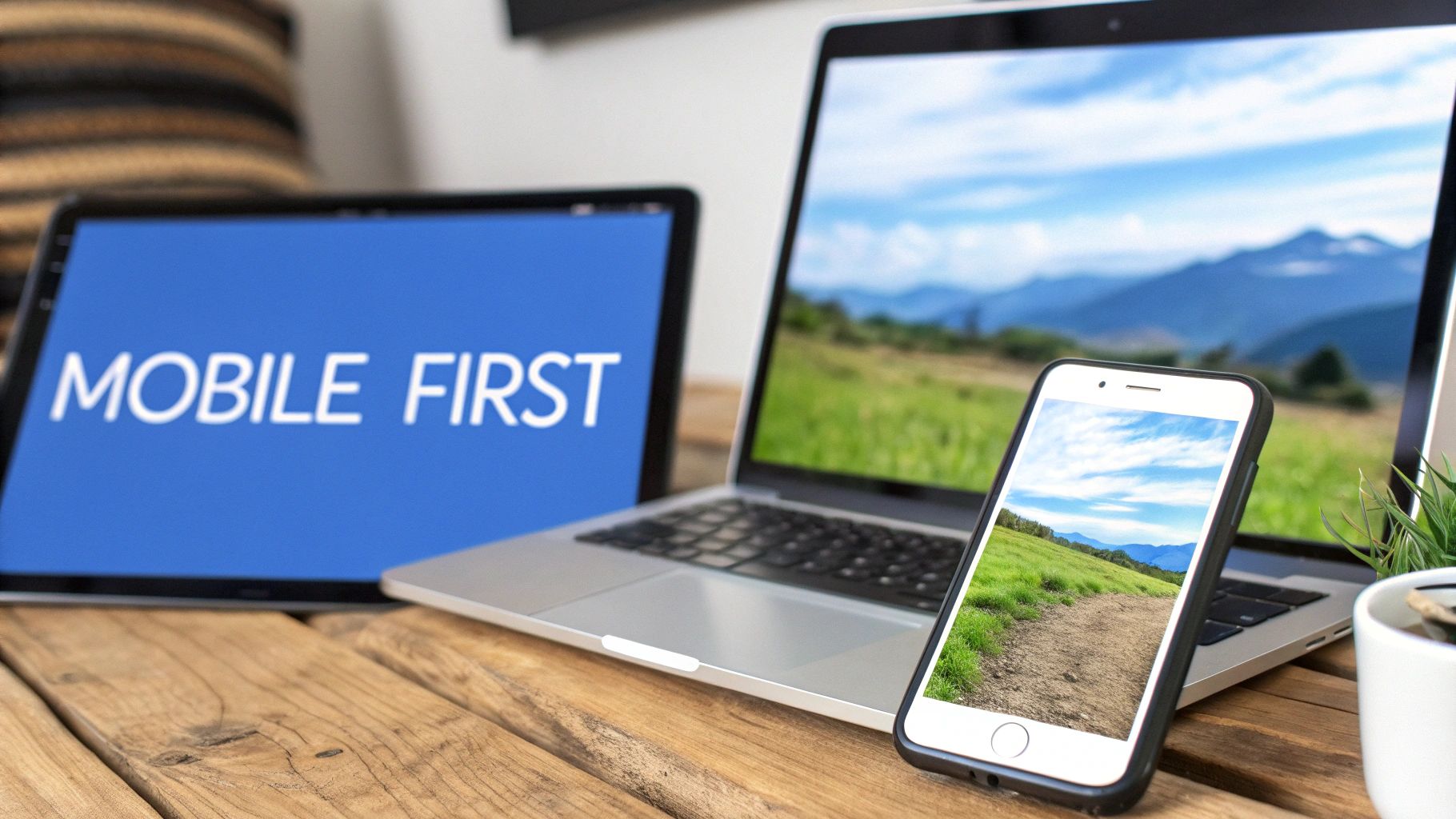
3. Prioritize Mobile-First Responsive Design
In an era where over 60% of web traffic originates from mobile devices, designing for the smallest screen first is no longer optional; it's essential. A mobile-first approach means designing your landing page for mobile users as the primary consideration and then adapting the layout for larger screens. This strategy ensures a seamless experience for the majority of your audience, directly impacting conversions and user satisfaction.
Failing to prioritize mobile users means alienating a massive segment of your potential customers. A page that is difficult to navigate, read, or interact with on a phone will lead to instant frustration and high bounce rates. Implementing a mobile-first responsive design is a core tenet of modern landing page design best practices, aligning your strategy with user behavior and Google's mobile-first indexing.
How to Implement a Mobile-First Strategy
To execute this, your design process must begin with the mobile layout. This forces you to focus on the most critical content and user actions, eliminating clutter. For example, Spotify’s mobile landing pages are clean and focused, with a single, clear call-to-action that’s easy to tap. Similarly, Uber's mobile-centric design simplifies the sign-up process, making it effortless for on-the-go users.
Actionable Tips for Implementation
- Prioritize Vertical Scrolling: Design content to flow naturally in a single column. Avoid horizontal scrolling, which is cumbersome on mobile devices.
- Optimize Touch Targets: Ensure all buttons, links, and interactive elements are at least 44x44 pixels to be easily tappable without accidental clicks.
- Simplify Forms: Minimize the number of form fields. Use larger input fields and mobile-friendly keyboards (e.g., numeric for phone numbers) to reduce friction.
- Compress Images: Use modern image formats like WebP and compress files to ensure fast loading times on mobile networks.
- Test on Real Devices: While browser simulators are helpful, always test your landing page on actual iOS and Android devices to catch real-world usability issues.
4. Leverage Social Proof and Trust Signals
People are inherently social creatures; we often look to the actions and experiences of others to guide our own decisions. Social proof and trust signals leverage this psychological principle by demonstrating that other people have trusted and benefited from your product or service. Incorporating these elements is a fundamental landing page design best practice that works to reduce purchase anxiety and build immediate credibility.
When a potential customer sees testimonials, user reviews, impressive client logos, or case studies, it validates your claims and creates a sense of security. It tells them, "Others have gone before you, and they had a great experience." This confirmation is often the final push a visitor needs to convert.

How to Build Credibility with Social Proof
Effectively implementing social proof means strategically placing evidence of your value throughout the page. For instance, Calendly showcases logos of trusted brands like Microsoft and Google to instantly align themselves with established industry leaders. Similarly, Shopify features detailed customer success stories that provide in-depth narratives. These aren't just claims; they are tangible proof points. You can discover more powerful techniques in our guide to social proofing examples.
Actionable Tips for Implementation
- Use Specific Testimonials: Instead of generic praise like "Great service!", feature testimonials with quantified results, such as "We increased our leads by 45% in the first quarter."
- Include Photos and Details: Attribute testimonials to real people with full names, titles, and photos. This adds a layer of authenticity that anonymous quotes lack.
- Leverage Video Content: Video testimonials are incredibly persuasive. A short clip of a happy customer sharing their story can have a much higher impact than text alone.
- Display Trust Badges: Showcase security seals (SSL certificates), industry awards, or partner logos near forms and call-to-action buttons to reassure users their information is safe.
5. Ensure Fast Page Load Speed and Performance
In the digital world, speed is not just a feature; it's a fundamental requirement. Fast page load speed is one of the most impactful, yet often overlooked, landing page design best practices. It directly influences everything from user engagement and bounce rates to SEO rankings and, most critically, conversion rates. Research has shown that even a one-second delay can cause a significant drop in conversions.
Failing to prioritize speed means you risk losing visitors before they even have a chance to see your compelling value proposition. Modern users expect instant results. A slow page communicates inefficiency and can frustrate potential customers, causing them to abandon your site for a faster competitor. This initial negative impression is difficult to overcome. You can learn more about reducing your bounce rate here.
How to Prioritize Page Performance
To implement this, you must treat page speed as a core design principle from the start, not an afterthought. The goal is to deliver a functional and engaging experience in under three seconds. For instance, data from Amazon shows that every 100-millisecond improvement in speed can increase revenue by 1%. Similarly, Pinterest boosted sign-ups by 40% after improving its perceived performance. These examples highlight the direct correlation between speed and business outcomes.
Actionable Tips for Implementation
- Audit Your Speed: Use free tools like Google PageSpeed Insights and GTmetrix to analyze your landing page and receive specific, actionable recommendations.
- Compress Your Images: Large images are a common cause of slow load times. Use tools like TinyPNG or ImageOptim to reduce file sizes without sacrificing quality.
- Minify Code: Reduce the size of your CSS, JavaScript, and HTML files by removing unnecessary characters, spaces, and comments.
- Enable Caching and Compression: Use browser caching and enable GZIP compression on your server to significantly speed up load times for repeat visitors.
- Leverage a CDN: A Content Delivery Network (CDN) like Cloudflare stores copies of your page on servers worldwide, delivering content from the closest location to the user.
- Monitor Core Web Vitals: Keep a close eye on Google's Core Web Vitals metrics (LCP, FID, CLS) to ensure you are meeting modern performance standards.
6. Use Minimal Form Design with Progressive Profiling
Long, intimidating forms are conversion killers. The more fields you ask a visitor to fill out, the more friction you create, leading to higher abandonment rates. Minimal form design, combined with progressive profiling, addresses this directly by making the initial sign-up process as painless as possible. The core idea is to ask for only the most essential information upfront and gather more data over time as the user's engagement deepens.
This approach respects the user's time and builds trust gradually. By requesting just an email address or name initially, you significantly increase the chances of securing that first conversion. This is a crucial element of modern landing page design best practices because it prioritizes the user experience over an immediate data grab.
How to Implement Minimalist Forms
To execute this strategy, start by mapping out the absolute minimum information you need. For a newsletter, this might just be an email. For a demo request, it could be a name, email, and company. HubSpot is a prime example; their initial forms are often incredibly short, reducing the barrier to entry. Later, as a user interacts with emails, subsequent forms can intelligently ask for new information, building a richer contact profile over time.
Actionable Tips for Implementation
- Start with the Essentials: If possible, ask for only a name and email address. Every additional field should be heavily scrutinized for necessity.
- Use Smart Fields: Employ forms that recognize returning visitors and hide fields they have already completed, asking for new information instead.
- Implement Inline Validation: Provide immediate feedback as users fill out the form, confirming correct inputs or highlighting errors in real-time to prevent frustration.
- Test Form Abandonment: Use analytics tools and heatmaps to identify which specific fields are causing users to drop off, then consider removing or rephrasing them.
- Adopt a Single-Column Layout: Especially for mobile users, a single-column design is easier to scan and complete than a multi-column layout.
7. Maintain a Consistent Visual Hierarchy and Design System
A landing page that feels chaotic or disconnected will instantly repel visitors. A consistent visual hierarchy and design system establishes order, guides the user's eye naturally through the content, and builds trust through professionalism. Visual hierarchy uses elements like size, color, and spacing to signal importance, ensuring visitors focus on the headline first, then the sub-headline, and finally the call-to-action.
This structured approach is a cornerstone of effective landing page design best practices because it reduces cognitive load. When a user doesn't have to struggle to figure out where to look next, they can focus entirely on your message. A cohesive design system, like those used by Airbnb or Shopify, ensures that every button, font, and color choice feels intentional and reinforces your brand identity.
How to Build a Cohesive Visual System
The goal is to create a predictable and intuitive experience. Start by defining the foundational elements of your design. For example, Google’s Material Design provides a comprehensive framework for creating logical and beautiful user interfaces. By creating your own mini-system for your landing page, you ensure every element works together harmoniously.
Actionable Tips for Implementation
- Establish a Typographic Scale: Use a tool like Type Scale to create a clear hierarchy for your headings (H1, H2, H3) and body text. Stick to no more than two or three font families.
- Define Your Color Palette: Choose a primary color for CTAs, a secondary color for accents, and a neutral palette for text and backgrounds.
- Use Whitespace Strategically: Generous spacing between sections and elements creates breathing room, improves readability, and helps differentiate distinct content blocks.
- Create a Reusable Component Library: Document your design patterns for buttons, forms, and cards. This ensures consistency and speeds up future development.
8. Incorporate Compelling Visuals and Multimedia Content
Humans are visual creatures; our brains process images about 60,000 times faster than text. This is why compelling visuals and multimedia are not just decorative elements—they are powerful communication tools. A landing page that leverages high-quality images, product videos, and animations can convey its value proposition more effectively and increase user engagement significantly.
Ignoring visuals is a missed opportunity to connect emotionally with your audience. Well-chosen multimedia content can demonstrate a product in action, build trust with authentic imagery, and break down complex ideas into easily digestible formats. This is a core tenet of modern landing page design best practices because it captures attention in a way text alone cannot.
How to Use Visuals for Maximum Impact
To implement this effectively, go beyond generic stock photos. For example, Asana uses clean, concise demo videos to showcase its platform’s collaborative features. Similarly, Dollar Shave Club’s viral marketing videos used humor and personality to create a memorable brand identity that drove massive conversions. Your visuals should tell a story and reinforce your core message.
Actionable Tips for Implementation
- Prioritize Authenticity: Use genuine photos of your team or customers instead of generic stock images. This builds trust and makes your brand more relatable.
- Demonstrate with Video: Create short, high-impact videos that demonstrate your product's key benefits or offer a quick walkthrough. Keep them focused and professional.
- Optimize for Performance: Compress images and videos to ensure fast page load times. Use modern formats like WebP for images and implement lazy loading.
- Ensure Accessibility: Always include descriptive alt text for images to aid SEO and screen readers. For videos, provide accurate captions and a full transcript.
9. Reduce Anxiety with Clear Policies and Guarantees
A visitor on the verge of converting often hesitates due to fear and uncertainty. What if the product isn't right? Is my payment information secure? Addressing these anxieties proactively with clear policies and risk-reversal guarantees is a crucial element of high-converting landing page design best practices. By eliminating friction caused by doubt, you build trust and make it easier for users to say yes.
Failing to address these common concerns leaves a gap that visitors will fill with their own worst-case scenarios, leading to missed conversions. When a user feels secure and confident, their focus shifts from "what could go wrong" to the value you offer. This psychological shift is often the final push needed to transform a prospect into a customer.
How to Build Trust and Reduce Fear
To implement this, you must identify potential user objections and address them head-on. ConvertKit, for instance, reduces commitment anxiety by prominently stating "No credit card required" for its free trial. Similarly, Kajabi and Grammarly display clear 30-day money-back guarantees, which effectively removes the financial risk. These elements signal that your company stands behind its product and prioritizes customer satisfaction.
Actionable Tips for Implementation
- Display Security Badges: Place SSL certificates and payment security badges (like Stripe or PayPal) near your CTA to reassure users their data is safe.
- Use Risk-Reversal Language: Frame your guarantees with phrases like "Try it risk-free for 30 days" to shift the perceived risk from the customer to your company.
- Be Specific with Guarantees: Clearly state the terms. Instead of a vague "satisfaction guaranteed," specify the duration (e.g., "60-day money-back guarantee") and conditions.
- Link to Detailed Policies: Provide easy access to your full privacy policy and terms of service, but summarize the key points directly on the landing page.
- Address Objections Directly: If you know users worry about setup difficulty, offer a "Free Onboarding Assistance" guarantee. Match your guarantees to specific points of friction.
10. Embrace A/B Testing and Data-Driven Iteration
Even the most well-designed landing page is built on assumptions. A/B testing, or split testing, is the systematic process of replacing those assumptions with hard data. It involves creating two or more versions of your page (a control "A" and a variation "B") and showing them to different segments of your audience to see which one performs better. This data-driven approach is the engine of continuous improvement.
Relying on intuition or "what looks good" is a surefire way to leave conversions on the table. Data-driven iteration ensures that every change you make is validated by actual user behavior, leading to progressively higher conversion rates. This commitment to testing is a cornerstone of modern landing page design best practices, separating high-growth companies from the competition.
How to Implement a Testing Culture
To get started, you just need a disciplined process. Identify a single element you want to improve, such as your headline or call-to-action button color. Create a variation that tests a specific hypothesis (e.g., "A more benefit-oriented headline will increase sign-ups"). Then, use a testing tool like Google Optimize or Unbounce to split your traffic between the original page and the new variation, and let the data decide the winner. For a deeper dive, learn more about A/B testing for landing pages on landermagic.com.
Actionable Tips for Implementation
- Test One Variable at a Time: To know what caused a change in performance, only alter one element per test (e.g., just the headline, not the headline and the image).
- Prioritize High-Impact Tests: Start by testing elements that have the biggest potential to affect conversions, such as your value proposition, CTA, and primary visuals.
- Run Tests Long Enough: Let your test run for at least one to two full business cycles to collect enough data and achieve statistical significance.
- Document Everything: Keep a log of every test you run, including your hypothesis, the variation details, the results, and what you learned.
Top 10 Landing Page Best Practices Comparison
From Best Practices to Best Performance
You have now journeyed through the ten foundational pillars of high-converting landing pages. From crafting a crystal-clear value proposition to the continuous cycle of A/B testing, each element plays a critical role in the user's decision-making process. Mastering these landing page design best practices is the key to unlocking consistent, predictable growth for your campaigns.
Remember, a landing page is not a digital brochure; it is a focused, persuasive argument designed to achieve one specific goal. By ruthlessly prioritizing a single call-to-action, you eliminate confusion and guide users toward the finish line. When you combine this focus with a mobile-first design, lightning-fast load speeds, and compelling visuals, you create an experience that feels effortless and professional.
The Human Element: Building Trust and Reducing Friction
Beyond the technical components, the most successful landing pages connect on a human level. This is where social proof, trust signals, and anxiety reduction become your most powerful assets. A testimonial from a happy customer, a security badge at checkout, or a clear money-back guarantee can be the final nudge a hesitant prospect needs to take action.
Similarly, simplifying your forms with progressive profiling respects your visitor's time and reduces friction. Every field you remove is a barrier dismantled. The goal is to make the entire process, from arrival to conversion, feel intuitive, secure, and valuable for the user.
Your Action Plan: From Theory to Tangible Results
Knowledge without action is merely potential. The true value of this guide lies in its implementation. Don't feel overwhelmed by the need to perfect all ten practices at once. Instead, adopt an iterative mindset.
Start by auditing your most critical landing page against this list. Where are the biggest opportunities for improvement?
- Is your CTA singular and compelling?
- Does your page load in under three seconds on a mobile device?
- Could your social proof be more prominent or persuasive?
Pick one or two areas to focus on first. Formulate a hypothesis, run an A/B test, and let the data guide your next move. This methodical, data-driven approach is what separates good marketers from great ones. The principles outlined here are your map, but your own testing and optimization efforts are the engine that will drive you toward unparalleled performance.
Ready to put these best practices into action without the technical headache? LanderMagic empowers you to create and deploy lightning-fast, conversion-optimized landing pages in minutes, not weeks. Stop wrestling with slow page builders and start turning more of your ad clicks into customers today with LanderMagic.