Summary
Meta description: Learn how to reduce bounce rate with 11 proven strategies. Boost user engagement, improve SEO, and keep visitors on your site longer with our expert guide.
Is your website losing visitors moments after they arrive? To lower your bounce rate, you must focus on three core pillars: lightning-fast performance, content that delivers on its promise, and a flawless user experience. Mastering these areas ensures you meet visitor expectations from the very first click, turning bounces into engaged sessions.
Understanding Why Visitors Leave Your Site
It's a familiar story: a visitor clicks your link, lands on your page, and vanishes in seconds. That swift exit is a "bounce," and the percentage of visitors who do this is your bounce rate. Why should you care? This metric is a direct signal about your website's health and effectiveness.
A high bounce rate can be a red flag for search engines, suggesting your page isn't the best answer for a user's query. More importantly, it tells you that your first impression is falling flat. People bounce for many reasons, but it almost always boils down to a disconnect between what they expected and what your page delivered.
Diagnosing the Root Causes of Bounces
Before you can fix the problem, you need to play detective. Is your site painfully slow? Is your content confusing or irrelevant to the audience you attracted? Is it a nightmare to navigate on a phone? Asking these critical questions is the first step toward building a "stickier" website that encourages exploration. A great place to start is by reviewing common web design mistakes that often send visitors packing.
The real reasons behind a high bounce rate typically fall into a few key categories:
- Technical Issues: Slow load times are the number one culprit. If your page takes more than a few seconds to appear, a significant portion of your visitors will simply give up and leave.
- Content Mismatch: This occurs when your page's content doesn't align with the ad, headline, or meta description that brought the user there. It creates a sense of a bait-and-switch.
- Poor User Experience (UX): A chaotic layout, aggressive pop-ups, or a design that isn’t mobile-friendly will frustrate users and send them straight back to the search results.
Tools like Google Analytics are perfect for pinpointing where the problems lie. This screenshot, for example, illustrates how bounce rates can vary dramatically from one page to another.

You can see immediately that the "Home" page is performing well, but the "/google/official/store/" page has a much higher bounce rate. This tells me it’s time to investigate that specific page for potential UX issues or content that isn’t hitting the mark.
Key Takeaway: Your bounce rate is a symptom, not the disease. It points to deeper issues with your site's performance, content, or design. The only effective cure is a holistic, user-first approach.
To give you a head start, I've created a quick-reference table below. It outlines the most common reasons visitors bounce and the best way to address each one. Use it as a checklist to diagnose what's happening on your own site.
Common Bounce Rate Triggers and Their Solutions
Think of this table as your initial diagnostic tool. By identifying and addressing these core issues, you'll be well on your way to creating a superior experience that keeps visitors engaged.
Make Your Website Faster to Keep Users Hooked
Imagine walking into a store and waiting ten seconds just to be acknowledged. Frustrating, right? That’s precisely how visitors feel when they land on a slow-loading website. In our world of instant gratification, a sluggish page is one of the quickest ways to lose a potential customer forever.
Every second your site takes to load, you're testing your visitor's patience. The longer they wait, the more likely they are to hit the "back" button and find a competitor. This isn't just an observation; it's a proven reality that directly impacts your bottom line.

Why Every Second Counts for User Retention
The link between page speed and user behavior is undeniable. When you analyze what drives bounce rate, your website's response time is always at the top of the list.
The data is stark. Research shows that as page load time increases from just 1 second to 10 seconds, the probability of a visitor bouncing skyrockets by a staggering 123%. Let that sink in. A delay of only a few seconds could more than double the chance that a user leaves without ever seeing what you offer.
This delay does more than just annoy people; it erodes trust. A slow site can feel unprofessional or even insecure, sending subtle signals that you don't value the user experience. Making your site faster isn't a technical luxury—it's a foundational requirement for success.
Finding Your Website's Speed Bottlenecks
So, where should you begin? The first step is to get a clear, honest picture of your site's current performance. The good news is you don't have to be a developer to figure this out.
One of the best tools for this task is Google PageSpeed Insights. It's free, and all you need to do is enter your URL. The tool analyzes both mobile and desktop performance, providing a score from 0 to 100. More importantly, it gives you a prioritized list of specific, actionable recommendations to fix what’s slowing you down.
Pro Tip: When you review your report, focus on the "Opportunities" and "Diagnostics" sections. This is your roadmap. Tackle the items that promise the biggest time savings first to get the most impact from your efforts.
Simple Fixes to Boost Your Page Speed
Once you know the problems, you can start addressing them. Many of the most effective changes are surprisingly straightforward. If you want to stop visitors from abandoning your site, you must learn how to improve website loading speed.
Here are three key areas to tackle first:
Compress Your Images: Large, unoptimized image files are the usual suspects behind slow load times. Use a tool like TinyPNG or a WordPress plugin like ShortPixel to automatically compress your images without any noticeable loss in quality. This single step can dramatically reduce your page size.
Set Up Browser Caching: Caching tells a visitor's browser to "remember" parts of your website, like your logo, fonts, and navigation menu. The next time they visit, their browser doesn't have to reload everything from scratch, making the page load almost instantly. Most reputable hosting providers and caching plugins (like W3 Total Cache) make this easy to implement.
Check Your Server Response Time: This sounds technical, but it often comes down to your hosting plan. If you're on a cheap, shared hosting plan and your site has grown, your server might be struggling to keep up. Upgrading to a better solution, such as a managed WordPress host, can make a massive difference in how quickly your server responds.
Don't Forget the Mobile Experience
With most internet traffic now originating from mobile devices, optimizing for speed on phones isn't optional—it's critical. Mobile users are often on slower network connections and have even less patience for delays.
What feels fast on a desktop can be painfully slow on a smaller screen. Ensure your website uses a responsive design, meaning it automatically adjusts its layout to fit any screen size. This not only makes your site faster on mobile but also significantly easier to navigate.
Pull out your own phone and test your site. Is it fast? Is it easy to use? If the answer is no, you can be sure your mobile visitors are bouncing.
Create Content That Captures and Holds Attention
Let's be honest: you can have the fastest, most beautiful website in the world, but if your content is a letdown, you've already lost. Your words are the first real handshake with a visitor. If that handshake is weak or irrelevant, they're gone before you can even say "conversion."
Great content is your secret weapon against a high bounce rate. It all comes down to a simple promise: giving people exactly what they came for. Get this wrong, and you're just paying for clicks that immediately turn into exits.

Align Your Content With User Intent
Put yourself in your visitor's shoes for a moment. You search for something specific, click a promising link, and land on a page that completely misses the mark. What do you do? You hit the back button instantly. We all do it.
This is why mastering user intent isn't just a good idea—it's everything. If someone searches for "best running shoes for beginners," they don't want a deep dive into the history of vulcanized rubber. They want a straightforward guide comparing a few top models, explaining why each is a good fit for a newcomer.
To nail user intent every time, you need to:
- Think Like Your Audience: What language are they using? What problem are they really trying to solve? Dig into the keywords and questions your audience is asking.
- Match Your Promise: Your headline and meta description form a contract with the searcher. Make sure the content on your page fulfills that promise from the very first sentence.
- Deliver the Solution: Every piece of content should be a direct answer to a question or a clear solution to a problem. Don't bury the lead.
When your content is a perfect match for what a visitor is seeking, you've already won half the battle. They feel understood and immediately see you as a credible source.
Hook Them Immediately With a Powerful Introduction
You have maybe three seconds. That's it. Your introduction is your one shot to convince a new visitor that staying on your page is worth their time. A generic, fluffy intro is like a welcome mat that says, "Go away."
A knockout introduction accomplishes three things, fast:
- It acknowledges the reader's problem, showing you understand their pain point.
- It promises a clear, valuable solution.
- It tells them exactly what they’ll gain by reading on.
Think of your intro as the movie trailer for your article. It needs to be exciting and prove the main event is worth watching. If it falls flat, they’ll assume the rest of your content does, too.
Use Formatting to Make Content Scannable
Nobody reads walls of text online. I don't, you don't, and your visitors definitely don't—especially on a small phone screen. People scan. They're hunting for the specific piece of information they need, and if your page is a dense brick of text, you're making them work too hard.
Smart formatting isn't just about aesthetics; it's about making your content accessible and easy to digest. Here's how to do it:
- Keep Paragraphs Short: Stick to 1-3 sentences. This creates white space and makes the text feel far less intimidating.
- Use Descriptive Subheadings: Break up your content into logical sections with clear H2 and H3 subheadings. This acts as a roadmap, allowing users to jump to the sections they care about most.
- Embrace Lists: Bullet points and numbered lists are perfect for breaking down steps, features, or key takeaways. They are infinitely more scannable than long sentences.
- Make Key Points Pop: Use bold text strategically to draw the eye to the most important stats, terms, or conclusions, guiding the reader's attention.
These simple tweaks can transform a page from an overwhelming task into a helpful resource people actually want to read.
Guide Users Deeper With Smart Internal Linking
A visitor landing on one page doesn't have to be the end of their journey. In fact, it shouldn't be. With a smart internal linking strategy, you can turn a single page view into an extended session, slashing your bounce rate in the process.
Don't let them hit a dead end. Once they've found the answer they came for, what's the next logical step? Guide them to a related piece of content. For instance, link from a "how-to" guide to a more advanced strategy article. Building trust with elements like social proof is also a great way to keep people engaged. You can see what I mean in our guide on effective social proofing examples.
One of the best ways to build out this web of content is through consistent blogging. According to HubSpot, businesses that publish 16 or more blog posts per month generate about 3.5 times more traffic than those publishing four or fewer. While individual blog posts can have high bounce rates (people find an answer and leave), a strong internal linking network converts those single-page visits into multi-page sessions. You can explore more of these web traffic analytics on HubSpot.
By creating more pathways, you give visitors more reasons to stay, explore, and see you as the go-to expert in your field.
Improve Your Website Navigation and User Experience
A confusing website is a frustrating one. And when visitors get frustrated, they bounce.
If people can't figure out where to find what they're looking for within seconds, they won't stick around to solve your website's puzzle. Optimizing your site's navigation and overall user experience (UX) is one of the most direct ways to encourage visitors to explore your content instead of hitting the back button.
Think of your website's navigation as its central nervous system. A well-designed menu acts as an intuitive guide, helping people move from page to page without friction. When users feel confident they can find what they need, they are far more likely to engage.
Create a Logical and Simple Menu Structure
The best navigation is practically invisible—it just works. Users shouldn't have to pause and guess where a link might lead. Your main menu must be simple, using clear and concise labels that anyone can understand. This is not the time for clever jargon or internal company terms that a new visitor won't recognize.
For example, instead of a vague menu item like "Solutions," be more specific with labels like "For Small Businesses" or "E-commerce Tools." This simple change helps visitors immediately self-select the most relevant path. It’s a small detail with a huge impact—a GoodFirms study found that a staggering 61.5% of users would leave a site due to poor navigation.
A clean design also builds instant trust. The core principles of a strong user experience are fundamental to successful conversion rate optimization best practices, since both focus on creating a seamless visitor journey.
Make Your Search Bar Impossible to Miss
While a great menu is essential, some visitors arrive with a specific goal. They will instinctively scan the page for a search bar to get there instantly. If your search functionality is buried or, worse, ineffective, you're creating an unnecessary roadblock.
Place your search bar in a prominent, conventional spot, like the top-right corner of your header. Ensure it's large enough to be easily seen and that it provides accurate, relevant results. For sites with a lot of content, an effective search function can be the single most important element that prevents a bounce.
Your navigation menu and search bar are your site's two most important tour guides. If either one is confusing, your visitors will feel lost and are much more likely to leave the tour early.
Eliminate On-Page Distractions and Clutter
User experience isn't just about what's on the page; it's also about what's not there. A cluttered layout packed with competing elements can overwhelm a visitor, making it hard to focus on what matters. This is especially true for intrusive elements that break a user's flow.
Here are a few common culprits to avoid:
- Intrusive Pop-ups: Don't hit visitors with aggressive pop-ups the second they land on your site. If you use them, trigger them based on user behavior, like scrolling to the end of a page or showing exit intent.
- Too Many Calls-to-Action (CTAs): A page with multiple, conflicting CTAs often leads to decision paralysis. Pick one primary goal for each page and make that action crystal clear.
- Cluttered Design: Use white space to your advantage. Giving your content room to breathe helps guide the user's eye toward the most important information on the page.
To better understand how different navigation styles impact user behavior, check out the infographic below.
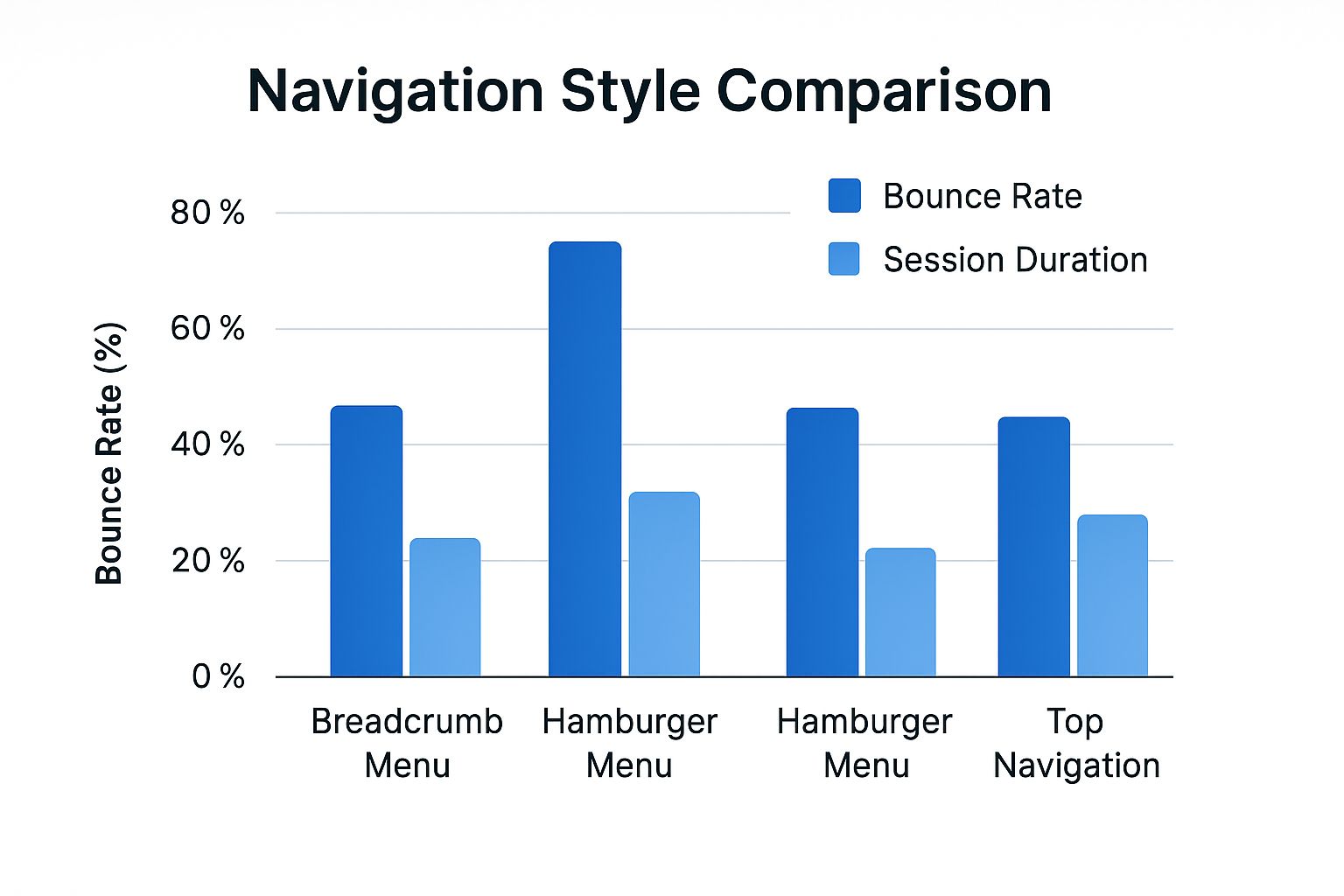
The data makes it clear: simpler, more direct navigation structures like a top menu tend to result in lower bounce rates and longer sessions.
Sometimes, the best choice depends on your site's complexity. Here’s a quick breakdown of common navigation structures and where they work best.
Navigation Structure Comparison
Choosing the right structure is a strategic decision that directly influences how users interact with your site and whether they stick around.
Prioritize the Mobile Experience
It's no secret that most web traffic now comes from mobile devices. Because of this, a clunky mobile experience is no longer an option. If your site is a pain to use on a smartphone, your bounce rate will reflect that.
Keep these mobile-first principles in mind:
- Responsive Layout: Your site must adapt perfectly to any screen size. Text should be readable without pinching and zooming.
- Readable Fonts: Use a base font size of at least 16px. This is the standard for ensuring text is legible on smaller screens.
- Easy-to-Tap Buttons: Ensure there is plenty of space around your buttons and links to prevent accidental clicks. This is crucial for a frustration-free mobile experience.
When you put your users first in every design decision, you create an environment that naturally encourages them to stay, explore, and convert.
Use Analytics to Pinpoint and Fix Problem Areas
Stop guessing why visitors are leaving. It's time to become a data detective and let the numbers tell you what's really happening. A high bounce rate is just a symptom; to find the cure, you must dig into your analytics and uncover the clues your users are leaving behind.
Tools like Google Analytics are indispensable for this. They allow you to move beyond sitewide averages and see exactly which pages are bleeding visitors. Are you ready to find your leakiest pages and plug the holes for good?
Segment Your Audience to Uncover Hidden Patterns
Your overall bounce rate is a good starting point, but the real insights come from segmenting your data. Think of it like a retail store: you wouldn’t just count how many people walk out. You’d want to know who they were and how they found your store in the first place.
This is what segmentation does for your website. It helps you spot patterns you would otherwise miss.
- Traffic Source: Are visitors from organic search bouncing more than people from your email list? A high bounce rate from search often signals a mismatch between your content and the keywords you're ranking for.
- Device Type: Is your bounce rate through the roof for mobile users? This is a classic red flag for a poor mobile experience. Check your responsive design, button sizes, and page speed on smaller screens.
- New vs. Returning Visitors: New visitors naturally have a higher bounce rate. But if your returning visitors are leaving just as quickly, it could mean they can't find new content or your site navigation is confusing.
Set Realistic Goals with Industry Benchmarks
So, what is a "good" bounce rate, anyway? The honest answer is: it depends. A single-page blog post where a user gets their answer and leaves might have a bounce rate of 80%, and that's perfectly fine. An e-commerce product page? Not so much.
Context is king. To set realistic goals, you need to know where you stand. For example, finance and automobile websites often see higher averages, around 51.7% and 51.9%. On the other hand, more interactive gaming sites tend to have lower bounce rates of about 46.7%. Understanding the landscape helps you focus your energy where it matters most.
Form a Hypothesis and Test It Systematically
Let's say you've identified a problem page. One of your key landing pages has a terrible bounce rate, specifically from mobile users. Now what? You form a hypothesis—an educated guess based on your data.
For instance, your hypothesis could be: "The bounce rate on this page is high for mobile users because the main call-to-action (CTA) is below the fold, and they aren't scrolling to find it."
With that, you've turned a vague problem into a clear, testable idea.
Key Takeaway: Data tells you what is happening. A solid hypothesis is your best guess as to why. This "why" is the foundation for all effective A/B tests and site improvements.
With your hypothesis ready, it's time to run an A/B test. Create a new version of the page (Version B) where the CTA is moved up, directly below the main headline. Using a testing tool, show the original page (Version A) to half your mobile visitors and the new page to the other half.
After letting the test run for a week or two, check the results. If the page with the higher CTA has a significantly lower bounce rate, your hypothesis was correct. You’ve just used a systematic, data-backed process to fix a real problem. This transforms bounce rate reduction from a frustrating guessing game into a continuous improvement cycle—an essential mindset for tracking any important KPI for a website.
Common Questions About Reducing Bounce Rate
As you start to optimize your website's performance, a few key questions often arise. Let's tackle some of the most common queries about bounce rate to reinforce these strategies and help you fine-tune your approach.
What Is Considered a Good Bounce Rate?
There is no single magic number. A "good" bounce rate is entirely dependent on context, your industry, and your website's purpose.
An e-commerce site, for example, might aim for a bounce rate between 20-45%, as success means visitors are clicking through multiple product pages. For a blog, however, a bounce rate of 70-90% can be perfectly normal. A user lands on your post, gets the answer they need, and leaves satisfied. That's a successful visit, not a failure.
The best approach is to benchmark against your specific industry, but more importantly, focus on improving your own metrics over time. Progress is the real goal, not some universal standard.
Can a High Bounce Rate Hurt My SEO Rankings?
This is a critical question. While Google has never officially stated that bounce rate is a direct ranking factor, it's a powerful indirect signal about user experience.
Imagine this: a user searches for a term, clicks your link, and immediately hits the "back" button to return to the search results. This behavior, known as "pogo-sticking," sends a clear message to Google that your page wasn't a good answer for that query. If this happens repeatedly, it can certainly harm your rankings over time. So yes, learning how to reduce bounce rate is a key part of any healthy SEO strategy.
How Do I Lower the Bounce Rate on Landing Pages?
Landing pages are your closers—they have one job: to convert. A high bounce rate here means you're leaking money and losing leads at the most critical stage.
To fix the leak, get laser-focused on these three elements:
- Perfect Message Match: The headline and core message on your landing page must be a perfect mirror of the ad or link the user clicked. Any disconnect feels like a bait-and-switch.
- A Crystal-Clear Call-to-Action (CTA): Your main CTA button should be impossible to miss. Use contrasting colors, action-oriented text ("Get My Free Demo"), and place it prominently above the fold.
- Zero Distractions: Be ruthless. Remove anything that could pull a visitor away from the main goal. This means ditching unnecessary navigation links, social media icons, and secondary offers.
Should I Focus on Content or Design to Lower Bounce Rate?
It's the classic "chicken or egg" question, but the answer is simple: they are two sides of the same coin. You absolutely cannot succeed with one without the other.
Think of it this way:
- Great Content + Poor Design: You could have the most life-changing article ever written, but if it's on a slow, cluttered site that looks terrible on mobile, people will bounce out of frustration.
- Great Design + Poor Content: A gorgeous, lightning-fast website is useless if the content is thin, unhelpful, or irrelevant. Visitors will leave to find a real answer to their problem elsewhere.
The winning formula is a partnership. You must create genuinely valuable, relevant content and present it within a clean, fast, and user-friendly design. When content and design work in harmony, you create an experience that makes people want to stick around.
Ready to turn those bounces into conversions? LanderMagic empowers you to create dynamically personalized landing pages that perfectly match user intent, dramatically improving your post-click experience and lowering costs. Start building high-converting pages for your Google Ads campaigns today!