Summary
Is your landing page a conversion machine or just a pretty brochure? Nailing four key areas is the secret: compelling copy, intuitive design, undeniable trust, and blazing-fast speed. Get these right, and you’re not just hoping for conversions—you’re engineering a system that moves visitors from casual interest to decisive action. This isn't about guesswork; it's a proven formula for turning clicks into customers.
Meta Description: Learn how to optimize landing pages with our expert guide. We cover compelling copy, intuitive design, trust signals, and page speed to boost your conversions.
The Blueprint for a High-Converting Landing Page
Every great landing page is built on a solid foundation. Before diving into specific tactics, it's crucial to understand how core components work together. Think of your landing page as a focused conversation with a potential customer. What's your goal? To make that conversation as clear, persuasive, and frictionless as possible.
This means every single element—from the headline to the button color—must serve one purpose: guiding the user toward your conversion goal. Anything that distracts from that is a liability. A slow-loading page frustrates people before they read your first sentence. Confusing copy leaves them wondering what you're even offering. Are you making these common mistakes?
What is a Good Landing Page Conversion Rate?
To know if your optimization efforts are working, you need a benchmark. Across all industries, the median landing page conversion rate is around 6.6%, according to extensive industry data. However, for eCommerce sites, that number dips to 4.2%.
Here’s the exciting part: the top 25% of eCommerce pages convert at 11.4% or higher. That’s nearly three times the median. This shows just how much potential is on the table when you get serious about optimization. To see how your landing page fits into the bigger picture, it's worth exploring these proven strategies to improve website conversion rates.
The Four Pillars of Landing Page Optimization
Your optimization efforts should always circle back to four essential areas. Each one tackles a different part of the user experience. If you neglect even one, you'll see it in your results.
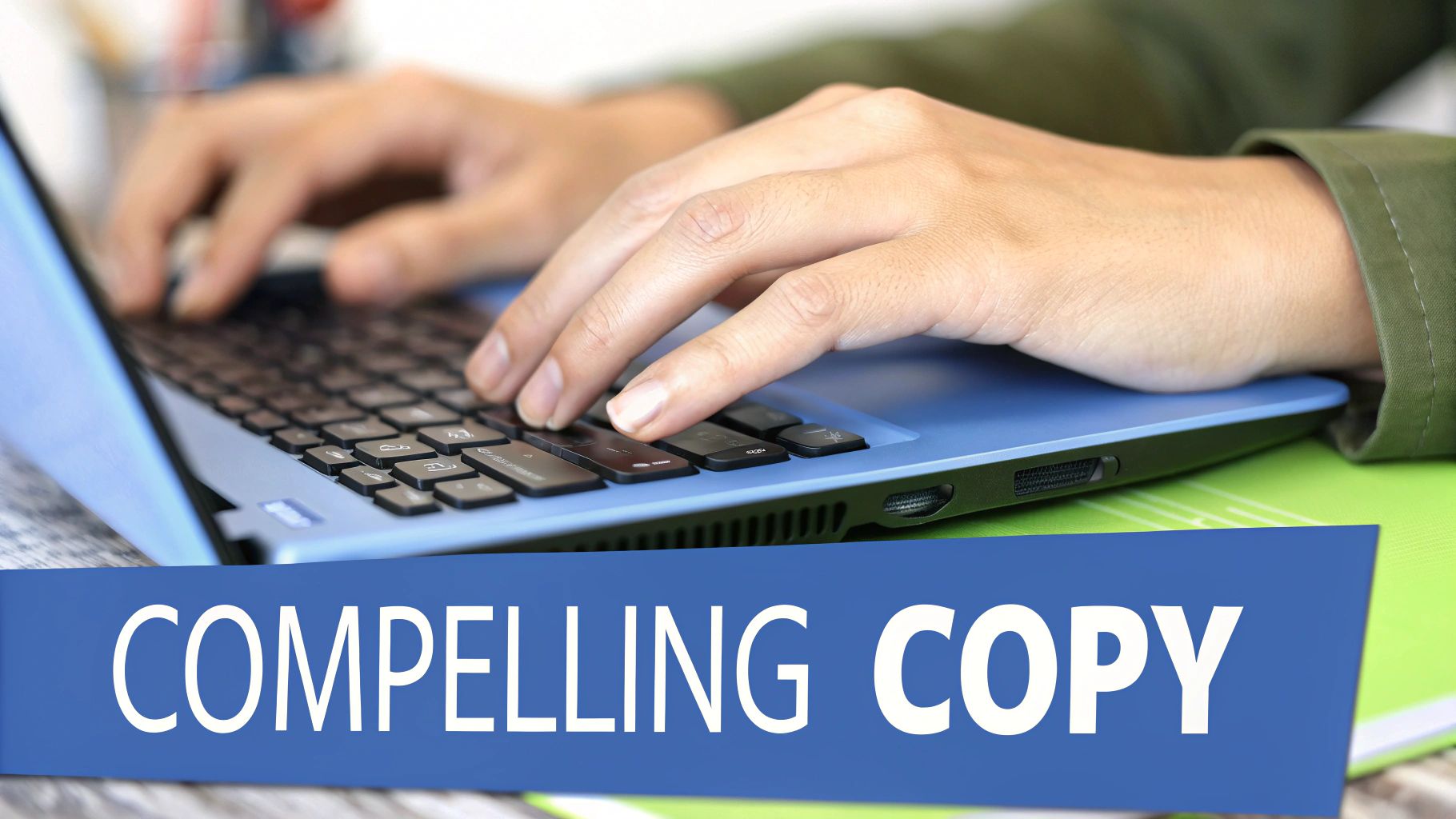
- Compelling Copy: This is your digital salesperson. Your words must articulate your value, speak directly to your audience’s pain points, and create a sense of urgency.
- Intuitive Design: Your layout and visuals are the tour guide. A clean, organized design with a strong visual hierarchy makes it simple for visitors to find what they need and take action. For great starting points, check out these free landing page templates.
- Undeniable Trust: People are skeptical online. Trust signals like testimonials, security badges, and clear contact info aren't optional anymore; they're required to earn a conversion.
- Rapid Speed: We live in a world of short attention spans. Every second your page takes to load is a chance for someone to leave. A fast page isn't just good for users; it's a confirmed ranking factor for search engines.
Mastering these four pillars gives you a repeatable blueprint for success.
Core Components of a High-Performing Landing Page
By systematically addressing each of these areas, you move from building just another landing page to engineering a true conversion machine.
How to Write Landing Page Copy That Converts
Your headline is your first—and often only—chance to prove you understand a visitor’s world. If it fails to answer their silent question, “What’s in it for me?” within eight seconds, most people will leave.
Clarity trumps cleverness every time. A great headline promises a clear outcome or a swift escape from a nagging problem. From there, your copy should build a bridge from “today’s pain” to “tomorrow’s relief.” What really keeps your audience up at night? Mirror those frustrations in your words, and you’ve earned their attention.
Hook Visitors With A Value-Driven Headline
Lead with the benefit, not the product name. A specific, compelling promise is the fastest way to grab attention.
Consider this pair:
“Our New Accounting Software.”
“Finally, Accounting Software That Saves You 10 Hours a Month.”
The second headline connects immediately—readers feel the time savings before they even scroll.
A benefit-focused headline connects emotionally. It shows readers they’re in the right place.
Write Body Copy That Solves A Problem
Once you’ve hooked someone, keep them moving with concise, purposeful paragraphs. Walls of text are conversion killers.
Break ideas into bite-sized chunks. Use subheadings and bullet points to guide the eye. Here’s a simple structure:
- Problem: Paint the exact struggle your visitor faces.
- Agitation: Explain why this issue won’t just disappear on its own.
- Solution: Position your offer as the clear next step.
For paid campaigns, consider using dynamic keyword insertion on your landing pages so your copy echoes each user’s search query.
Create Irresistible Calls To Action (CTAs)
Your CTA is the final step. Generic buttons like “Submit” or “Click Here” destroy momentum. Are your CTAs inspiring action?
Instead, write CTAs that spell out the benefit:
- Action-first wording: “Get My Free Guide Now” is much better than “Download.”
- A touch of urgency: Use words like “Today” or “Now.”
- A contrasting button color so it jumps off the page.
A stand-out CTA is your conversion engine. Make it clear, convincing, and impossible to miss.
Designing for Engagement and Trust
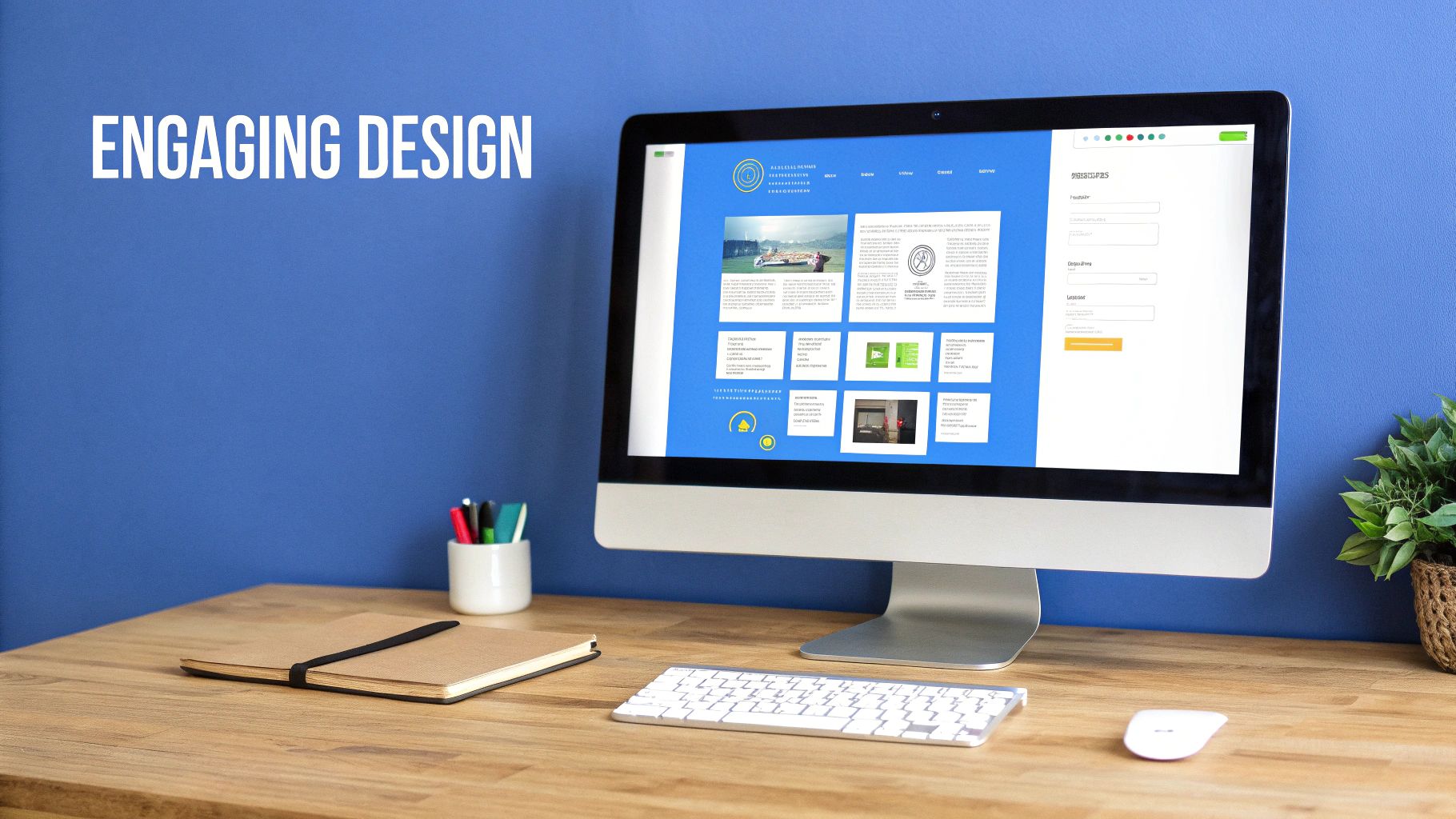
Great design isn't just about making things look pretty; it's about psychology. A good design steers your visitor's eye exactly where you want it to go—the conversion goal—while building instant credibility.
When you land on a page that’s clean, professional, and easy to understand, you instinctively trust the offer more. It feels more valuable. Your design is the silent narrator of your page, pointing out the most important parts. Your headline, form, and CTA button must be the stars of the show.
Master Your Visual Hierarchy
Visual hierarchy tells visitors what to look at first, second, and third. You control this flow with simple tools like size, color, and placement.
Your headline should be the biggest, boldest text. Your CTA button needs a color that clashes just enough with your background to stand out. And please, don't be afraid of white space. It's your best friend for isolating key elements and preventing a cluttered, overwhelming feeling.
A strong visual hierarchy eliminates confusion. It creates a clear path from the headline to the CTA.
Use Images and Video to Build Credibility
People process visuals much faster than text. A high-quality image or a well-produced video can communicate your offer's value in seconds.
Use images that show your product in use by real people, or feature smiling, relatable customers. Avoid generic stock photos at all costs. They scream "inauthentic" and can kill trust instantly. For a deeper dive, check out these powerful social proofing examples.
The Power of Personalization and Distraction-Free Layouts
This is where things get interesting. Tailoring your landing page to the user is a game-changer. The data doesn't lie: personalized CTAs convert 42% more visitors than generic ones. Adding a video can boost conversions by up to 86%.
These aren't small numbers. Even the number of pages you have matters. One study found that businesses that increased from 10 to 15 landing pages saw a 55% increase in leads, simply because they could create more targeted messages.
To ensure your message lands, create a distraction-free environment. This means ruthlessly stripping away anything that doesn't push the visitor toward conversion.
Here’s a quick checklist to get your design laser-focused:
- Remove the main navigation: Don't give visitors an easy escape. Keep them focused on the single action you want them to take.
- Stick to one primary CTA: Too many choices lead to decision paralysis. Make the next step obvious.
- Limit your color palette: Use a simple, clean color scheme that matches your brand. Let your CTA button be the main pop of color.
- Ensure readability: Choose a clean, legible font with plenty of contrast against the background.
When you combine a strong visual hierarchy with trustworthy visuals and a clean layout, converting feels like the natural next step.
Building Forms That People Actually Complete
Think of your form as the final handshake. It's the critical moment when a visitor decides to become a lead. Unfortunately, it’s also where many conversions fall apart. A clunky, intimidating form can undo all the hard work your headline and design accomplished.
The goal isn't just to gather data; it’s to make the process feel so effortless that filling out the form is the obvious next step. This is a delicate balance. You need the info you require without overwhelming your visitor.
The Frictionless Form Philosophy
Every field you add to a form creates friction. It adds another moment of hesitation. Before adding a field, ask yourself: do I really need their phone number right now? Is the company name essential for this initial download? Each "nice-to-have" field slowly chips away at your conversion rate.
Imagine a visitor has decided your offer is valuable. Don't make them second-guess that choice with a form that feels like an interrogation. Keep it short, simple, and laser-focused on the absolute essentials. This infographic shows how dramatically the number of form fields can slash completion rates.

The trend is clear. As you ask for more, you give people more reasons to walk away.
Form Field Count vs. Conversion Impact
The takeaway is simple: unless you have a compelling reason to ask for more information, stick to the essentials to maximize your lead flow.
Overcoming Hesitation with Trust Signals
Even with a short form, visitors can get cold feet. They need to feel confident their personal information is safe. This is where trust signals become your best friend.
You can build this confidence right where it matters most—around your form.
- Security Badges: Displaying an SSL certificate or other security logos is a quick visual cue that their data is encrypted and protected.
- Privacy Pledges: A simple link to your privacy policy can work wonders. A sentence like, "We'll never share your email," is all it takes.
- Social Proof: Placing a short testimonial next to the form is incredibly powerful. When people see that others have had a positive experience, it lowers their perceived risk.
These small elements dismantle a user’s natural skepticism at the moment of truth.
The best forms don't just ask for information; they provide reassurance.
How to Improve Form Completion Rates
Form abandonment is a huge problem. 81% of users have ditched forms after starting them. The top reasons? Security concerns (29%) and form length (27%). Conversely, using five or fewer fields can boost conversion rates by a staggering 120%. This shows how critical thoughtful design is for landing page optimization. For more insights, check out the latest conversion rate optimization statistics.
To turn your form from a conversion killer into an asset, nail these design details:
- Use Clear Field Labels: Always place labels above the input fields. Don't use placeholder text inside the box, as it disappears when a user starts typing.
- Provide Helpful Error Messages: If a user makes a mistake, tell them exactly what went wrong. A vague "Invalid Entry" message is frustrating.
- Use a Single-Column Layout: A single, vertical column is much easier for the eye to scan and follow. It creates an uninterrupted path to the submit button.
- Design an Obvious CTA Button: The button text should be specific (e.g., "Get My Free Ebook"). Use a color that contrasts with the rest of the page to draw the eye.
When you treat your form as a key part of the user experience, you transform your biggest bottleneck into a seamless final step.
Getting the Technical Stuff Right: Speed and Performance
You can craft the perfect headline and a stunning design, but if your landing page takes forever to load, it’s all for nothing. Page speed isn’t just technical jargon; it's a massive part of the user experience that directly impacts conversions and SEO.
We live in a world of short attention spans. A one-second delay in page load time can cause a 7% nosedive in conversions. Your page's foundation must be rock-solid, ensuring it’s fast, accessible, and easy for search engines to find. The good news? You don't need to be a developer to get this right.
Why is Page Speed Important for Landing Pages?
What’s the usual suspect for a slow landing page? Massive images and clunky code. Those beautiful, high-resolution images look great, but they can bring your load time to a screeching halt, especially on a mobile connection.
Before you upload any image, you must run it through a compression tool. This simple, non-negotiable step can slash file sizes by 70% or more without any noticeable drop in quality. Think of it as putting your images on a diet—they still look fantastic, just much lighter. The goal is to make every piece of your page as lean as possible.
Fine-Tuning Your On-Page SEO
You might think, "This is a landing page for an ad campaign, I don't need it to rank on Google." You're partially right. But applying basic on-page SEO principles is still a fantastic best practice. It helps get your page indexed properly and can even pull in relevant organic traffic.
Focus on these quick wins:
- A Catchy Title Tag: This is the text in the browser tab and search results. It must be clear, include your main keyword, and instantly tell people what you're offering.
- An Intriguing Meta Description: While not a direct ranking factor, your meta description is your ad copy for the search results page. You have about 155 characters to write a compelling summary that makes people want to click.
- A Clean URL Structure: Keep your URLs short and descriptive. A clean link like
yourwebsite.com/free-ebookhelps users and search engines understand the page’s purpose at a glance.
The bottom line: solid technical performance isn't about chasing a perfect 100/100 score. It's about aggressively removing every bit of friction between your visitor and the "submit" button. A faster page is always a better-converting page.
Getting these technical basics locked down ensures a seamless, lightning-fast experience. That immediate positive impression sets the stage for your offer, making visitors far more likely to convert. Are you leaving money on the table because of a sluggish page?
Landing Page Optimization FAQs
Even with a solid grasp of optimization, a few questions always pop up. Here is a quick-fire guide for those nagging "what if" moments. Answering these common questions helps you move from theory to action with confidence.
How Often Should I Be Testing My Landing Pages?
The simple answer is "always," but that's not always practical. A better approach is to launch a new A/B test whenever you start a major campaign or see a sudden drop in performance. For high-traffic pages, you can test smaller elements like headlines or CTA button colors monthly.
For lower-traffic pages, be patient. Let tests run long enough to gather statistically significant data. Always start with a clear hypothesis and test only one major element at a time. It’s the only way to get clean, trustworthy results.
What’s The Single Most Important Thing To Optimize?
If you could only focus on one thing, it must be your offer and its headline. Hands down. The offer is the entire reason someone visited your page.
The headline is the gatekeeper. It has about three seconds to convince visitors your offer is worth their time. If the headline falls flat, nobody will stick around to see your beautiful design or clever copy. Always start there.
The strongest landing pages are built on an irresistible offer wrapped in a killer headline.
Should My Landing Page Have Navigation Links?
For 99% of lead generation pages, the answer is a hard no. Removing your site's main navigation is a classic tactic because it eliminates distractions.
When you remove exit routes, you create a focused path that guides your visitor straight to the call-to-action. The only exceptions are legally required links like your privacy policy or terms of service. Tuck them away in the footer where they won’t steal the spotlight.
Can I Use The Same Landing Page For Desktop And Mobile?
Yes, but only if your page is fully responsive and truly optimized for mobile. For many campaigns, most of your traffic comes from smartphones. Your design, forms, and buttons must feel natural on that small screen.
This means you must ensure:
- Buttons are big enough for a thumb to tap easily.
- Forms are short and simple, with no frustrating pinching and zooming.
- Page speed is a top priority, because mobile connections can be slow.
So, while you'll use a single URL, you're designing two distinct experiences. To win, you must nail both the desktop and mobile versions to convert visitors on any device.
Ready to stop guessing and start converting? LanderMagic builds dynamic, high-speed landing pages that adapt to your visitors, turning more clicks into customers. Discover how LanderMagic can transform your post-click experience.