Summary
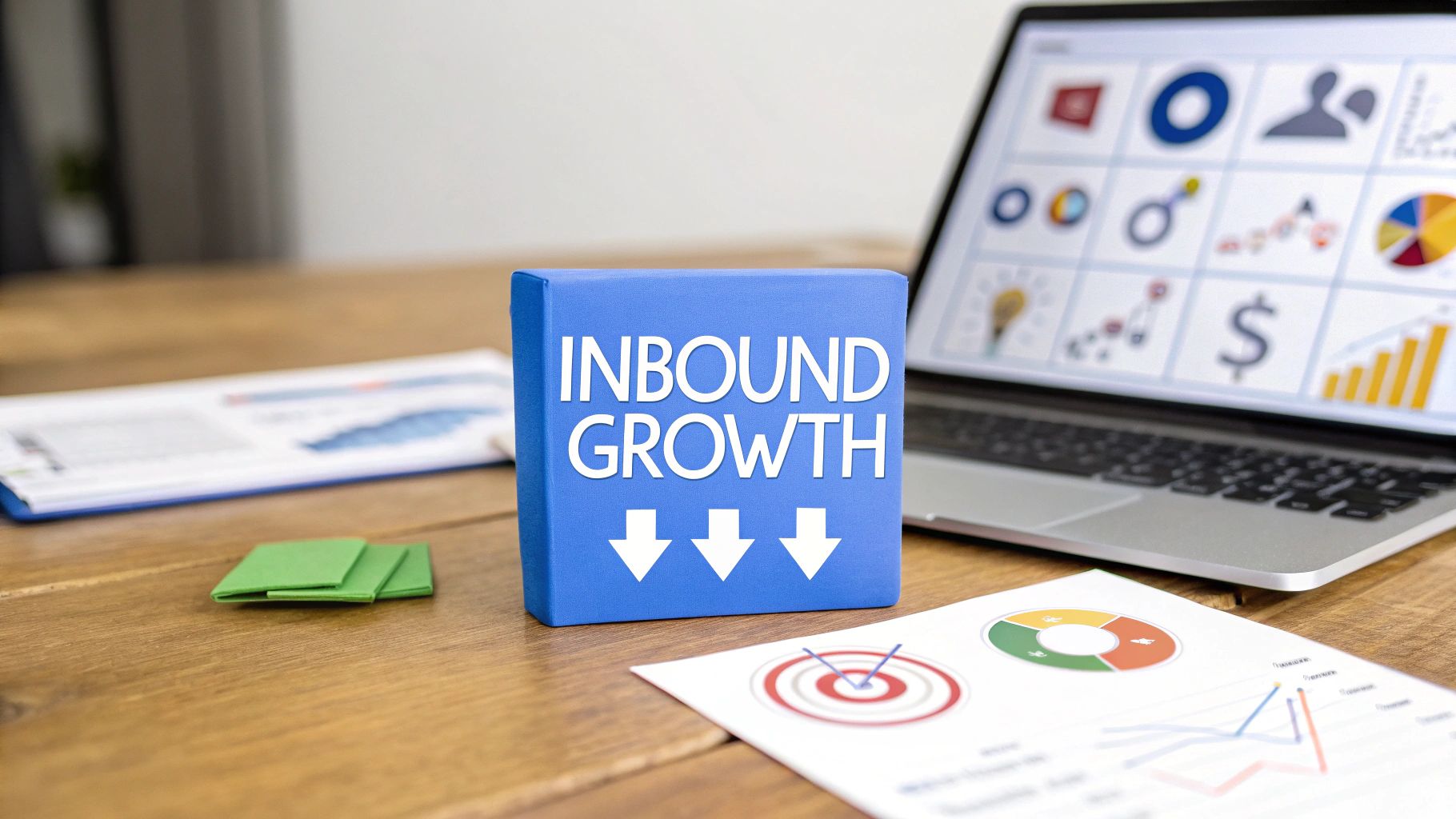
How to Increase Website Conversions: A Step-by-Step Guide for 2025
Meta Description: Ready to boost your sales? Learn how to increase website conversions with proven strategies on user experience, A/B testing, and building trust.
Before you can boost your website conversions, you need to know where you stand. Are you hitting your goals? It's less about making wild guesses and more about digging into your data to see what people are actually doing on your site. This initial analysis is your treasure map—it shows you exactly where the biggest opportunities are hiding.
Taking Stock of Your Current Conversion Performance
Let's get one thing straight: you can't improve what you don't measure. What's the first step? Get a brutally honest picture of your website's performance right now. This isn't about glancing at vanity metrics; it's about a deep dive into your analytics to understand real user behavior.
The goal here is simple: find out which pages are pulling their weight and, more importantly, which ones are sending visitors running for the exit. Without this baseline, any changes you make are just shots in the dark. This is how you turn a pile of raw data into a smart, actionable strategy.
Setting Goals You Can Actually Hit
So, what’s a “good” conversion rate, anyway? The truth is, it completely depends on your industry. As of 2025, the global average for e-commerce is floating somewhere between 2% and 4%. But that number can be misleading.
For example, personal care brands often see an impressive 6.8% average, thanks to lower-priced items and repeat buys. On the flip side, home decor shops average around 1.4% because people naturally take more time to decide on big-ticket furniture. Knowing these benchmarks helps you set targets that make sense for your business. If you sell couches, aiming for a 7% conversion rate overnight is a recipe for disappointment. Focus on small, steady wins that push you toward your industry’s average and beyond.
Find Your MVPs (and Your Weakest Links)
Think of your website as a team. Some pages are your star players, and others are warming the bench. To make a real impact, you need to know who's who. Ready to jump into your analytics? Look for a few key things:
- Top Landing Pages: These are the front doors to your website. Where is most of your traffic landing first? These pages make the first impression and have a massive influence on the rest of the user's journey.
- High-Converting Pages: Which pages are actually closing the deal? Figure out what they're doing right. Is it the killer copy? The irresistible offer? The slick design?
- High-Exit Pages: Where are people giving up and leaving? A high exit rate on a product page or, even worse, the checkout page, is a massive red flag that something is broken.
Pouring your energy into improving a high-traffic page by just 1% will almost always deliver a bigger return than completely overhauling a page nobody sees. This is also where tracking the right numbers becomes critical. For a deeper look at what you should be measuring, our guide on essential KPIs for a website is a great place to start.
To help you get started, we've put together a quick diagnostic checklist. Think of this as your initial game plan—a way to quickly identify where you should focus your efforts first.
Your Initial Conversion Diagnostic Checklist
A quick-start guide to diagnosing your website's current conversion performance and identifying immediate opportunities for improvement.
This checklist isn't exhaustive, but it's the perfect starting point to move from "I think we have a problem" to "I know exactly what we need to fix."
Figuring Out the "Why" Behind the Clicks
Once you know where users are bailing, the million-dollar question is why. This is where you graduate from looking at numbers (quantitative data) to understanding the experience (qualitative insights).
Are people getting lost in your navigation? Is your main call-to-action button practically invisible? Maybe your sign-up form is asking for their life story. To get even more sophisticated and identify which visitors are most likely to convert, you can explore advanced AI Lead Scoring strategies. When you combine hard data with a bit of human empathy, you get a crystal-clear picture of what needs to change.
Optimizing The User Journey For Conversions

A killer conversion rate isn't just about a perfectly colored call-to-action button. It’s the direct result of a seamless, intuitive experience from start to finish. To really move the needle, you have to look at the entire path a visitor takes—from their first click all the way to the final "thank you" page.
Every single step is a chance to either build momentum or introduce friction that kills the sale.
Think of it like a good conversation. If you make it difficult, confusing, or slow, the other person will just walk away. Your website is no different. The goal is to get ahead of your visitor's needs and strip away every possible obstacle, making their journey feel natural and completely effortless.
The Critical Role Of Responsive Design
Mobile traffic is king, but mobile conversions often tell a different, more frustrating story. It’s a huge mistake to assume mobile and desktop users are the same. They aren't. They have different goals, mindsets, and almost zero patience for a clunky experience.
A design that looks great on a 27-inch monitor can be a complete trainwreck on a phone. This is where responsive design becomes non-negotiable. It's more than just squishing your site to fit a smaller screen; it’s about optimizing the entire experience for touch, tiny text, and quick decisions.
The data consistently shows a massive gap. While mobile pulls in about 73% of all online traffic, desktop users convert at around 4.8%. That’s nearly double the 2.9% mobile conversion rate. This almost always points directly to a poor mobile experience. Your first step is understanding this gap exists—then you can work to close it.
Key Takeaway: A bad mobile experience is like putting a "closed" sign on your door for most of your visitors. A mobile-first approach isn't just a best practice anymore; it's a matter of survival.
How Page Speed Directly Impacts Your Bottom Line
Online, speed is money. Nothing torpedoes a user journey faster than a slow-loading page. A one-second delay might not sound like much, but to an impatient visitor, it feels like an eternity. The financial hit is staggering.
Let these numbers sink in:
- A page that takes longer than three seconds to load will lose almost half of its mobile visitors.
- Just a 100-millisecond improvement in load time can boost conversion rates by a full percentage point.
This isn’t some minor technical detail to hand off to your developer and forget about. It's a core business metric. Slow load times create frustration and doubt before a visitor even gets a chance to see what you're offering. Use a tool like Google PageSpeed Insights to find out what's holding your site back. Compressing images, minimizing code, and investing in quality hosting are the foundational steps to a faster, more profitable website.
Streamlining Navigation And Simplifying Forms
Once someone lands on your site, can they actually find what they're looking for? Confusing navigation is a classic conversion killer. People have been trained to expect an intuitive site structure with obvious labels. If they have to hunt for your products, they won't—they'll just bounce.
Here’s how to tighten up your navigation:
- Use Clear Labels: Forget clever or vague terms. Stick to the basics like "Products," "Pricing," and "Contact."
- Add a Search Bar: If your site has a lot of content, a prominent and effective search bar is a must-have.
- Limit Your Menu: Too many options lead to "analysis paralysis." Keep your main navigation focused on the absolute essentials.
At its core, a smooth user journey is built on solid user experience design fundamentals that guide people effortlessly toward taking action.
This "keep it simple" rule is even more critical for forms. Whether it’s a checkout page, a lead magnet download, or a contact inquiry, every single field you add is another reason for someone to give up and leave.
Be ruthless. Do you really need a phone number for a newsletter signup? Is every field in your checkout process absolutely necessary? Trimming your forms down to the bare essentials can have a massive impact on completion rates. By making the path to conversion as short and simple as possible, you remove the final hurdles standing between you and a new customer.
Designing Landing Pages That Convert

If the user journey is the path, your landing page is the destination where the real magic is supposed to happen. You can have the smoothest, most intuitive site navigation, but if that final page doesn't persuade someone to act, the conversion is lost. Think of it as your digital storefront, your sales pitch, and your closing argument all rolled into one.
Crafting a landing page that actually delivers results isn't about guesswork; it's a science. Every single element has to work together with an almost obsessive focus on getting that visitor to take one specific action.
The Anatomy of a Winning Landing Page
A high-converting landing page isn’t just a random collection of pretty elements. It's a strategic framework where every component has a specific job. If you miss one piece, the whole structure can weaken, costing you valuable leads and sales.
Let's break down the essential building blocks:
- A Magnetic Headline: This is the very first thing a visitor reads. It needs to instantly answer their silent question: "Am I in the right place?" Make it clear, compelling, and directly tied to whatever ad or link they just clicked.
- A Clear Value Proposition: Right after the headline, you have to explain what you offer and why it matters to them. This isn't the time for vague industry jargon. Use a sharp subheading and a few benefit-focused bullet points to get straight to the point.
- Compelling Visuals: A high-quality image or a short video showing your product or service in action is huge. Visuals help people understand your offer much faster than text alone and make the page feel far more engaging.
- Social Proof and Trust Signals: Why should a stranger trust you? This is where you show them. Display customer testimonials, star ratings, case studies, or logos of well-known clients. This social proof is what reassures hesitant visitors that they're making a smart decision.
- A Singular, Powerful Call-to-Action (CTA): This is it—the most important element on the page. Your CTA button has to be impossible to miss, use action-oriented language (like "Get Your Free Quote" instead of just "Submit"), and be the only major action they can take.
Pro Tip: Your number one enemy is distraction. A truly great landing page has no navigation menu, no footer links, and nothing else that could pull a visitor away from your main goal. The only way out should be through your CTA or by closing the tab.
Click-Through vs. Lead Generation Pages
Not all landing pages are created equal. You need to align their design and purpose perfectly with your campaign's specific goal. Grasping the difference between a click-through page and a lead generation page is a big step in knowing how to increase website conversions effectively.
A click-through page has one simple job: warm up a visitor and convince them to click through to another page, which is usually a checkout or registration form. It "sells" the next step. A lead generation page, on the other hand, is built specifically to capture a visitor's information—like a name and email—in exchange for some kind of valuable offer.
This one distinction has a massive impact on performance. Recent data shows that landing pages designed for click-throughs have a median conversion rate of 11.3%. That's nearly three times higher than form-based pages, which hover around just 4.1%. While both types are vital, choosing the right one for your campaign is absolutely key. You can discover more insights on conversion benchmarks to see how your industry stacks up.
Putting It All Together With Great Design
Great design isn't just about looking good; it's about guiding the eye and removing friction. It uses visual hierarchy—things like font size, color, and spacing—to draw attention to the most important elements in the right order: headline, value prop, visuals, and finally, the CTA.
White space is your best friend. A cluttered page is an overwhelming page, making it hard for visitors to focus. Use generous spacing around your elements to create a clean, professional look that’s incredibly easy to scan.
For anyone just starting out, using pre-designed layouts can be a huge help. You can explore our guide on free landing page templates to see proven designs you can adapt for your own campaigns.
Ultimately, your landing page is a conversation. It should address a visitor's problem, present your solution with absolute clarity, and make it ridiculously easy for them to say "yes."
Using A/B Testing And Personalization To Grow
Stop guessing what works. Start knowing.
Optimizing your website isn't about gut feelings or just copying what the competition is doing. It’s a methodical process of testing, learning, and refining your approach. This is where A/B testing becomes your most powerful tool for growth.
But great optimization doesn't stop there. Once you figure out what works for your audience as a whole, the real magic happens when you deliver an experience that feels uniquely personal to each visitor. Combining data-driven testing with smart personalization is the engine that drives sustainable growth and helps you truly master how to increase website conversions.
A/B Testing: Let Your Users Tell You What They Want
A/B testing, often called split testing, is a pretty straightforward concept. You create two versions of a webpage—an "A" version (your original, the control) and a "B" version (the variation with one specific change). Then you show each version to a different segment of your audience to see which one performs better. Simple as that.
It’s the most direct way to let your users vote with their clicks. This approach strips ego and assumptions out of the equation and replaces them with cold, hard data.
It All Starts With A Strong Hypothesis
Before you even think about changing a single pixel, every A/B test needs a solid hypothesis. This isn't a random idea; it's an educated guess based on what you're seeing in your analytics, hearing in user feedback, or observing in customer behavior.
A good hypothesis follows a simple framework: "If I change [X], then [Y] will happen, because [Z]."
For instance, a weak idea is "Let's make the button green." A strong hypothesis, on the other hand, sounds like this: "If we change the CTA button color from gray to a high-contrast green, then we will see a 15% increase in form submissions because the button will be more visually prominent and draw more user attention."
This structure forces you to think through the why behind your test, making it a valuable learning opportunity no matter the outcome.
What Should You Actually Test?
While you can technically test anything on your site, some changes pack a much bigger punch than others. It's best to focus your initial efforts on high-leverage areas that can move the needle in a big way.
Here are some of the most effective elements to A/B test:
- Headlines: Your headline is your first—and sometimes only—chance to grab someone's attention. Test different emotional triggers, value propositions, or levels of clarity.
- Calls-to-Action (CTAs): Don't just stick with "Submit." Experiment with the text ("Get Started" vs. "Claim Your Free Trial"), the color, the size, and even the placement of your main button.
- Images and Videos: Does a product video convert better than static images? Does showing a real person's face build more trust than an abstract graphic? Test it.
- Form Length: We all hate long forms. Test removing non-essential fields from your signup or checkout process to see if a shorter, simpler experience boosts completions.
Tools like the now-sunsetted Google Optimize have historically been the go-to for running these experiments, giving marketers an easy way to set up and monitor tests.
The Power of Website Personalization
A/B testing is fantastic for finding the best overall design, but personalization is where you take things to the next level. It's about delivering the right experience to the right person at the right time. Instead of showing everyone the same generic page, you tailor the content based on what you already know about them.
Key Takeaway: Personalization shifts the conversation from "What do most people want?" to "What does this specific person want right now?"
Modern marketing platforms let you customize content based on a huge range of data. For example, a visitor from Canada could see pricing in CAD, while someone from the US sees it in USD. A returning customer could be greeted with a "Welcome back!" message and recommendations based on their past purchases. It's a game-changer.
How To Get Started With Personalization
Getting started with personalization doesn't have to be a massive, complicated project. You can start with some simple yet incredibly effective tactics.
Here are a few ideas to get you started:
- Location-Based Targeting: Show different offers or highlight local shipping options based on a visitor’s geographic location. A simple touch that makes a big difference.
- Behavioral Targeting: If a user has repeatedly viewed products in your "running shoes" category, why not feature that category more prominently on the homepage the next time they visit?
- Traffic Source Personalization: This one is huge for paid ads. Customize your landing page headline to perfectly match the ad copy a visitor clicked on. Someone who clicked an ad for "small business accounting software" should land on a page that immediately talks about that exact solution.
This level of relevance makes your visitors feel seen and understood. It builds trust and dramatically increases the chances they'll convert. It’s the difference between a generic sales pitch and a helpful, one-on-one conversation.
Building Trust And Urgency To Drive Action
You can have the most beautiful landing page in the world and a user journey smoother than silk, but it can still fall completely flat if a visitor doesn't trust you. It's a hard truth, but often the biggest barrier to a conversion isn't your price or your product—it's a simple lack of credibility. You have to earn that click.
This is where a little bit of buying psychology comes into play. If you want to turn a hesitant browser into a confident buyer, you need to combine two powerful forces: trust signals that build credibility and a touch of ethical urgency that encourages them to act now.
The Foundation of Every Conversion Is Trust
Before anyone is going to hand over their email address, let alone their credit card number, they need to feel safe. Building trust isn't a passive thing; it's an active process of showing visitors you're a legitimate, reliable business, not just telling them.
Your first job is to make your credibility impossible to miss. Put your best proof front and center.
Here are a few of the non-negotiable trust signals you should have:
- Authentic Customer Reviews: There's nothing more persuasive than unfiltered feedback from real people. Displaying star ratings and written testimonials directly on your landing pages offers instant validation.
- Security Badges: Logos from well-known security providers (Norton, McAfee) or payment processors (Visa, PayPal) are a powerful visual shortcut to safety. Place them near your forms and checkout buttons.
- Transparent Policies: Make your privacy policy, return policy, and terms of service ridiculously easy to find. This kind of transparency signals that you have nothing to hide and you respect your customers.
Building a foundation of trust isn't a "nice-to-have"—it's a core requirement for knowing how to increase website conversions. An untrustworthy website will always bleed conversions, no matter how great the offer is.
The placement of these elements is everything. For a deeper look at how to show off these trust builders for maximum effect, check out our complete guide on powerful social proofing examples you can implement right away.
Creating Ethical Urgency To Prompt Action
Once trust is established, what's next? You need to give people a compelling reason to act now instead of "later." This is where urgency comes in. When it's used ethically, urgency helps overcome our natural tendency to procrastinate by framing an offer as time-sensitive or limited.
The key word here is ethical. Fake scarcity or a countdown timer that mysteriously resets will destroy the trust you just worked so hard to build. Keep it genuine.
Here are a few effective ways to create real urgency:
- Countdown Timers: A classic for a reason. A visible timer counting down to the end of a sale makes a deadline feel tangible and pushes people to make a decision.
- Low Stock Indicators: This taps right into the fear of missing out (FOMO). Simple phrases like "Only 3 left!" can be the final nudge a customer on the fence needs.
- Limited-Time Promotions: Clearly state the start and end dates for a special deal, like a flash sale or holiday promotion. This creates a natural window of opportunity that encourages action.
Comparing Trust Signals And Urgency Tactics
It's helpful to see these psychological triggers side-by-side. Both are designed to influence behavior, but they work in different ways and serve different purposes. Trust signals build confidence and reduce anxiety, while urgency tactics create a reason to act promptly. The table below breaks down the nuances.
Ultimately, the goal is to find the right balance. Using these tactics thoughtfully ensures you're persuading, not pressuring, your visitors.
Balancing Trust and Urgency for Maximum Impact
Think of trust and urgency as two sides of the same conversion coin. Without trust, any attempt at urgency feels scammy and aggressive. Without urgency, even the most trustworthy site can fail to convert because there's no reason for visitors to stop browsing and start buying.
Imagine a landing page for a flash sale. The bold headline shouts, "50% Off For The Next 24 Hours!"—that’s your urgency. But right below it, you see 4.8-star ratings from over 1,000 customers and a secure checkout badge. That’s your trust. It's the combination of the two that makes the offer both compelling and believable.
The infographic below shows the powerful results of an A/B test on two page versions. The second variant simply included enhanced trust and urgency elements. The difference is stark.
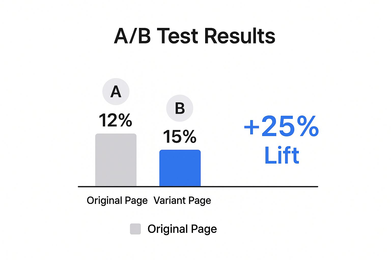
As the data clearly shows, layering these psychological triggers on top of a solid landing page can lead to a huge lift in performance. You're addressing both the logical and emotional needs of your visitors at the same time.
Got Questions? We've Got Answers

We’ve unpacked a lot of strategies for boosting your conversions. But theory is one thing, and putting it into practice is another. Let's tackle some of the most common questions that come up when you're in the trenches trying to make these changes happen.
What Is a Good Website Conversion Rate, Really?
Honestly, a "good" conversion rate is a moving target. It really depends on your industry, your price point, and your business model. You’ll often hear a general e-commerce average floating around 2% to 4%, but relying on that number alone can be misleading.
For instance, a low-cost beauty brand might be crushing it with a 7% conversion rate. At the same time, a high-end custom furniture store would probably be thrilled to hit 1.5%. The best way to gauge your success is to benchmark against your specific industry and—more importantly—focus on beating your own numbers month after month.
The most valuable metric isn't some universal average; it's your own growth. A good conversion rate is one that keeps climbing, proving your optimization efforts are working.
How Long Should I Run an A/B Test?
The perfect length for an A/B test comes down to one thing: your website traffic. Your main goal is to reach statistical significance, which is a fancy way of saying you have at least a 95% confidence level that your results aren't just a fluke.
So many people make the mistake of stopping a test too early and acting on bad data. As a rule of thumb, let your test run for at least one or two full business cycles—that usually means one to two weeks. This helps smooth out any weird fluctuations between weekday and weekend traffic. Luckily, most modern A/B testing tools will give you a heads-up when a result is statistically solid.
What's the One Change That Has the Biggest Impact on Conversions?
Everyone's looking for that one silver bullet. The truth? The highest-impact changes almost always come down to your headline and your main Call-to-Action (CTA). These two elements do the heaviest lifting when it comes to convincing a visitor to stick around.
Your headline has to instantly scream your value proposition, letting visitors know they've landed in the right place. From there, your CTA needs to be obvious, clear, and compelling enough to guide them to the next step without a second thought.
If you’re looking for where to start, these are your best bets:
- Sharpening your headline and sub-headline for absolute clarity.
- Tweaking your CTA button's text, color, and placement to make it pop.
- Cutting out unnecessary form fields to slash friction during sign-up or checkout.
Focusing your energy here is the most efficient way to learn how to increase website conversions. You’re tackling the biggest potential roadblocks in the user's journey right from the start.
Ready to stop guessing and start building landing pages that actually convert? LanderMagic gives you the tools to create dynamic, personalized experiences that match user intent perfectly.