Summary
Meta Description: Ready to boost your website's performance? Learn how to improve website conversion rates with our expert guide on A/B testing, persuasive copy, and user analytics.
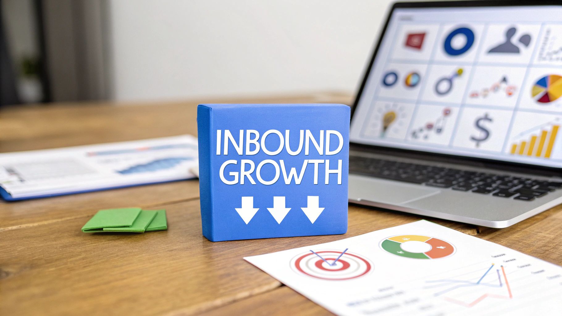
Want to turn more of your website visitors into customers? Before you touch a single button or rewrite a line of copy, you need a solid game plan. Boosting your website's conversion rate starts with a clear understanding of what you want users to do and how to measure their actions precisely. This means getting your analytics and user behavior tools dialed in before you start making changes.
Laying the Groundwork for High Conversions
You can't fix what you can't see, right? Too many businesses dive headfirst into tweaking button colors without knowing their starting point. That’s like trying to navigate a new city without a map—you'll just end up going in circles. To genuinely improve your conversion rates, you must first set a baseline and get the right tools in place.
This initial setup isn't just a technical task; it's the most strategic move you can make. It transforms optimization from a wild guessing game into a repeatable, data-driven process. Skip this, and any "improvements" will be based on gut feelings, not cold, hard evidence.
Define Your Website's Key Conversions
So, what does a "conversion" actually mean for your business? It’s not always about the final sale. A conversion is any meaningful action a visitor takes on your site. For an e-commerce store, it’s a purchase. For a SaaS company, it might be a demo request.
Start by mapping out your primary goals:
- Macro-Conversions: These are the big wins, the actions that directly impact your bottom line. Think completing a purchase, requesting a demo, or submitting a quote request.
- Micro-Conversions: These are the smaller yet crucial steps that show someone is on the right path. This could be signing up for a newsletter, downloading a whitepaper, or adding a product to their cart.
Defining both gives you a complete picture of user engagement. While a macro-conversion is the ultimate prize, tracking micro-conversions helps you understand the small wins leading up to it. Want to go deeper? You can learn more about what a conversion is in marketing and why this step is non-negotiable.
Set Up Analytics and Goal Tracking
Once you know what you’re tracking, you need a system to track it. Google Analytics 4 (GA4) is the industry standard for a reason, but simply dropping the tracking code on your site isn't enough. You have to actively configure it to measure the specific conversions you just identified.
The real goal here is to stop chasing vanity metrics like page views and start focusing on data that tells a story. You need to know which blog post is driving the most demo requests or which ad campaign is leading to the most newsletter sign-ups.
For every macro- and micro-conversion, set up a corresponding goal or conversion event in GA4. It can be as simple as creating an event that triggers when someone lands on your "thank-you" page. This one move immediately lets you see which marketing channels are doing the heavy lifting.
Deploy User Behavior Analytics Tools
While GA4 is great for telling you what is happening, user behavior tools show you why. They add a visual layer of data that a standard analytics platform can't provide. Think of it as installing a security camera on your website.
There are two tools you need in your stack:
- Heatmaps: Tools like Hotjar or Crazy Egg create visual maps of where users click, move their mouse, and scroll. Heatmaps instantly show you which parts of your page get attention and which are completely ignored. Are people clicking on an image that isn't a link? That's a classic sign of user frustration and an easy win.
- Session Recordings: These are video playbacks of individual user sessions. Watching a few of these is like stepping into your visitors' shoes. You can witness their confusion firsthand, spot bugs, and pinpoint the exact moment they abandon your checkout process.
When you combine hard numbers from GA4 with visual insights from these tools, you create a powerful optimization dashboard. You no longer have just data; you have a clear roadmap for improvement.
Finding the Real Reasons Visitors Don't Convert
Okay, you've got your analytics tools fired up. Now what? The numbers tell you what is happening, but the real money is in understanding the why. This is where you put on your detective hat and dig into the human side of user behavior to find those hidden friction points that are bleeding conversions.
You need to become an expert at spotting frustration. This isn't guesswork; it's about learning to read your visitors' digital body language. Every hesitant mouse movement, every confused click—it's all a clue.
Uncover User Frustration with Heatmaps
Heatmaps are fantastic for getting a quick, visual read on user behavior. They show you what gets attention and what gets ignored. But where they really shine is in flagging unusual behavior.
One of the most obvious signs of trouble is the rage click. This happens when a visitor repeatedly clicks a specific spot, expecting something to happen... but nothing does. It’s a dead giveaway for a broken link or a non-clickable element that looks clickable. Finding and fixing these is one of the fastest ways to improve user experience.
See Your Website Through Your Customer's Eyes
While heatmaps show you the crowd, session recordings let you follow an individual. Seriously, have you ever watched recordings of users trying to complete a purchase on your site? It can be a humbling experience. You'll see exactly where they get stuck, what text confuses them, and the precise moment they give up.
It's easy to think your site navigation is perfectly intuitive—after all, you built it. But watching a real person struggle to find the shipping options is undeniable proof that something is broken.
To get organized, it helps to formalize this process by conducting a user experience audit. This turns your observations into a concrete action plan instead of a random list of problems.
Dig Deeper by Segmenting Your Data
Lumping all your visitors into one big bucket is a surefire way to miss critical insights. The real breakthroughs come from segmentation. When you slice your data into smaller, specific groups, patterns start to emerge.
Instead of just looking at your overall bounce rate, ask more pointed questions:
- By Device Type: Are mobile users abandoning product pages more often than desktop users? That could point to a clunky mobile design.
- By Traffic Source: Do visitors from Instagram ads behave differently than those from organic search? Maybe your ad is promising something your landing page isn't delivering.
- New vs. Returning Users: Are first-timers getting lost while loyal customers fly through the checkout? This could mean your value proposition isn't clear enough.
The infographic below drives this home. Once you've identified a key segment—say, mobile users from paid ads—you can optimize the landing page experience specifically for them.
This focused optimization is how you turn data into dollars. By understanding these different user journeys, you can identify the essential KPI for a website that actually matters for each segment.
Industry Conversion Rate Benchmarks
Looking at industry-specific data gives you a much more realistic picture of what "good" looks like. A 2% conversion rate might be amazing for one industry but a disaster for another. Here’s a quick look at how much rates can vary.
Source: Data from various 2024 industry reports.
Context is everything. Instead of chasing a vague global average of 2-4%, benchmark yourself against direct competitors and, more importantly, against your own historical performance. By comparing converting users to non-converting ones within key segments, you’ll build an evidence-backed list of conversion blockers to tackle first.
Designing A/B Tests That Actually Work
So, you’ve dug into the analytics and found the friction points. Now what? It's time to stop guessing and start proving what works. This is where A/B testing becomes your secret weapon for turning behavioral insights into measurable conversion lifts.
Think of it as the scientific method for marketing. You show two different versions of a page to two similar groups of people and let the data tell you which one performs better. It removes ego from the design process.
From Vague Ideas to Strong Hypotheses
Here’s where many marketers drop the ball. They start with a weak idea like, "Let's test the button color." That's a recipe for inconclusive results. An effective test always starts with a strong, data-backed hypothesis.
A good hypothesis is a clear statement that connects a change to an outcome for a specific reason.
- Weak Idea: Let's test a new headline.
- Strong Hypothesis: "We believe changing the headline from 'Our Services' to 'Get a Free Quote in 60 Seconds' will increase form submissions because it communicates a clear, time-sensitive value proposition."
This framework forces you to be specific. What are you changing? What metric do you expect to move? And most importantly, why do you think it will work? Your user behavior analysis should feed directly into that "why."
Setting Up Your A/B Test Correctly
Once your hypothesis is solid, the technical setup is straightforward. The golden rule is to isolate a single variable. If you change the headline, button color, and hero image all at once, you'll have no clue which change made the difference.
Here’s how to get your test started:
- Pick Your Tool: Platforms like VWO or Optimizely make this process simple. They handle the heavy lifting of splitting traffic and tracking results. Even Google Analytics 4 has built-in testing features.
- Create Your Variation (B): Take your original page (the "control") and duplicate it. Then, make that one specific change you outlined in your hypothesis. This new page is your "variation."
- Define a Clear Goal: What single action determines the winner? A click on the main CTA? A completed form submission? This conversion goal has to tie directly back to your hypothesis.
If you're looking for the right platform, there’s a ton of great info on the best landing page optimization tools to help you run tests effectively.
Knowing When You Have a Winner
How long should a test run? The answer has nothing to do with a specific number of days. It’s all about reaching statistical significance. This is a fancy way of saying you have mathematical confidence that your results aren't a random fluke.
Most testing tools calculate this for you, but the industry standard is to aim for a 95% confidence level. This means you can be 95% sure that if you roll the winning version out to everyone, you'll see a similar lift in conversions.
Calling a test too early is a classic rookie mistake. A huge conversion spike on day one could be an anomaly. You have to let the test run its course until your tool gives you the green light, ensuring your decisions are based on solid data.
Writing Copy and Designing for Persuasion

Once you’ve dug into the data and started running tests, it’s time for the heart of persuasion: your words and visuals. Your website's copy and design are your 24/7 sales team. They’re either convincing visitors to stay or sending them packing in seconds.
The mission isn't just to make things look pretty. It's about architecting an experience so smooth that it naturally guides users toward saying "yes." Every element needs to work together to build confidence.
Craft Headlines That Answer "What's In It for Me?"
Let's be real: you have about three seconds to grab a visitor's attention. Your headline is the first thing they see, and if it's weak, you've already lost. The best headlines cut through the noise by immediately answering the visitor's most pressing question: "What's in it for me?"
Forget clever, vague taglines. Focus on clarity and tangible benefits.
- Weak Headline: "Innovative Marketing Solutions" (Means nothing. What kind of solutions?)
- Strong Headline: "Double Your Leads in 90 Days with Our Proven SEO Strategy" (Specific, benefit-driven, and time-bound. Now we're talking.)
Want to take it a step further? Interactive dialogues can be incredibly persuasive. Think about strategies like building a chatbot for lead generation that converts to actively pull prospects into a conversation.
Design Calls to Action That Create Urgency
Your call-to-action (CTA) button is the final doorway. Simply slapping "Submit" on a button is a massive missed opportunity. Your CTA copy needs to reinforce the value the user is about to get.
A great CTA completes the sentence, "I want to..." So instead of "Download," try "I want to Get My Free Ebook." This subtle shift reframes the action around their benefit.
Color and contrast are your allies. Your CTA should be one of the most visually dominant elements on the page. Inject a little urgency with phrases like "Get Instant Access" or "Claim Your Spot Now" to nudge people into action.
Build Instant Trust with Strategic Design
A professional, trustworthy design is non-negotiable. Research consistently shows that 94% of a visitor's first impression is tied directly to your site's design. A dated or confusing layout will kill your credibility on sight.
Here are a few design moves that build trust:
- Simplify Your Forms: Be ruthless. Only ask for the information you absolutely need. Every extra field introduces friction.
- Showcase Social Proof: Place customer testimonials, five-star ratings, or logos of well-known clients right near your CTAs. This reassures a hesitant visitor.
- Use High-Quality Imagery: Invest in professional photos. Generic stock photos can make your brand feel cheap. Your visuals should match the quality of your offer.
It's also critical to remember that traffic source impacts conversion rates. Direct traffic converts at the highest average rate of around 3.3%. Paid search isn't far behind, averaging 3.2%. Knowing this helps you tailor your design and copy to the visitor's mindset from the second they land.
Fixing Technical Issues That Kill Conversions
All the effort you pour into persuasive copy and slick design can be wasted if your website is slow, buggy, or broken. Technical issues are the silent killers of conversion. A visitor might be ready to buy, but if they have to wait an eternity for a page to load, they're gone.
Fixing these underlying problems is a massive part of conversion rate optimization. Think of it as paving the road to your checkout. A smooth experience builds trust and keeps your visitor moving forward.
Supercharge Your Website Page Speed
When it comes to e-commerce and lead generation, speed is the name of the game. Every second counts. A slow website feels unprofessional and sends a clear signal that you don't respect visitors' time.
Page load speed is a massive factor for conversions. The data doesn't lie: sites loading within 2.4 seconds see conversion rates around 1.9%. Let that slip to 3.3 seconds, and you're looking at 1.5%. At 4.2 seconds, you've dipped below 1%. If your site takes a sluggish 5.7 seconds or more, conversions can crater to a dismal 0.6%. You can dig into more of these conversion rate optimization statistics to see just how much a slow site is costing you.
So, where do you start?
- Compress Your Images: Giant, unoptimized images are the #1 offender for slow pages. Use a tool to shrink them without losing quality.
- Enable Browser Caching: This tells a visitor's browser to save parts of your site, so it doesn't have to reload everything on their next visit.
- Minimize Your Code: Bloated HTML, CSS, and JavaScript can drag down performance. Clean it up and get rid of anything that isn't necessary.
Ensure a Flawless Post-Click Experience
Have you ever clicked an ad for "50% off running shoes" and landed on a generic homepage? It’s frustrating. That disconnect between the ad's promise and the landing page's content is a huge conversion killer. We call this the post-click experience.
Your landing page needs to be a perfect reflection of the ad that brought the visitor there. The headline, images, and offer must all align. If the user has to hunt for the deal you promised, you've already lost them.
Your ad makes a promise. Your landing page must deliver on it instantly. Consistency isn't just good practice; it's the foundation of a high-converting user journey.
This is non-negotiable for paid campaigns where you're bleeding cash for every click. Nailing your message match is one of the simplest ways to improve your ROAS.
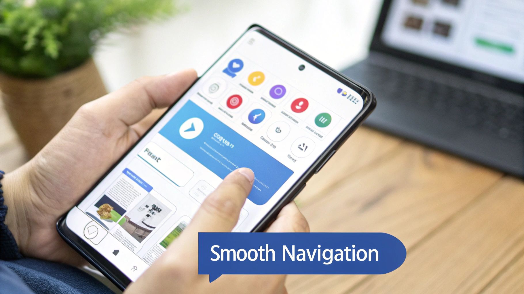
Truly Optimize for Mobile Users
Look, having a "responsive" website isn't enough anymore. A desktop site that shrinks to fit a tiny screen isn't optimized for mobile. It's just smaller. Mobile users are distracted and using their thumbs. The experience has to be dead simple.
How can you improve mobile conversion rates?
- Think "Thumb-Friendly": Are your buttons big enough to tap without zooming in? Is there enough space between links?
- Simplify Navigation: Ditch the complex, multi-level desktop menu. It’s a nightmare on a phone. Keep it streamlined.
- Streamline Forms: Nobody wants to fill out a 10-field form on their phone. Keep it brutally short and use mobile-friendly inputs like dropdowns.
By tackling these core technical pillars—speed, message consistency, and true mobile optimization—you build a rock-solid foundation that allows your great copy and design to do their job.
Common CRO Questions (and Straight-up Answers)
Jumping into conversion rate optimization always brings up a few questions. It's normal to wonder if you're doing things right, what kind of results are realistic, and how to sidestep common mistakes. Let's clear the air on some of the most common questions.
Getting these fundamentals straight from the start helps you set sane expectations and build an optimization strategy that works for the long haul.
So, What's a Good Website Conversion Rate?
This is the million-dollar question, and the only honest answer is: it depends on your industry, business model, and traffic source. There's no single magic number. The global average might hover between 2% and 5%, but that figure is often misleading.
Think about it. An e-commerce store selling trendy t-shirts might see conversion rates over 4%. A B2B SaaS company selling a six-figure enterprise package would celebrate a 0.5% conversion rate, because each deal is massive.
Instead of getting hung up on a universal benchmark, focus on two things:
- Your Industry's Ballpark: Use industry averages as a quick gut check to see if you're in the right zip code.
- Your Own History: This is the metric that truly matters. Your goal is to consistently beat your own numbers from last month or last quarter. That's real progress.
Your goal isn't to hit an arbitrary industry standard. It's to build a system of testing that keeps lifting your own conversion rate over time. That's the only way you really win.
How Long Until I Actually See Results?
Patience is key in CRO. While you might find a quick win with a simple A/B test, reliable results don't happen overnight. The time it takes to see an impact boils down to one thing: your website's traffic volume.
A site with tons of traffic might run a test and hit statistical significance (95% confidence) in just a couple of days. But for a site with less traffic? You might need to let that same test run for several weeks to get enough data for a trustworthy decision.
It's critical to let tests run their full course. Pulling the plug early because of an initial spike is a classic mistake that will lead to a false conclusion. Improving your conversion rate is a marathon, not a sprint.
What's the Biggest Mistake Newcomers Make?
Easy. The single biggest mistake is testing without a data-backed hypothesis. They jump right into changing button colors or messing with headlines based on a gut feeling. It's like throwing darts in a dark room—you might hit the board eventually, but it'll be pure luck.
This guesswork leads to a frustrating cycle of inconclusive tests and wasted time. You might get a tiny lift, but you'll have no clue why it worked, which means you can't learn from it.
Every test you run needs to start with an insight from your analytics, heatmaps, or user feedback. Always kick things off with a clear hypothesis: "We believe that by making [this specific change], we will achieve [this specific outcome] because of [this user behavior we observed]." This disciplined approach is what separates random tinkering from a powerful engine for consistent growth.
Ready to move beyond guesswork and start creating landing pages built to convert? At LanderMagic, we specialize in dynamic, AI-powered landing pages that adapt to your audience for an optimized post-click experience. See how LanderMagic can transform your Google Ads performance.