Summary
Meta Description: Ready to turn clicks into customers? Our expert guide reveals the secrets to building high-converting landing pages that drive real results and boost your ROI.
What exactly is a high-converting landing page? It’s a specialized web page built for one reason and one reason only: to persuade a visitor to take a specific action. Unlike your homepage, designed for exploration, a great landing page strips away all the noise. It creates a single, focused path for the user, whether that's signing up for a newsletter, downloading a free guide, or buying a product.
Ready to build pages that don't just look good, but actually perform?
What Are High-Converting Landing Pages?
Think of your main website as a sprawling department store. It has dozens of aisles, endless products, and multiple exits. It's easy for people to wander, browse, and get lost.
A high-converting landing page, on the other hand, is like a pop-up boutique shop with a single, clear purpose. From the moment someone walks in, every single element—the sign in the window, the product displays, the salesperson's first words—is laser-focused on guiding them toward one specific outcome.
This singular focus makes these pages incredibly effective. They are your best digital salesperson, working around the clock to turn clicks into tangible business results. Instead of just hoping visitors stumble upon your contact form, a landing page paves a direct, frictionless road straight to a conversion.
The Purpose of a Dedicated Landing Page
So, why not just send all your ad traffic straight to your homepage? The answer comes down to one word: focus. A homepage has to wear many hats, linking to your "About Us" page, your blog, your services, and everything in between. All those choices can be paralyzing.
A dedicated landing page eliminates "analysis paralysis" by doing a few things exceptionally well:
- Matching Visitor Intent: It aligns perfectly with the ad or link the visitor just clicked, giving them instant confirmation they're in the right place.
- Removing Distractions: The best landing pages often ditch the main navigation menu entirely. This forces the visitor to engage with the offer in front of them, without tempting escape routes.
- Speaking to a Specific Audience: You can tailor the message, visuals, and offer to a single audience segment, making the content feel far more personal and persuasive.
A landing page isn't just another page on your website; it's a strategic tool designed to get the absolute most out of your marketing spend. Its only job is to convert a visitor who has already shown interest in what you're offering.
Setting Realistic Conversion Goals
Before you start building, it's crucial to know what a "good" conversion rate actually looks like. The numbers can vary significantly depending on your industry and what you're asking people to do.
What kind of results should you aim for?
Average Landing Page Conversion Rates by Industry
Here's a quick look at some typical conversion rate benchmarks. Use these to set realistic goals for your own pages.
Source: Mailmodo
As you can see, B2B pages often have higher conversion rates, but every industry has its nuances. These numbers provide a solid starting point for your strategy.
Ultimately, building these pages solves a common business problem: getting website visitors who don't just browse, but actually take the next step. For a deeper dive into the nuts and bolts, check out this comprehensive guide to building high-converting landing pages. Getting this foundation right is the key to creating pages that drive serious results.
The Core Components of a Winning Landing Page
Every high-converting landing page is a finely tuned machine, built from a handful of essential, hard-working parts. Think of it as a recipe where each ingredient is critical. If you miss one, the whole thing falls flat. This is your blueprint for the five core elements you must get right.
These components work in harmony to guide a visitor from initial curiosity to decisive action. From the headline that hooks them to the button they can't resist clicking, each piece has a specific job. Once you understand how they fit together, you're on your way to building landing pages that truly convert.
An Unforgettable Headline
Your headline is, without a doubt, the most important text on the entire page. It’s the first thing people see, and you have about three seconds to grab their attention and convince them to stay. A great headline doesn’t just describe your offer; it screams its value from the rooftops.
It must be crystal clear, benefit-focused, and perfectly matched to the ad or link the visitor just clicked. If your ad promised “Effortless Smoothie Recipes,” your headline needs to echo that promise, not suddenly discuss blender specs. This creates a seamless, reassuring experience that tells users they’ve landed in the right place.
The infographic below drives this point home, placing the headline at the very top of a marketer’s to-do list.

This visual makes it clear: without a powerful headline, everything else on your page might as well be invisible.
Persuasive and Scannable Copy
The headline did its job. Now, your page copy must carry the ball over the finish line. Its purpose is to build on that initial promise, address any doubts, and persuade the visitor that your offer is the solution to their problem. But here's the catch: people don't read websites. They scan.
That’s why your copy has to be ridiculously easy to digest.
- Short paragraphs are your friend: Stick to one or two sentences maximum.
- Use bullet points: They are perfect for breaking down features and benefits into bite-sized, scannable lists.
- Focus on benefits, not features: Instead of saying, "Our software has 128-bit encryption," try, "Keep your data completely safe from prying eyes."
This approach helps visitors absorb the most important information in seconds, guiding them smoothly toward the call to action.
Engaging and Relevant Visuals
On a landing page, a picture is worth a thousand words—maybe more. High-quality images or a slick video can communicate your offer's value faster and more emotionally than text ever could. But the key word here is relevance. Your visuals must directly support your message and help the visitor picture themselves succeeding with your product or service.
For instance, if you're selling a project management tool, a screenshot of a messy spreadsheet is a total buzzkill. A short video showing a team breezing through tasks in your clean interface? That’s the ticket. Pick visuals that tell a story and make your offer feel real.
Trust-Building Social Proof
Why should a stranger on the internet trust a single word you're saying? This is where social proof swoops in to save the day. It’s proof from other people that your offer is legitimate and effective, instantly reducing skepticism. In fact, studies show that adding social proof can give your conversion rates a serious boost.
By showing that real people—people just like your visitor—have already found success with your offer, you lower their perceived risk. It makes saying "yes" feel much safer.
Here are a few of the most powerful types of social proof:
- Customer Testimonials: Real quotes from happy customers, ideally with a name and photo to make it genuine.
- Case Studies: Deeper dives that tell a customer’s success story from start to finish.
- Trust Badges: Think logos of big-name clients, media mentions ("As seen in..."), or security certifications.
- Data Points: Hard numbers are incredibly persuasive. Think "Over 10,000 satisfied customers" or "Trusted by teams at Google."
An Irresistible Call to Action
Finally, every element on your page—the headline, the copy, the visuals, the social proof—should point to one destination: the Call-to-Action (CTA). This is the button that asks for the conversion. Your CTA needs to be impossible to miss, usually with a bold, contrasting color that makes it pop right off the page.
But design is only half the battle. The text on the button itself needs to be clear, direct, and action-focused. Ditch generic words like "Submit" or "Click Here." Instead, use specific language that reminds the user of the value they’re about to receive. For example, "Get Your Free Ebook" is infinitely more compelling than "Download." This is the final handshake that turns a curious visitor into a real lead or customer.
Applying Design Principles That Convert
Great design isn’t just about making a page look pretty. It’s the invisible force that directs a visitor’s eyes and actions, acting as the architecture of persuasion. Every choice—from your headline's size to your CTA button's color—either pulls someone closer to your goal or pushes them away.
At its core, an effective page layout is rooted in psychology. When you understand how people scan and process information, you can build a frictionless path that leads straight to a conversion. This isn't about artistic flair; it's about strategic direction.
You have the right ingredients. Now it’s time to arrange them perfectly, so your value is easy to grasp and your call to action is impossible to ignore.
Master Visual Hierarchy to Guide the Eye
Visual hierarchy is a fancy term for arranging elements on your page to show what’s most important. For a landing page, that means making your headline and CTA the undeniable stars of the show. You are essentially telling the visitor’s eyes exactly where to look first, second, and third.
How do you pull this off?
- Size Matters: The most critical elements should be the largest. Your main headline needs to dwarf the body text, and your CTA button should be substantial enough to demand attention.
- Strategic Color: Give your CTA button a bold, contrasting color. If your page is full of blues and whites, a bright orange or green button will naturally pop, screaming, "Click me!"
- Smart Placement: In Western cultures, people tend to scan pages in an "F" or "Z" pattern. Placing your most crucial information along these natural eye paths makes it far more likely to be seen and absorbed.
By deliberately controlling this visual flow, you stop users from feeling overwhelmed and instead guide them effortlessly toward your conversion goal.
Leverage Whitespace for Clarity and Focus
Whitespace, or negative space, is the empty area around your page elements. It’s anything but wasted—in fact, it’s one of your most powerful design tools. It acts like a frame, separating and emphasizing the important parts of your message.
A cluttered page is a cognitive burden. When text, images, and buttons are crammed together, the user’s brain has to work harder to figure out what matters. That friction is the enemy of conversion.
Whitespace is the silent partner in a high-converting design. It reduces clutter, improves readability, and creates a sense of calm and focus, making it easier for visitors to process your offer and take the desired action.
Think of it as giving your content room to breathe. Proper use of whitespace makes your copy more scannable and your CTA more prominent. It’s a simple change that can make your page feel more professional, trustworthy, and easier to act on.
Adopt a Mobile-First and Distraction-Free Approach
These days, a mobile-first design isn’t an option; it’s a necessity. A huge portion of your traffic will come from smartphones, so your landing page must look and function flawlessly on a smaller screen. That means bold, readable text, large tap-friendly buttons, and a simple, single-column layout.
Just as critical is creating a "sealed" experience. A standard website is full of escape routes—navigation menus, footers, sidebars. A high-converting landing page removes these leaks.
By eliminating the main navigation, you focus the visitor’s attention on the one path you want them to take. This single-minded approach dramatically increases the odds they will complete the form or click the button instead of wandering off to your "About Us" page.
This strategy is also why having multiple, targeted pages is so effective. Companies using 31 to 40 landing pages see seven times more leads than those with just one to five pages. Each page can be a perfectly sealed environment for a specific campaign. You can discover more stats on how page volume impacts lead generation.
Writing Persuasive Copy That Drives Action
If great design sets the stage, your copy is the star of the show. It’s what delivers the final, persuasive punch. Every word on your landing page is valuable real estate—an opportunity to connect with your visitor, speak to their deepest needs, and guide them toward a confident “yes.”
This isn't about being clever or stuffing your page with buzzwords. It’s about crafting a crystal-clear message that gets people to act.
Great copy never just lists features. It translates those features into tangible benefits that solve a real problem for the visitor. Don't say your software has "AI-powered scheduling." Say, "Effortlessly reclaim 10 hours of your week." See the difference? One is about your product; the other is about their life.
Address Customer Pain Points Directly
Before writing a single word, you must know exactly who you're talking to. What keeps them up at night? What frustrations are they desperate to escape? Your copy should be a mirror, reflecting their problems back to them so they feel completely seen and understood.
This is how you build instant trust. By articulating their struggle better than they can, you position your offer not just as a product, but as the solution they've been searching for. You want them thinking, "Finally, someone who gets it!"
For a more advanced take, you can even tailor your copy in real-time. Check out our guide on using dynamic keyword insertion on landing pages to see how you can make your message feel intensely personal to every visitor.
Use a Proven Copywriting Framework
You don't have to reinvent the wheel. Copywriting frameworks give you a time-tested structure for your message, walking the reader logically from curiosity to conversion. One of the most effective for landing pages is the AIDA model.
It breaks down your copy’s job into four simple stages:
- Attention: Grab them with a powerful, benefit-driven headline they can't ignore.
- Interest: Build on that initial hook. Use compelling subheadings and an engaging opening to dive deeper into their problem.
- Desire: This is where you paint a vivid picture of success. Show them what life looks like with your solution. Use bullet points, social proof, and emotional language.
- Action: End with a clear, urgent, and irresistible Call-to-Action (CTA) that tells them exactly what to do next.
Following this simple flow ensures your message builds momentum, making the final ask feel like the most natural next step.
Your landing page copy is a conversation, not a lecture. It should be clear, simple, and all about the visitor. Ditch the industry jargon. If a 10th grader can't understand it in seconds, it's too complicated.
Craft an Irresistible Call to Action
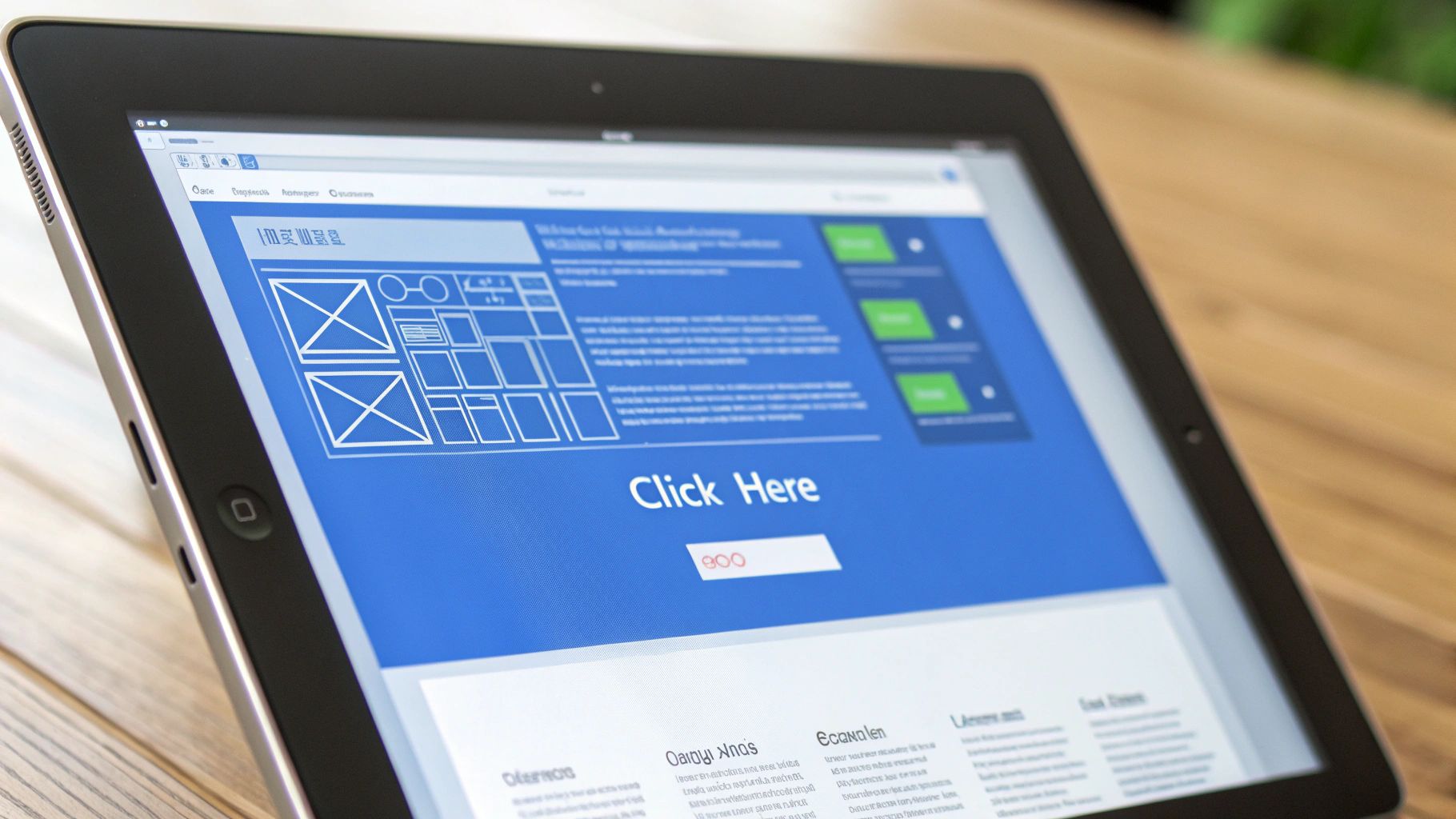
Your Call-to-Action (CTA) is arguably the most important snippet of copy on the entire page. It's the final instruction that seals the deal. Vague phrases like "Submit" or "Click Here" are conversion killers. They are boring and create uncertainty.
Instead, your CTA button needs to be specific, action-oriented, and focused on the value they’re about to receive. Reinforce what they’re getting. For example, “Get Your Free Marketing Plan” is infinitely more compelling than “Download.” It’s not just a button; it’s the gateway to the value you promised.
At the end of the day, small tweaks to your copy can lead to massive gains. The average landing page converts at a mere 2.35%, but pages with laser-focused copy and design can do so much better. Top performers often hit conversion rates between 21% and 50%. You can discover more insights about conversion rate optimization to see just how high you can aim.
Learning From Real-World Landing Page Examples
Theory is great, but seeing how the pros do it is where the real learning happens. It’s one thing to talk about high-converting principles; it’s another to see them working together in the wild.
By breaking down what makes a successful landing page tick, we can move from abstract ideas to a practical playbook. Let's dig into a few examples to see how they expertly blend design, copy, and psychology to get results. These pages aren't just pretty—they're finely-tuned conversion machines.
SaaS Example: The Clean and Confident Approach
Picture a popular project management tool. The moment you land on their page, you’re greeted with a simple, benefit-focused headline like, "The Easiest Way to Manage Projects." It's not about features; it's about solving your biggest headache. The subheadline usually drives it home with a tangible outcome, like, "Get more done with less effort."
The entire page is engineered to build trust and eliminate friction:
- Minimalist Design: Lots of whitespace keeps your eyes on the main message and the all-important CTA button.
- Trust-Building Logos: They’ll flash the logos of big-name companies using their software. It’s powerful social proof that works instantly.
- A Simple CTA: The call-to-action is often a low-commitment "Get Started for Free," which vaporizes the financial risk for anyone on the fence.
This approach is so effective because it makes the decision feel safe and painless. The clean design screams "simplicity," while the social proof tells you you're making a smart choice.
E-commerce Example: Creating Urgency and Desire
Now, let's switch gears to an e-commerce brand dropping a limited-edition product, like a fresh pair of sneakers. Their landing page plays a completely different psychological game. The mission here is to crank up desire and create a powerful sense of urgency.
Visuals are the star of the show. You'll see high-quality, dynamic images showcasing the product from every conceivable angle, making it feel almost tangible. The copy is short, punchy, and packed with emotion, focusing on exclusivity and status.
The most effective e-commerce landing pages don't just sell a product; they sell an experience. They make you feel like you'll miss out on something special if you don't act immediately.
You’ll almost always find these elements in the mix:
- Countdown Timers: A clock ticking down is a classic and brutally effective way to trigger the fear of missing out (FOMO).
- Customer Photos: Seeing real people rocking the product makes the purchase feel more relatable and trustworthy. It's social proof in action.
- Clear Value Proposition: "Free Shipping & Easy Returns" is usually plastered somewhere obvious to squash any last-second doubts.
Professional Services Example: Building Authority and Trust
Finally, consider a page for a financial advisor or a law firm. The conversion goal here isn't a quick sale—it's booking a consultation. The entire strategy shifts from urgency to building unshakable authority and trust.
The design is buttoned-up and professional, often using a color palette that feels stable and reliable. The copy is more detailed, usually featuring a professional headshot of the expert while highlighting their credentials, awards, or years of experience.
To see how personalization takes these pages to the next level, check out these dynamic landing page examples that adapt their content based on who is visiting. Ultimately, the goal is to make the visitor feel like they're in capable hands, turning a cold click into a warm prospect ready to talk.
A Simple Framework for Testing and Optimization

Hitting "publish" on your landing page isn't the finish line—it's the starting block. The most successful high-converting landing pages aren't just built and forgotten. They're the product of constant, data-backed tweaking. This is where you trade guesswork for a reliable system that pushes your conversion rates higher.
Think of your page not as a static brochure but as a living tool. By methodically testing different elements, you can figure out exactly what makes your audience tick and, more importantly, what pushes them to act. This is how you stop wondering what works and start knowing.
Embrace the Power of A/B Testing
At the core of all good optimization is A/B testing, sometimes called split testing. It's a simple idea: compare two versions of your landing page to see which one performs better. You show version "A" (the control) to half your visitors and version "B" (the variation, with one single change) to the other half.
The whole point is to isolate one variable and measure its direct impact on conversions. Did that new headline boost sign-ups? Did changing the CTA button from blue to orange get more clicks? A/B testing gives you hard answers backed by real user behavior.
Optimization isn't about massive, sweeping redesigns. Often, the smallest changes—a different word in a headline, a new image, or a shorter form—can produce the most significant lifts in conversion rates.
To get going, focus on high-impact elements first. Here are great places to start your tests:
- The Main Headline: Pit a benefit-driven headline against one that asks a compelling question.
- The Call-to-Action (CTA) Button: Play around with the button's color, size, and text. Try "Get Your Free Trial" vs. "Start Now."
- Page Visuals: Compare a photo of a person against a product image or an abstract graphic.
- Form Length: Does a form with three fields convert better than one with five? Test it and find out.
Develop Your Optimization Workflow
A structured approach to testing is your best friend. It keeps you from making random changes and helps you build on what you learn over time, making each test smarter than the last.
Just follow this simple, three-step framework:
- Form a Hypothesis: Start with an educated guess. For instance: "I believe that making the CTA button text more specific will increase clicks because users will have a clearer idea of what they're getting."
- Run the Test: Use a testing tool to create your "B" version and split your traffic. Let the test run long enough to gather solid data—this usually means waiting for at least a few hundred conversions.
- Analyze and Implement: Once the test is over, look at the numbers. If your hypothesis was right and the new version won, make it your new control page. If it lost, that's still a win—you've learned something valuable. Form a new hypothesis and go again.
This continuous loop of hypothesizing, testing, and analyzing is the engine of successful optimization. For a much deeper look into this process, check out these essential conversion rate optimization best practices. You can also supercharge your results by pairing your landing pages with solid marketing automation best practices to better nurture the leads you capture.
Common Questions We Hear All the Time
Even when you know the ropes, building landing pages that convert can bring up nagging questions. It’s normal. Getting these cleared up will help you move forward with more confidence.
Let's dig into some of the most common questions we get from marketers just like you.
How Many Landing Pages Do I Really Need?
There’s no magic number, but the data is crystal clear: more is almost always better. The best practice is to create a unique landing page for every single ad group, marketing campaign, or audience you’re targeting.
Why go through the trouble? It lets you nail the message. You can perfectly tailor the headline, images, and offer to match what that specific visitor is looking for. This level of relevance is what sends conversion rates through the roof. It might feel like more work upfront, but the payoff is huge.
What's a Good Landing Page Conversion Rate Anyway?
A "good" rate is all over the map. It completely depends on your industry, your offer, and where your traffic is coming from. While you’ll see general averages floating around 2-5%, that’s not a useful benchmark to chase. Top-performing pages often convert at 10%, 20%, or even higher.
Instead of getting hung up on some universal number, your real goal should be to figure out your own baseline. From there, it's all about A/B testing to beat that number again and again. For your business, a good conversion rate is one that’s consistently getting better every month.
Focus on your own progress. That's the only metric that truly matters.
Should I Actually Remove the Navigation Menu?
In almost every single case, the answer is a resounding yes. Remember, your landing page has one job and one job only: to get that conversion. A navigation menu is just a list of escape routes, inviting visitors to get distracted and wander away from your call to action.
By stripping out the main navigation, you create a focused, frictionless path that guides the user straight to the finish line. It’s a simple change that dramatically improves what marketers call the "attention ratio," ensuring the visitor's focus stays locked on the one thing you want them to do.
Ready to stop leaving conversions on the table? With LanderMagic, you can create stunning, personalized landing pages that turn more clicks into customers. Start building for free and see the difference a dynamic, high-converting landing page can make for your campaigns. Start your free trial at LanderMagic today!