Summary
Meta Description: Create a high converting landing page with our expert guide. Learn the core anatomy, design principles, and copywriting secrets that turn clicks into customers.
A high-converting landing page is a specialized, ultra-focused web page built for a single purpose—whether that's to capture an email, drive a sale, or book a demo. It’s not just another page on your site; it’s a finely-tuned machine. It works by combining a killer value proposition, persuasive copy, and a frictionless user experience to nudge visitors toward one specific action.
If it’s working right, it instantly answers your visitor’s most important question: “What’s in it for me?” Ready to build one? Let's dive in.
The Core Anatomy of a High Converting Landing Page

Have you ever wondered what truly separates a landing page that converts like crazy from one that just… exists? It isn't magic. It's a deliberate strategy. Every high-performing page is built on a foundation of proven components working together in perfect harmony. Think of it as an engine where every part has a critical job.
Forget generic templates for a moment. Instead, think about the psychology that turns casual clicks into loyal customers. You have less than five seconds to grab their attention, communicate your value, and earn their trust. That’s why understanding the anatomy of a high converting landing page is non-negotiable. For a deeper dive into these foundational elements, resources like Vizule.io's Lander guide can be incredibly helpful.
Key Components Every Successful Page Shares
At its core, a landing page that works boils down to a few essential elements. Once you master these, every other design and copy decision becomes infinitely easier.
- A Magnetic Headline: This is your first impression, and you only get one. It must grab attention and clearly state the biggest benefit of your offer. Critically, it needs to match the message from the ad or link the visitor just clicked.
- A Crystal-Clear Value Proposition: Your page must immediately answer: what is this, who is it for, and why is it the best choice? This isn't just text; it’s a combination of your headline, a punchy subheadline, and strong visuals.
- Compelling Visuals: A great photo or a short video can communicate value much faster than a block of text. Show your product being used or, even better, show the positive outcome your customer can expect.
- An Unmistakable Call-to-Action (CTA): What’s the one thing you want them to do? Your CTA button needs to pop off the page with a contrasting color and use clear, action-oriented text like "Get Your Free Quote" instead of a boring "Submit."
The golden rule is focus. A great landing page ruthlessly removes distractions—navigation menus, footer links, sidebars—to keep the visitor locked in on the one goal you want them to complete.
Building on the Foundation with Trust Signals
Beyond these core pieces, building trust is what seals the deal. You do this with social proof. Think testimonials from happy customers, logos of companies you've worked with, or short case studies proving others have had a great experience with you. Without these trust signals, even the most amazing offer can fall completely flat.
Ultimately, understanding this anatomy gives you a powerful framework. While you can get a running start with our guide on free landing page templates, knowing why these elements work is what will empower you to test, tweak, and optimize your way to incredible conversion rates.
How to Design a Landing Page for Persuasion

Let's be blunt: a beautiful landing page that doesn't convert is just an expensive piece of art. Great design was never about looking pretty; it’s about psychology and persuasion. Every element—from the colors you pick to the amount of breathing room—has one job: guide your visitor’s attention directly to your call-to-action.
This is where visual hierarchy comes in. It’s the art of arranging elements to signal their importance. Through a smart mix of size, color, and placement, you can create a clear path that a visitor’s eyes will naturally follow, leading them right where you want them to go.
When you nail this, the design feels intuitive and trustworthy. It makes the decision to convert feel like the next logical step, not a hard sell.
Master Your Visual Hierarchy for Better Flow
Think of your landing page as a conversation. Your most important point—your call-to-action—should be the loudest voice in the room. You can do this without being obnoxious just by sticking to some simple design principles.
For example, your CTA button needs the strongest visual weight. That means making it larger than other buttons and using a color that pops right off the background. This simple trick makes it almost impossible to miss.
Another pro tip is to surround your CTA with plenty of white space (also called negative space). This gives it room to breathe and naturally draws the eye toward it. Clutter is the enemy of conversion. It creates confusion and decision fatigue, whereas a clean, spacious layout signals professionalism and helps your core message shine.
The goal isn't just to make the CTA visible; it's to make everything else on the page subtly point to it. A well-executed visual hierarchy makes clicking your button feel like an inevitable conclusion.
Craft an Irresistible Hero Section
Your hero section—everything a visitor sees before scrolling—is your digital handshake. It has seconds, maybe less, to connect with your audience and nail your value proposition. This is where powerful imagery or a short video becomes your greatest asset.
Ditch the generic stock photos. Instead, use a high-quality image that shows your product in action or, even better, shows the happy outcome your customer will get. If you sell project management software, show a calm, organized team collaborating with smiles, not just a boring screenshot of your dashboard.
Video is also a powerhouse. The team at Moz, a big name in SEO software, discovered that adding a sales video to their landing page helped boost conversions by a massive 52%. That translated to over $1 million in new subscriptions. This isn't a one-off; marketers often report an 86% lift in conversions by adding personalized videos. If you're a data nerd, you can explore more landing page statistics and case studies that back this up.
Use Directional Cues to Guide the Eye
Want a secret weapon for creating a high converting landing page? Use subtle visual cues. These are tiny design elements that visitors might not consciously notice, but they have a massive impact on directing attention.
Here are a few practical examples you can use right away:
- Explicit Cues: Simple arrows or lines pointing directly at your form or CTA button. They seem almost too obvious, but they work.
- Implicit Cues: An image of a person looking toward your call-to-action. We’re hardwired to look where other people are looking, so visitors’ eyes will follow suit.
- The F-Pattern: Eye-tracking studies show that people tend to scan websites in an "F" shape. Place your most critical info—headline, key benefits, CTA—along this natural viewing path.
These cues create a frictionless path to conversion by telling the user's brain exactly where to look next. This is a huge part of turning a passive visitor into an active lead. When you combine these cues with strong evidence of success, like testimonials, you reduce friction even more. For a deeper dive, check out our complete guide on how to use social proofing examples to build crucial trust.
The table below breaks down critical design elements and the role they play in getting more people to click that button.
Key Design Elements and Their Impact on Conversion
Each of these components works together to create a cohesive and persuasive experience. By thoughtfully incorporating them, you’re not just designing a page; you're engineering a conversion machine.
Writing Copy That Actually Sells
Your design can guide the eye, but your words do the heavy lifting. Great copy is the engine of a high-converting landing page, turning a visitor's passive interest into a decisive action. It’s time to move beyond boring feature lists and start writing copy that speaks directly to your visitor’s deepest needs and motivations.
Every single word needs to earn its spot on the page. From the headline that stops the scroll to the button text that seals the deal, your copy is a direct conversation with a potential customer. Get it right, and you build trust, clarify value, and make converting feel like the most natural next step.
Craft an Irresistible Headline
You have about three seconds to convince someone to stick around. Your headline is your only shot. It needs to be a powerhouse of clarity and benefit, promising a solution to a problem your visitor is actively trying to solve.
A great headline isn't just clever; it's a promise. It should instantly connect with the ad or link the visitor just clicked, confirming they've landed in the right place. Always focus on the outcome, not the product. Instead of "Our Advanced CRM Software," try "Stop Losing Leads and Close More Deals." See the difference? One describes; the other delivers a benefit.
A winning headline answers the visitor's unspoken question: "What's in it for me?" If your headline doesn't clearly articulate the value they'll receive, nothing else on the page matters.
Define a Value Proposition That Clicks
Once your headline grabs their attention, your value proposition has to hold it. This is your elevator pitch—a concise explanation of what you do, who you do it for, and why you’re the best choice. It should be impossible to misunderstand.
Your value proposition is a combination of your headline, subheadline, and a few key bullet points. It must be specific, benefit-driven, and unique.
To nail your value proposition, ask yourself these questions:
- What specific problem do we solve? Be precise. "We help you get more organized" is vague. "We organize your client files so you can find anything in 10 seconds" is a real solution.
- What is the tangible outcome for the customer? Will they save time, make more money, or reduce stress? Quantify it whenever possible.
- What makes us different from the competition? Is it your unique process, amazing support, or a special feature? This is your unique selling proposition (USP).
This core message should be woven throughout your copy, reinforcing the main benefit at every opportunity.
Weave in Social Proof to Build Trust
People are naturally skeptical online. You can tell them how great you are all day, but they’ll trust what other people say about you far more. This is where social proof becomes your most persuasive tool.
Don't just drop in random quotes. Instead, integrate testimonials that tackle specific pain points or objections head-on. A testimonial saying, "I was worried about the setup, but it took less than five minutes," is infinitely more powerful than a generic "Great product!"
Here are a few ways to use social proof effectively:
- Customer Testimonials: Use real names and photos to add authenticity.
- Case Studies: Tell a short story of a customer's transformation.
- Trust Logos: Feature well-known clients or media mentions.
- Data Points: Highlight compelling numbers, like "10,000+ satisfied customers."
This evidence dismantles skepticism and builds the credibility you need to convince someone to take the next step.
Master the Call to Action
Finally, we arrive at the most critical piece of copy on the entire page: the call to action (CTA). This is where the conversion happens. Your CTA copy needs to be clear, compelling, and action-oriented. Vague phrases like "Submit" or "Click Here" are total conversion killers.
Instead, use text that reinforces the value the user is about to receive. "Get Your Free Ebook," "Start My 14-Day Trial," or "Book My Free Consultation" all promise a specific outcome. The text on the button should complete the sentence, "I want to..."
Interestingly, marketers consistently rank clear CTAs as the most vital element for a high-converting landing page. It's also crucial to limit distractions. Data shows that pages with a single, focused CTA convert at 13.5%, while those with multiple competing links drop to 10.5%. By removing every other option, you create a clear path to your goal. If you're curious, you can discover more insights about landing page performance.
Ultimately, every word on your landing page should work in concert, guiding the visitor from their first impression to the final click.
Ensuring a Flawless Mobile and Speed Experience
In the race for conversions, page speed isn't just a feature—it's everything. A slow-loading page is the digital version of a locked door. It doesn't matter how incredible your offer is if no one can get inside to see it.
We live in an age of instant gratification. Even a one-second delay can cause a 7% drop in conversions. For a landing page to have any hope of converting, a flawless technical experience isn't a "nice-to-have"; it's the absolute foundation.
This is especially true on mobile, where more than half of all web traffic now lives. A clunky mobile experience is the fastest way to lose a potential customer for good. They won't wait for your desktop-sized images to load or struggle to pinch-and-zoom their way to your CTA. They’ll just leave, and you can bet they won't be back.
The Unforgiving Nature of Page Speed
Think of your page speed as the first promise you make to a visitor. A snappy, quick-loading page instantly signals professionalism and respect for their time. A slow one? It creates doubt and frustration before they’ve even read your headline.
Google understands this, which is why page speed is a significant ranking factor for both desktop and mobile search.
So, how do you make sure your page loads in the blink of an eye? It comes down to a few key technical tweaks.
- Compress Your Images: Large, unoptimized images are the number one killer of page speed. Use a tool like TinyPNG or ImageOptim to slash file sizes without wrecking the quality.
- Minify Your Code: Minification is a fancy word for cleaning up your code. It strips unnecessary characters from your HTML, CSS, and JavaScript files, making them smaller and faster for browsers to read.
- Enable Browser Caching: Caching lets a visitor's browser save parts of your page. When they come back, their browser doesn't have to re-download everything from scratch, which makes repeat visits lightning-fast.
- Use a Content Delivery Network (CDN): A CDN stores copies of your landing page on servers all over the world. When someone visits your page, the content is served from the server closest to them, dramatically cutting down load time.
A one-second delay might not seem like much, but in conversion optimization, it's an eternity. Prioritizing these technical fixes is one of the highest-ROI activities you can undertake.
Designing with a Mobile-First Mindset
Building a great mobile experience is much more than making your desktop design shrink to fit a smaller screen. It requires a total shift in how you think—a mobile-first mindset. You have to design for the thumb, not the mouse.
Mobile users are often on the go, distracted, and dealing with spotty connections. Your design must account for that reality by being dead simple, crystal clear, and easy to use with one hand. Forget complex layouts and tiny text. Think big, tappable buttons and scannable content.
To build a high converting landing page for mobile, your number one priority has to be usability. That means creating a completely frictionless path to conversion that works perfectly on a four-inch screen.
Practical Tips for Mobile Optimization
Getting mobile design right is about empathy. You have to put yourself in the user's context. Are they trying to fill out your form while waiting in line for coffee? Then you better make it easy for them.
Here are some specific, actionable tips to ensure your mobile page actually converts:
- Make Buttons Thumb-Friendly: Ensure your CTA buttons are big enough to be easily tapped without frustrating mis-clicks. A minimum size of 44x44 pixels is a solid rule of thumb.
- Use Legible Fonts: Tiny text is a massive pain point on mobile. Stick to a font size of at least 16px for body copy so people can read it without zooming in.
- Simplify Your Forms: Nobody wants to write an essay on their phone. Keep your forms as short as possible, asking only for what you absolutely need. Use features like auto-fill to make it even easier.
- Prioritize Vertical Layouts: Mobile users are conditioned to scroll vertically. Design your page in a single-column layout that flows naturally as they swipe down.
By focusing on these technical and design fundamentals, you ensure every visitor, no matter their device, has a smooth and intuitive path to becoming a customer.
How to Use Data to Continuously Improve Conversions
Here's a hard truth: launching your landing page isn't the finish line. It's the starting gun.
The best marketers agree on one thing—the first version of any page is just a well-researched guess. The real magic behind creating a high converting landing page happens when you start listening to what your users do, not just what you think they'll do. This is where data becomes your most valuable player.
True conversion optimization isn't a one-and-done task; it's a continuous cycle of testing, learning, and tweaking. When you embrace this process, you stop making decisions based on hunches and start making them based on cold, hard evidence. You let your audience's behavior guide you to a page that works.
It all boils down to a simple but powerful framework.
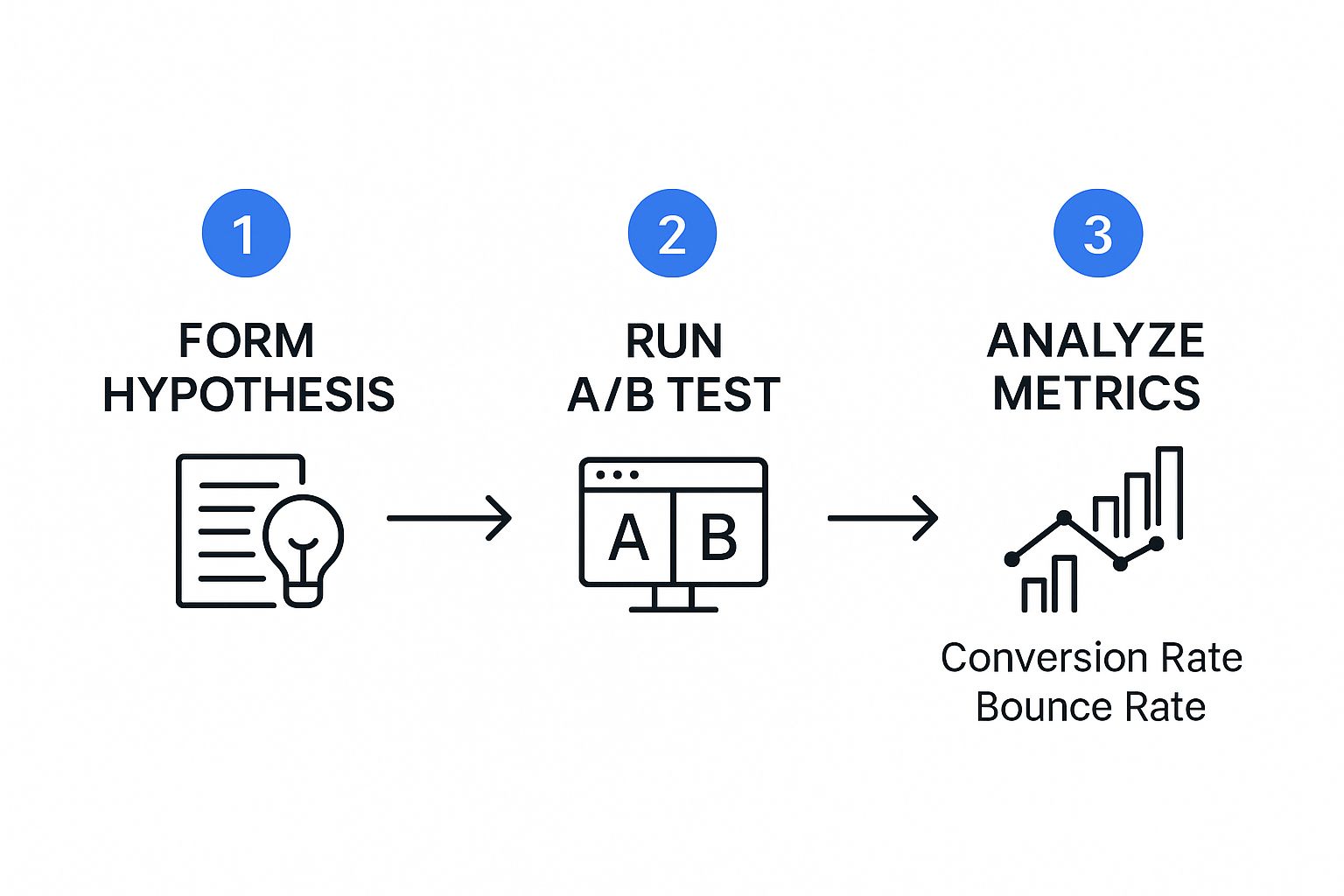
As you can see, improvement is a perpetual loop. You're constantly refining your page based on real user feedback, not just boardroom opinions.
Demystifying A/B Testing for Landing Pages
At the heart of optimization is A/B testing, sometimes called split testing. It’s a straightforward idea: show two versions of your page to different segments of your audience and see which one performs better. By changing just one thing at a time, you can scientifically figure out what truly resonates with your visitors.
But the key to doing this right is starting with a clear hypothesis. A good hypothesis isn't a random idea; it's a structured prediction. For example: "Changing the CTA button text from 'Submit' to 'Get My Free Guide' will increase form submissions because it clarifies the value the user will receive."
See how that works? It's specific, measurable, and testable. It gives your experiment a purpose and makes the results easy to understand. Without a solid hypothesis, you’re just throwing spaghetti at the wall.
A/B testing removes ego and guesswork from the equation. The data tells you what works, not your personal preference for the color green or a particular headline.
What Elements Should You Test First?
You could test nearly anything on your page, which can feel overwhelming. The trick is to prioritize. Focus on the elements with the biggest potential to move the needle. For a great structured approach, check out this landing page optimization checklist.
To get you started, here are some of the most impactful elements to test:
- The Headline: This is your first impression. Test different benefit statements or emotional triggers.
- The Call to Action (CTA): Experiment with the button color, size, placement, and—most importantly—the text.
- Hero Image or Video: Does a slick product photo work better than a raw customer testimonial video? Only one way to find out.
- Form Length and Fields: This one is huge. Test removing non-essential fields. You might be surprised how many more sign-ups you get just by asking only for an email address.
- Social Proof: Try different testimonials, case study snippets, or trust logos to see what builds the most credibility.
A quick word of warning: always test one variable at a time. If you change the headline and the CTA button color in the same test, you’ll never know which change was responsible for the lift (or drop) in conversions. If you need help with the technical side, our guide on landing page optimization tools breaks down platforms that make this whole process much easier.
A/B Testing Priority Matrix
Deciding where to start can be tough. Use this matrix to prioritize your tests by weighing potential impact against the effort required. It's a simple way to find low-hanging fruit.
This framework helps you focus your energy on tests that are most likely to give you a significant win without a ton of development work. Start with the "High Impact, Low Effort" items to build momentum.
Key Metrics That Actually Matter
When you run a test, you need a clear definition of success. It's easy to get lost in a sea of data, so focus on the few metrics that tie directly to your landing page's primary goal.
- Conversion Rate: This is the undisputed champion. It’s the percentage of visitors who complete your desired action. If this number goes up, your test is a winner. Simple as that.
- Bounce Rate: This tells you the percentage of visitors who land on your page and leave without doing anything. A high bounce rate can signal a disconnect between your ad and your landing page or a weak value proposition.
- Time on Page: While not a direct conversion metric, this provides useful context. If visitors are spending more time on a new version of your page, it might mean the copy is more engaging or the offer is clearer.
Having more pages tailored to specific campaigns can have a massive impact on these numbers. Data from several studies reveals that businesses with 21 to 40 landing pages see nearly a 300% increase in conversions. This reinforces why continuous testing and iteration across multiple targeted pages is one of the most effective strategies out there.
Common Landing Page Questions Answered
Even with the best strategy, you're going to hit some snags when building and tweaking landing pages. It just happens. Think of this section as your quick-reference guide for those moments—a place to get straight answers for the hurdles we all face.
Let's jump into the questions I hear most often from other marketers.
What Is a Good Landing Page Conversion Rate?
The industry average landing page conversion rate is supposedly around 9.7%, but that number is practically useless without context. It swings wildly depending on your industry, traffic source, and offer. A "good" rate isn't some universal number; it's a rate that's consistently getting better than your own last month.
Before you chase an arbitrary benchmark, figure out your baseline. Once you have that, your only job is to beat it through steady A/B testing.
The real metric to watch is progress, not perfection. Sure, some top-tier landing pages can hit conversion rates of 25% or higher, but focusing on small, steady wins is a much smarter and more sustainable way to grow.
How Long Should My Landing Page Be?
This is the classic "it depends" question. The only thing that should guide your page length is the complexity of your offer.
- Simple, low-risk offers? Think email signups or a free PDF download. Keep it short and sweet. Get straight to the point and make that call-to-action impossible to miss.
- Complex, high-commitment offers? We're talking high-ticket services, a SaaS subscription, or an in-depth course. You'll need a longer page. You have to earn that conversion by explaining the value, crushing every possible objection, and building serious trust.
The rule is simple: your page should be exactly as long as it needs to be to make a solid case for your offer—and not a single word longer.
Should I Put a Video on My Landing Page?
Yes, absolutely—but only if the video is good. A well-made video can be one of the most powerful conversion tools you have. In fact, studies show that adding a video to a landing page can boost conversions by over 80%. Why? Because video is fantastic at breaking down complex ideas and creating a real human connection, fast.
A great landing page video does three things right:
- It's short. Keep it under 90 seconds.
- It focuses on the user's problem and how you solve it.
- It looks professional and makes your brand look good.
For the biggest impact, stick your video right in the hero section. It’s the first thing people will see, giving you the best shot at grabbing their attention immediately.
How Many Landing Pages Do I Actually Need?
The short answer? More is almost always better. It might sound like a lot of work, but the data doesn't lie: companies with 40+ landing pages generate up to 500% more conversions than businesses with just one or two.
This isn't about creating pages just for the sake of it. It’s about segmentation and relevance. The goal is to create a unique, laser-focused landing page for every marketing campaign, ad group, or audience you're targeting. This lets you match your headline, copy, and images perfectly to what the user is looking for—and that's the real secret to skyrocketing your conversion rates.
Ready to stop guessing and start building dynamic, high-performing landing pages that convert? LanderMagic uses AI to create personalized post-click experiences for your Google Ads, ensuring every visitor sees the most relevant message.
Start your free trial with LanderMagic today and see the difference for yourself!