Summary
meta_description: Unlock higher conversions with our expert guide to CRO. Learn 9 proven conversion rate optimization best practices to turn more visitors into customers today!
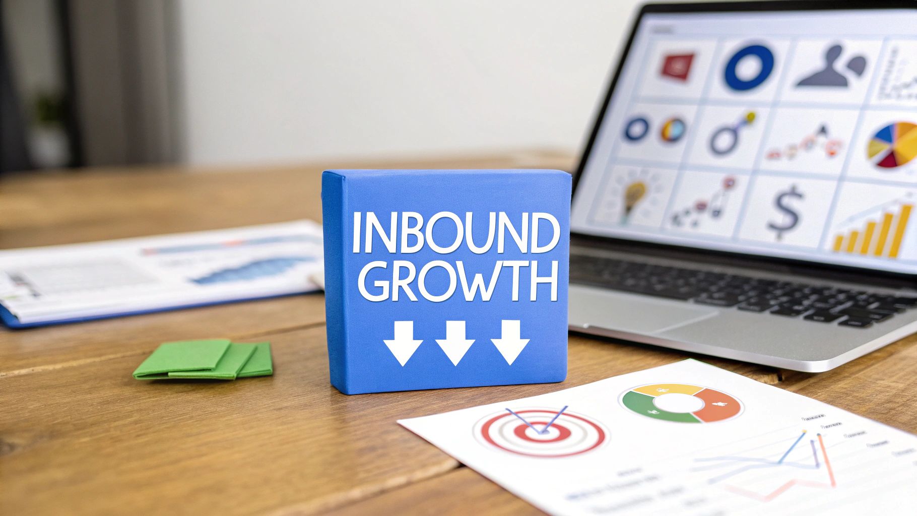
Are your paid campaigns driving traffic but failing to deliver conversions? You're not alone. The journey from a user's click to a valuable conversion is filled with potential drop-off points, turning your ad spend into a sunk cost. This is precisely where conversion rate optimization (CRO) becomes your most powerful tool. It’s the systematic process of turning visitors into customers by enhancing every element of their post-click experience. So, how do you move beyond guesswork? Effective CRO is all about data-driven decisions that directly impact your bottom line.
This article dives deep into the top nine conversion rate optimization best practices you need to master. We will move beyond generic advice and provide actionable strategies specifically designed to supercharge your dynamic landing pages. To truly transform clicks into customers, delving into a comprehensive guide to website conversion rate optimization can provide the foundational understanding you need. The insights here will build upon that knowledge, giving you a practical toolkit for immediate implementation.
Ready to learn how to leverage A/B testing, refine your calls-to-action, streamline user experience, and implement powerful social proof? We'll cover everything from form optimization and personalization to ensuring your pages are blazing-fast on every device. Whether you're a seasoned marketer managing complex campaigns or a small business owner looking to maximize every dollar, these strategies will help you reduce acquisition costs, increase ROI, and achieve your most ambitious goals. Let's begin building your conversion machine.
1. What is A/B Testing and How Does It Improve Conversions?
At the heart of any successful conversion rate optimization best practice lies a commitment to data-driven decision-making, not guesswork. A/B testing, also known as split testing, is the foundational method for this. It involves creating two versions of a webpage (Version A, the control, and Version B, the variation) and showing them to different segments of your audience. The goal? To see which one performs better against a specific metric, like generating sign-ups or sales.

Multivariate testing takes this concept a step further by testing multiple elements on a single page simultaneously. For instance, instead of just testing one new headline, you could test two different headlines and two different call-to-action (CTA) buttons at the same time. This approach helps you understand the combined impact of various elements and which combination produces the best results.
Why is this method essential?
Without testing, any changes you make to your landing pages are based on assumptions. A/B and multivariate testing provide quantitative proof of what works for your specific audience. Giants like Booking.com run thousands of tests annually, optimizing everything from button colors to urgency-inducing copy. Similarly, Airbnb famously increased bookings by testing different search result layouts, demonstrating the massive potential of structured experimentation. This systematic approach eliminates personal bias and ensures every change contributes positively to your conversion goals.
Actionable Implementation Steps
To effectively integrate this into your workflow, you need a structured process. Start by identifying high-impact pages with significant traffic but low conversion rates. Formulate a clear hypothesis, such as "Changing the CTA button color from blue to orange will increase clicks by 15% because it stands out more."
- Test One Element at a Time: In A/B testing, isolate a single variable (e.g., headline, image, or CTA text) to gain clear, unambiguous insights.
- Ensure Statistical Significance: Use a sample size calculator to determine how many visitors you need for your results to be statistically valid. Don't end a test prematurely.
- Run Tests for Full Cycles: Let tests run for at least one to two full business cycles (e.g., a week or two) to account for daily and weekly fluctuations in user behavior.
- Focus on High-Impact Elements First: Prioritize testing elements that have the greatest potential to influence conversions, such as your headline, hero image, CTA, and offer.
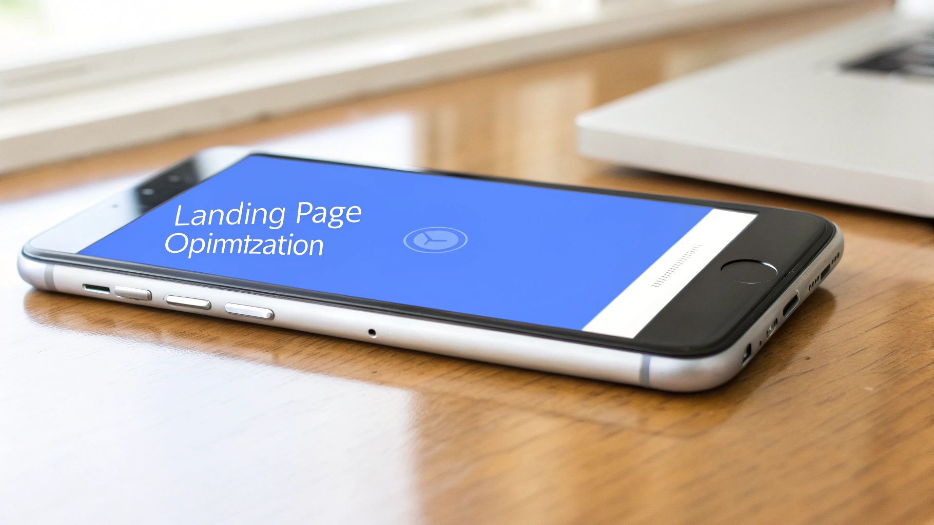
2. Using Landing Page Optimization to Increase Conversions
A core principle of conversion rate optimization best practices is guiding visitors toward a single, focused action. Landing page optimization achieves this by creating dedicated, standalone pages designed to convert traffic from a specific campaign or source. Unlike a homepage with multiple navigation options, a landing page eliminates distractions. It aligns its message, design, and call-to-action with the visitor's original intent, whether they came from an ad, email, or social media post.
This focused approach creates a seamless user journey. A well-optimized landing page is paramount for converting visitors into customers. Understanding how a dedicated landing page can significantly increase your pay-per-click conversion is a crucial aspect of this. By matching the messaging from the initial touchpoint, you reassure visitors they are in the right place and make it easy for them to take the next step.
Why is this method essential?
Directing paid traffic or email subscribers to a generic homepage is a common yet costly mistake. It forces users to navigate and find the offer themselves, leading to high bounce rates. Dedicated landing pages solve this by providing a highly relevant, purpose-built experience. For instance, HubSpot creates unique landing pages for each content offer, achieving conversion rates over 40%. Similarly, Unbounce has demonstrated that a focused landing page design can improve client conversion rates by 30% or more by reducing friction and clarifying the value proposition.
Actionable Implementation Steps
Building high-converting landing pages requires a strategic approach that prioritizes clarity and relevance. Start by defining the singular goal of your page, then design every element to support that goal. To improve your process, explore various landing page optimization tools that can streamline everything from creation to testing.
- Match Your Message: Ensure the headline and hero section of your landing page directly mirror the copy of the ad or link that brought the user there. This "message match" confirms relevance and builds trust instantly.
- Focus on a Single CTA: Remove all competing links, including main site navigation and footer links. Every clickable element should guide the user toward the primary conversion goal.
- Leverage Social Proof: Place testimonials, case study snippets, or trust badges "above the fold" to immediately establish credibility without requiring the user to scroll.
- Minimize Form Friction: Only ask for the information you absolutely need. For a lead magnet, a name and email might be sufficient. Every additional field is a potential point of abandonment.
3. How to Perfect Your Call-to-Action (CTA) for More Clicks
Your Call-to-Action (CTA) is arguably the most critical element on your landing page. It's the final gateway between a visitor and a conversion. What does CTA optimization involve? It's about strategically designing and placing action-oriented buttons, links, and messages that guide users toward your primary goal. This process examines everything from button text and color to size and placement, ensuring every aspect is fine-tuned to maximize click-throughs.
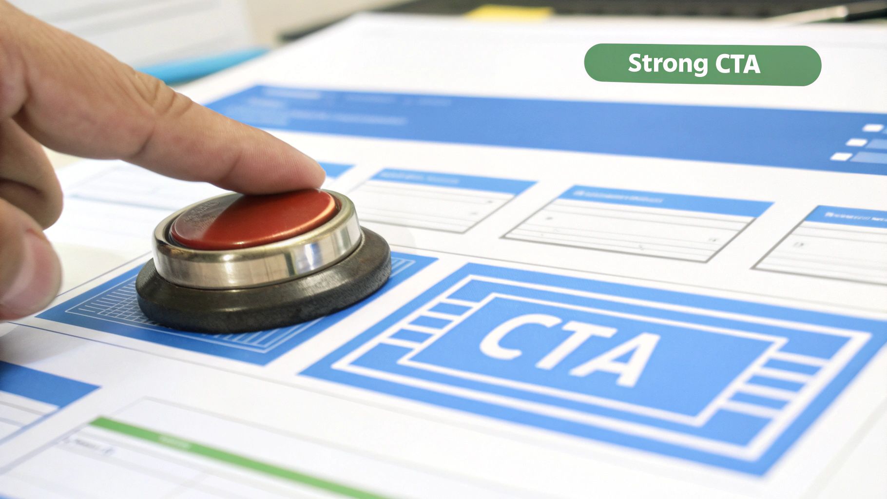
This practice moves beyond simply having a button; it focuses on the psychology behind user action. The goal is to create a CTA that is compelling, clear, and virtually irresistible to your target audience. A well-optimized CTA reduces friction and hesitation, making it an essential component of any high-performing landing page and a core tenet of conversion rate optimization best practices.
Why is this method essential?
A weak or ambiguous CTA can render all your other optimization efforts useless. Even with persuasive copy and a brilliant offer, if users don't know what to do next or aren't compelled to act, they will leave. Case studies prove the immense impact of small changes. For example, Performable (now part of HubSpot) famously increased clicks by 21% just by changing a button color from green to red. Similarly, ContentVerve saw a staggering 90% conversion lift by changing button text from "Order Information" to "Get Instant Access," highlighting the power of value-driven language.
Actionable Implementation Steps
Optimizing your CTA is a continuous process of testing and refining. Start by analyzing your current CTAs for clarity, visibility, and value. Is it immediately clear what will happen when a user clicks? Does the button stand out from the rest of the page?
- Use Action-Oriented, First-Person Language: Instead of a generic "Submit," try specific, benefit-focused text. Testing "Get My Free Trial" against "Get Your Free Trial" often reveals that first-person language connects better with users.
- Create Strong Visual Contrast: Your CTA button should be impossible to miss. Use a color that contrasts with your page's background and surrounding elements, guiding the user's eye directly to it.
- Strategic Placement: Position your CTA where users naturally look. This means placing it prominently above the fold and repeating it after long sections of copy or at natural reading endpoints.
- Ensure Mobile-Friendliness: On mobile devices, CTAs must be large enough to be easily tapped with a thumb. Aim for a minimum size of 44x44 pixels to avoid user frustration.
4. Leveraging User Experience (UX) and Interface Design
A seamless user experience (UX) and intuitive user interface (UI) are critical components of conversion rate optimization best practices. This approach goes beyond aesthetics, focusing on making the entire user journey as effortless and enjoyable as possible. By optimizing navigation, page layouts, visual hierarchy, and interactive elements, you remove friction points that might otherwise cause a potential customer to abandon your site. A great UX guides users naturally from their entry point to the final conversion goal.
Pioneered by experts like Don Norman and Steve Krug, user-centered design principles have proven their immense value. Amazon’s legendary "one-click" purchasing system is a prime example, drastically simplifying the checkout process and reducing cart abandonment. Similarly, Slack’s intuitive onboarding sequence ensures new users understand the product’s value immediately, which boosted user activation rates. These successes demonstrate that investing in a user-friendly interface directly translates to higher engagement and conversions.
Why is this method essential?
A poor user experience is a direct path to high bounce rates and lost revenue. If users find your site confusing, slow, or difficult to navigate, they will quickly leave for a competitor. Optimizing UX and UI design builds trust and confidence, showing visitors that you value their time and attention. By anticipating user needs and creating a clear path to conversion, you remove psychological barriers and make it easy for them to say "yes." This focus on the user journey is a fundamental pillar of any sustainable growth strategy.
Actionable Implementation Steps
To improve your site's UX and UI, you need to understand your users' behavior and pain points. Start by gathering both qualitative and quantitative data through user testing, heatmaps, and analytics. From there, you can begin making targeted improvements.
- Prioritize Mobile-First Design: With the majority of web traffic coming from mobile devices, ensure your landing pages are fully responsive and easy to use on a smaller screen.
- Simplify Navigation: Follow the "three-click rule," where users can find any crucial information within three clicks. Use clear labels and a logical site structure.
- Maintain Design Consistency: Use consistent fonts, colors, button styles, and layouts across your entire website to create a cohesive and predictable experience.
- Conduct User Testing: Watch real users interact with your site to uncover friction points you may have overlooked. Tools like heatmaps and session recordings are invaluable.
- Implement Clear Error Messages: When a user makes a mistake on a form, provide helpful, clear validation messages that guide them to a solution instead of just saying "error."
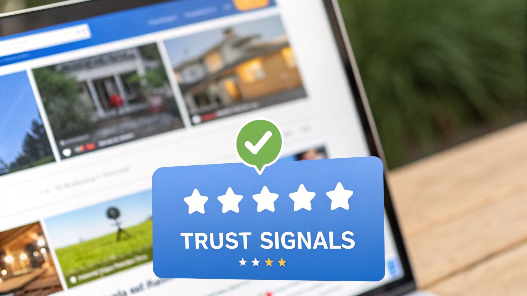
5. The Power of Social Proof and Trust Signals in CRO
One of the most powerful conversion rate optimization best practices is leveraging social proof. What is social proof? It's a psychological principle where people conform to the actions of others under the assumption that those actions are correct. By implementing trust signals like testimonials, customer logos, case studies, and security badges, you reduce friction and anxiety for potential customers. This makes them feel more confident in their decision to convert by showing that others have already tried and trusted your product or service.
Trust signals work by validating a user's choice before they even make it. When a visitor sees that well-known brands or a large number of peers are using your service, it immediately establishes a baseline of trust. This validation is critical at key decision points, such as near a "Buy Now" button or a sign-up form, where hesitation is most likely to occur.
Why is this method essential?
Without social proof, visitors must rely solely on your own marketing claims, which are inherently biased. Social proof provides independent, third-party validation that your offer is valuable and legitimate. For example, Basecamp famously boosted conversions by 102% simply by adding customer testimonials and logos to its homepage. Similarly, Booking.com uses real-time social proof like "X people are looking at this hotel" to create urgency and has seen booking increases of up to 15% as a result. These examples prove that what others say about you is far more persuasive than what you say about yourself.
Actionable Implementation Steps
To effectively implement social proof, strategically place different types of validation throughout your landing page. Start by identifying where users might feel uncertainty or risk, and place trust signals nearby to reassure them. Are you wondering where to begin?
- Be Specific and Authentic: Use detailed testimonials that highlight specific benefits or results rather than generic praise. Including a full name, company, and photo adds significant credibility.
- Leverage Numbers: Quantifiable proof is highly persuasive. Use statistics like "Trusted by over 10,000 customers" or data from case studies to demonstrate your impact.
- Place Signals Strategically: Position your most powerful social proof, like customer logos or a star rating, near your primary call-to-action to reduce last-minute hesitation.
- Keep It Fresh: Regularly update your testimonials, reviews, and case studies. Recent social proof feels more relevant and shows that your business is actively succeeding.
6. Reducing Friction with Strategic Form Optimization
Every form on your landing page represents a critical point where a visitor can either convert or abandon their journey. Form optimization is the practice of systematically removing friction from this process. It involves simplifying the design, minimizing the number of required fields, and making the submission process as effortless as possible to boost completion rates. The goal is to balance your need for data with the user's desire for a quick, painless experience.
This approach transforms a potential roadblock into a smooth pathway to conversion. By asking for less upfront and making the process intuitive, you respect the user's time and significantly increase the likelihood that they will follow through. This is a core component of any effective conversion rate optimization best practices, as forms are often the final hurdle before a lead is captured or a sale is made.
Why is this method essential?
Long, complicated, or confusing forms are a primary cause of conversion abandonment. Each additional field adds cognitive load and gives a user another reason to leave. Expedia famously increased annual profit by $12 million simply by removing one optional field ("Company Name") from their booking form. Similarly, ImageScape saw a 120% increase in conversions after reducing their contact form from 11 fields to just four. These examples highlight a simple truth: the easier you make it for users to convert, the more of them will.
Actionable Implementation Steps
To begin reducing form friction, analyze every field and ask if it is absolutely essential for the initial conversion. Your objective is to make the form feel less like an interrogation and more like a simple, welcoming handshake.
- Ask Only for Essential Information: Start with the bare minimum needed to qualify or contact the lead (e.g., just an email address). You can always gather more information later using progressive profiling.
- Use Inline Validation: Provide real-time feedback as users fill out the form, highlighting errors immediately instead of waiting until they hit "submit." This prevents frustration and streamlines the process.
- Group Related Fields Logically: Organize fields into logical sections (e.g., "Contact Information," "Shipping Details") to make the form easier to scan and complete.
- Prioritize a Single-Column Layout: Studies by form design experts like Luke Wroblewski show that single-column layouts are typically completed faster as they provide a clear, linear path for the user's eye to follow.
7. How Website Speed Impacts Your Conversion Rate
In today's fast-paced digital environment, a user's patience is incredibly thin. Website speed and performance optimization is the practice of reducing page load times and ensuring a smooth, responsive user experience. This isn't just a technical nicety; it's a critical component of conversion rate optimization best practices. Why? Because even a one-second delay can cause a significant drop in conversions and a spike in bounce rates.
Slow-loading pages frustrate users, diminish trust, and directly harm your bottom line. When a visitor has to wait, they are far more likely to abandon your page for a competitor's. Optimizing for speed ensures that your carefully crafted landing page has the chance to be seen and to persuade your audience before they lose interest.
Why is this method essential?
The impact of page load time on conversions is well-documented and profound. Major brands have invested heavily in performance optimization because they have seen the direct correlation with revenue. For example, Walmart discovered that for every one-second improvement in page load time, their conversions increased by 2%. Similarly, after reducing their load time by 36%, AliExpress saw a 10.5% increase in orders. These figures prove that speed isn't a feature; it's a foundational requirement for a high-converting website.
Actionable Implementation Steps
Improving your site's performance requires a systematic approach to identifying and eliminating bottlenecks. Start by analyzing your page with tools like Google's PageSpeed Insights to get a baseline score and specific recommendations. From there, prioritize the changes that will deliver the biggest improvements.
- Optimize Your Images: Use modern image formats like WebP and compress images without sacrificing visible quality. Ensure images are correctly sized for their containers to avoid loading unnecessarily large files.
- Minimize HTTP Requests: Each element on your page (scripts, images, stylesheets) requires a separate request. Combine CSS and JavaScript files and reduce the number of third-party scripts to lower the total request count.
- Leverage Browser Caching: Configure caching to store parts of your website on a visitor's browser. This allows subsequent pages to load much faster, as the browser doesn't have to re-download every asset.
- Implement Lazy Loading: Configure images and videos located below the fold to load only when a user scrolls down to them. This dramatically speeds up the initial page load and conserves bandwidth.
8. What is Personalization and Behavioral Targeting?
In a world saturated with generic marketing messages, personalization is the key to cutting through the noise. This strategy involves tailoring your landing page content, offers, and overall user experience based on specific data points like visitor behavior, demographics, location, or past interactions. By delivering a message that feels uniquely created for the individual, you dramatically increase its relevance and persuasive power, making conversions far more likely.
Behavioral targeting is a core component of this, allowing you to adapt your content in real-time based on how a user engages with your site. For example, you can show a special discount to a returning visitor who previously abandoned their cart or display testimonials from customers in the same industry as the current user. This creates a dynamic, one-to-one conversation rather than a static, one-to-many broadcast.
Why is this method essential?
Generic experiences lead to generic results. Personalization makes your audience feel seen and understood, which builds trust and drives action. The proof is in the results of industry leaders: Amazon's recommendation engine is famously responsible for a huge portion of its revenue, while Netflix's personalized content suggestions keep viewers engaged and subscribed. These giants have proven that by catering to individual preferences, you can achieve exponential growth. This is a vital conversion rate optimization best practice because it directly addresses the user's specific needs.
Actionable Implementation Steps
Implementing personalization doesn't have to be overly complex from the start. You can begin with simple segmentation and gradually introduce more sophisticated tactics. To learn more about the fundamentals, explore our guide on what is behavioral targeting for a deeper understanding.
- Start with Segmentation: Group your audience by simple criteria like new vs. returning visitors, traffic source, or geographic location, and tailor headlines or offers for each segment.
- Use Progressive Profiling: Instead of overwhelming new visitors with long forms, gather information over multiple interactions. Ask for their industry on the first visit and their company size on the second.
- Test Personalized vs. Generic: Always run A/B tests to measure the exact uplift a personalized experience provides compared to your standard, non-personalized version.
- Prioritize High-Impact Opportunities: Focus your initial efforts on personalizing key elements like headlines, calls-to-action (CTAs), and hero images on your most important landing pages.
9. Why a Mobile-First Optimization Strategy is Crucial
In today's digital landscape, mobile-first optimization is no longer a suggestion; it's a fundamental requirement. This approach reverses the traditional design process, prioritizing the user experience on mobile devices before scaling up to desktop. With mobile traffic consistently surpassing desktop for most websites, ensuring your landing pages are seamless, fast, and intuitive on a small screen is one of the most critical conversion rate optimization best practices.
A mobile-first strategy involves designing for the smallest screen's constraints from the start. This forces you to focus on the most essential content and functionality, resulting in a cleaner, more focused user journey. This approach contrasts with responsive design that starts with a desktop version and then adapts it down, which can often lead to a cluttered and slow mobile experience.
Why is this method essential?
Failing to optimize for mobile is equivalent to shutting the door on more than half of your potential customers. A clunky mobile interface leads to high bounce rates and abandoned carts, directly harming your conversions. For instance, after adopting a mobile-first redesign, Starbucks saw an 11% surge in mobile conversions. Similarly, retail giant West Elm achieved a 25% increase in mobile revenue by focusing on this strategy. These examples underscore the massive revenue potential unlocked by prioritizing the mobile experience.
Actionable Implementation Steps
To implement a mobile-first strategy, shift your design and development perspective. Think "thumb-friendly" from the very beginning. Instead of asking what to remove for the mobile version, ask what is absolutely essential for a user to convert.
- Design for Thumb Navigation: Place key interactive elements like CTAs and navigation menus within the natural sweep of a user's thumb for easy one-handed use.
- Prioritize Critical Content: Ensure your value proposition, primary headline, and CTA are immediately visible "above the fold" without requiring any scrolling.
- Use Touch-Friendly Buttons: Make buttons and links large enough to be easily tapped without accidental clicks. A minimum size of 44x44 pixels is a common guideline.
- Simplify Forms and Inputs: Use mobile-native features like numeric keypads for phone numbers and simplify forms to only ask for essential information, reducing user friction.
- Test on Real Devices: Always test your pages on various physical smartphones and tablets, not just browser emulators, to catch real-world performance and display issues.
Best Practices Comparison of 9 CRO Strategies
Your Next Step: From Insight to Implementation
You have just navigated a comprehensive roadmap of conversion rate optimization best practices. From the foundational principles of A/B testing to the nuanced art of behavioral personalization, we've covered it all. We've deconstructed everything from CTA psychology and frictionless form design to the non-negotiable need for mobile-first optimization and lightning-fast page speeds. The common thread weaving through all these strategies is a relentless focus on the user’s journey.
The goal isn't just to implement a checklist of tactics; it's to cultivate a mindset of continuous improvement. True mastery of CRO lies in understanding that every element on your landing page—from the hero image to the footer text—is an opportunity to build trust, clarify value, and guide your visitor toward a meaningful action. Your journey with these conversion rate optimization best practices is just beginning. What will you do next?
From Theory to Tangible Results
Knowledge without action is just potential. To transform this potential into tangible revenue growth and enhanced customer loyalty, you must bridge the gap between knowing and doing. The most successful marketers don't try to overhaul their entire funnel at once. Instead, they adopt a methodical, data-driven approach.
Start by identifying the path of least resistance with the highest potential impact. Use analytics to pinpoint where your users are dropping off. Is it a complex checkout form? A confusing value proposition on your main landing page? A CTA that fails to inspire action?
Key Takeaway: Your data holds the clues. Begin by diagnosing your biggest conversion bottleneck, form a clear hypothesis about how to fix it, and then design a controlled test to validate your assumption. This iterative cycle of diagnosis, hypothesis, and testing is the engine of successful CRO.
Your Action Plan for Continuous Optimization
Don't let analysis paralysis stall your progress. Here is a simple, actionable framework to get you started today:
- Choose Your Battlefield: Pick one of the nine areas we covered. For a quick win, you might start with CTA Optimization. A simple change in color, copy, or placement can yield surprising results and build momentum for your team.
- Form a Testable Hypothesis: Don't just make changes randomly. Structure your idea as a hypothesis. For example: "By changing the CTA button text from 'Submit' to 'Get My Free Guide,' we will increase form submissions by 15% because the new copy focuses on the value exchange."
- Leverage the Right Tools: Implementing these conversion rate optimization best practices, especially A/B testing and personalization, requires the right technology. Platforms built specifically for this purpose remove technical barriers, allowing you to launch tests quickly without relying on a development team.
- Analyze, Learn, and Repeat: Whether your test wins, loses, or is inconclusive, you gain valuable insight into your audience's behavior. Document your findings, share them with your team, and use that knowledge to inform your next hypothesis. This is how a one-time project becomes a sustainable optimization culture.
By consistently applying these principles, you move beyond simply having a landing page and start creating a powerful post-click experience. This refined experience doesn't just convert a visitor into a lead or customer; it lays the foundation for a long-term, profitable relationship. The question is no longer what to do, but where will you start?
Ready to turn these expert strategies into reality without the technical headache? LanderMagic is the all-in-one platform designed to help you build, test, and personalize dynamic landing pages effortlessly. Stop guessing what works and start knowing with a tool that makes implementing conversion rate optimization best practices simple and effective. Start your journey with LanderMagic today!